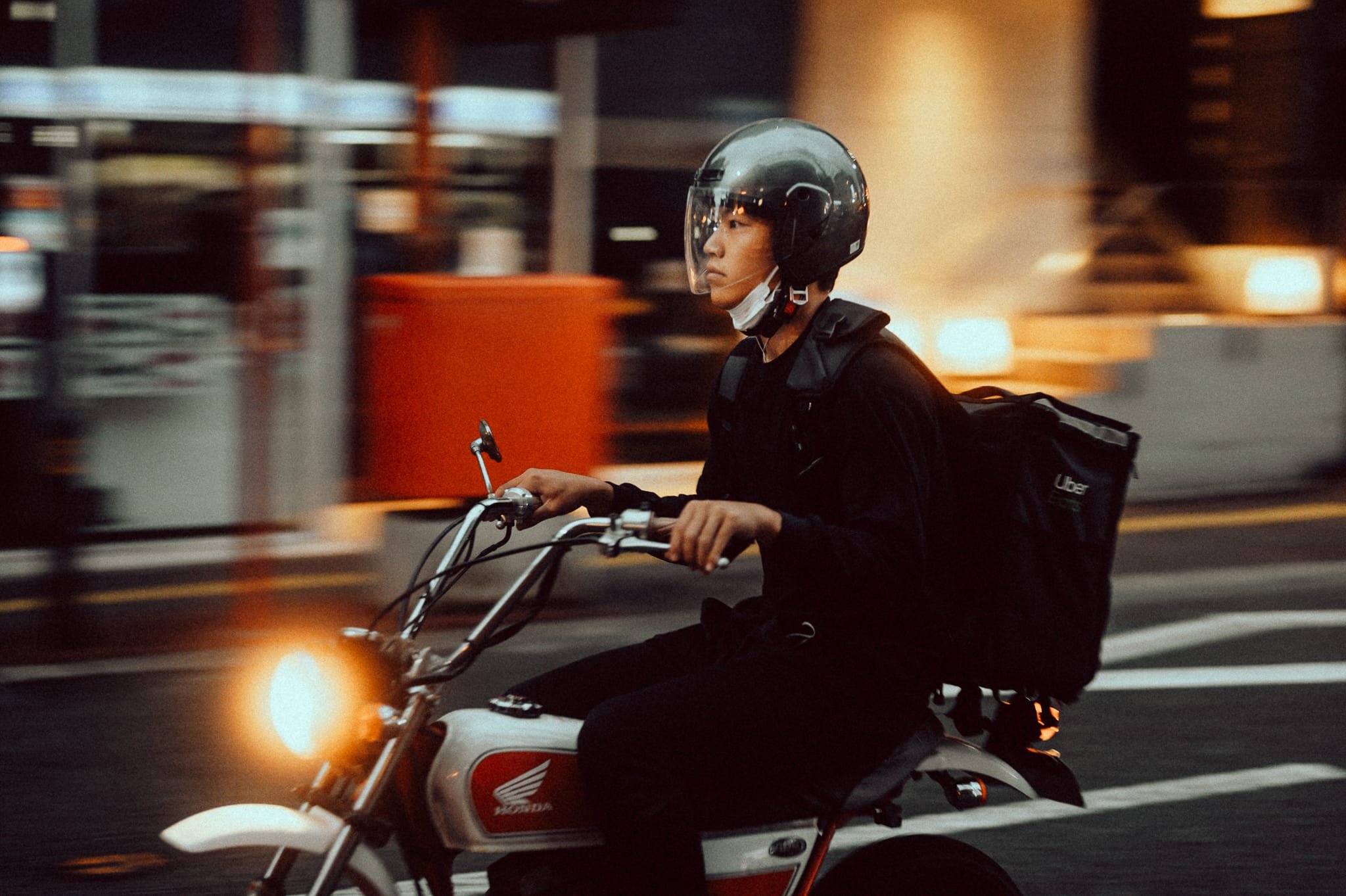
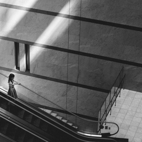
These are not gimmicks, these were not rushed to make money. These are the looks I designed for myself to help me speed up my workflow. This is what I use.
After constant requests from readers and followers years ago, I’ve taken a great deal of time to package these looks into something that can be incredibly powerful and useful in every situation for any style of photography. This is a product I am very excited about and it has dramatically changed the way I edit. It has made me faster and I’ve also learned a great deal about tone control, color harmony, and grain while making these, I think you can learn a great deal from these presets as well by opening them up and seeing how they work. Since these are my regularly used looks they do change over the years and I will roll out updates regularly for those that have purchased them.
See the full product overview Core V3
Thank you for considering these presets and supporting the site!
New Version 3 Is Here – Two Packs in One
Core Color V3.0 is a preset pack for Lightroom that simulates the styling that can be found in various Kodak and Fujifilm film stocks. Since the film has a dramatically different color profile depending on the temperature of the light, it is impossible to truly simulate film as a single one-click preset. Instead, these packs offer some similar styling to push your digital files and give them a little more vibe and character. I’ve spent over five years developing these presets and this is the most versatile version yet.
The Pack is now split between two styles. The regular Core Film looks and Sepia Looks.
New With Version 3
For those upgrading from Version 1 and Version 2, Version 3 has all new looks with a new layout.
The Basic: Film – Core looks – have little fade with a higher contrast, designed for portraits and general or lifestyle photography.
The Classic: Based on the base Core looks, the Classic looks push images to have less contrast with some color shifts, fades, and reduced highlights to simulate classic film looks.
Retro: Retro takes Classic a step further by adding a distressed film look as seen with some cheaper film stocks.
Sepia Color: Sepia looks were first introduced in V2, and now they have a dedicated section and have been expanded on.
Color Elements: There are several Color Elements – these use the Color Grading tools to quickly add some color adjustments to the image.
Grain: There are several grain effects from fine, to heavy with varying degrees of texture.
Important Tips
Because these looks have some pretty aggressive color curves, it’s pretty important to get the WB adjustments right especially when dealing with skin tones. The first thing I almost always do is a minor adjustment to WB. The colors will be shaped and work differently depending on the exposure. There is a bit more color contrast in the shadows than in the highlights, so brighter images will often have a slightly calmer feel, and darker images might have a bit more punch.
When dealing with in-camera profiles, these do stack very well with some profiles but they can dramatically change skin tones, so again just adjust WB to get it right. With Fujifilm, I often use these on top of Classic Chrome set in Lightroom when shooting RAW and sometimes even on top of Classic Chrome as JPGs. I’ll also occasionally use them with Astia.
With Nikon I’ll sometimes use them with Camera Standard or sometimes with the Portrait looks to find different blends. But for years, and almost all the samples above, I’ve been using them with either Adobe Color or Adobe Standard. But you can just experiment, to build your own workflow.
What Looks work well in what situations? The first half of the pack I designed to work well with people and casual situations Core I – Core III. I only built Core V – Core VII when I started shooting a lot more street photography, especially street photography at night. For night street shooting I often jump straight to those later looks first. Many of the looks work very well stacked with some in-camera profiles. So if you shoot Nikon, Sony, Canon, or Fujifilm, try them with Classic Chrome or some of the Camera Portrait profiles.
Changelog
Current version: v1.10 Those who purchase presets will be automatically added to an email newsletter where they will receive updates when changes occur.
These looks will continuously change with updates and tweaks as cameras and technology change.
v1.10 2a – Film – Core I.1 C1 – Desaturated red primaries slightly
2a – Film – Core I.2 – Aged C1 – small tweaks
2a – Film – Core I.2 – Aged C2 – small tweaks
2b – Film – Core II.1 C3 – Added for now as a work in progress as a possible replacement for C2. 2b – Film –
Core II.1 C3 – Small tweaks
2b – Film – Core II.2 C3 – Small tweaks
2b – Film – Core II.2 Sepia – New Look
2c – Film – Core III.1 – C3 – Shifted Blue Primary
2c – Film – Core III.4 Sepia – New Look
2d – Film – Core IV.1 – Desaturated blues, lowered contrast overall.
2d – Film – Core IV.3 Aged – Small Tweaks
2e – Film – Core IV.4 – Sepia – New Look
2e – Film – Core V.1 – Alt – Small Tweaks
2e – Film – Core V.1 – Warmer – Small Tweaks
2e – Film – Core V.1 – Small Tweaks
2f – Film – Core VI.1 – Alt – Small Tweaks
2f – Film – Core VI.3 – Sepia – New Look
2g – Film – Core VII.1 – Small Tweak
Elements Reworked
All the Split Toned Elements have been reworked for the major update that came with Lightroom in 2020. If you are working on an older version of LR, some of these updates will not work correctly for you and you should stick with V1.00.
V2.00
2a – Film Core I.1 – This look has been totally rebuilt. Most of the Aged looks have been heavily adjusted. All New Sepia Looks. 6 New Color Elements. New Light Grain
V3.0
Slight adjustments to all the looks. Eliminated the C1 and C2 variations and now go with just xx.1 or xx.2 alternate looks as reduced some of the variations that were not necessary. Added Mild looks. Changed naming from Aged to Classic. Added Retro looks. Added more Sepia Looks. Added more Color Elements.
V3.1 Reduces contrast and intensity of most of the looks with some minor color adjustments on the retro looks.
How To Install
Unzip file. Right-click in the preset panel in Lightroom. Click Import. If you use an older version of Lightroom that uses lrtemplate files email me and I can send presets converted for that, but you will lose some of the color grade effects. I do try to keep these backward compatible, but some looks do take advantage of the new color-grade tool. The latest V2.00 update will not work with the older Lightroom versions because I use new Color Grading tools.
How To Update
Download the new presets. Right-click in your preset window and import new ones. You can click directly on the new zip file when importing. These will load without overwriting your older presets so you can keep what you like from them while making the transition into these new looks.


