Core Color V3 Lightroom Presets
Core Color V3 is a Lightroom preset pack that simulates the styling of various Kodak and Fujifilm film stocks. Since film has a dramatically different color profile depending on the light temperature, it is impossible to simulate film as a single one-click preset. Instead, these packs offer a similar style to liven up your digital files and give them a little more vibe and character.
The Core Color V3.0 set comprises four styles. The Core or base looks Classic, and the new Retro and Sepia look.
Latest Update: In V3.10, I’ve reduced the contrast and intensity of many of the looks. Many of the new cameras coming out have a bit more punch, so I compensated for this.
*If you own V1 or V2, just log in and re-download the pack. You will now see V3.10 included in the zip file. Also, if you’re new to the presets, feel free to try V2, which is also found in the zip file.
CORE BASICS
7 Base Looks With Alternate Styles
The Core Basic looks are designed for portraits and general or lifestyle photography. They are strong with contrast and saturation, and mostly retain the blacks and highlights. These give you a clean look with some styling to build off of.
The looks can vary depending on your camera brand and model. The original core lenses were designed with Fujifilm and Sony, and later I made some adjustments with Leica and Nikon cameras. So, while some presets might not work in every situation, there is always a variation that’s perfect.
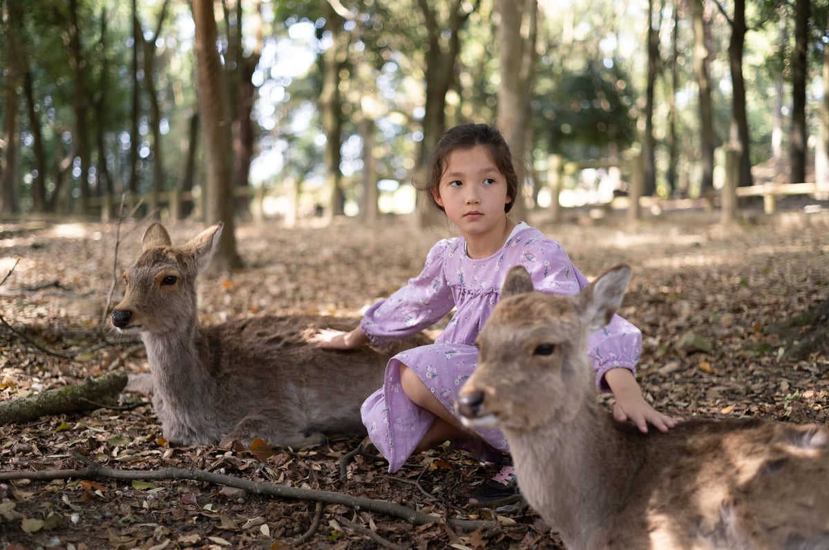
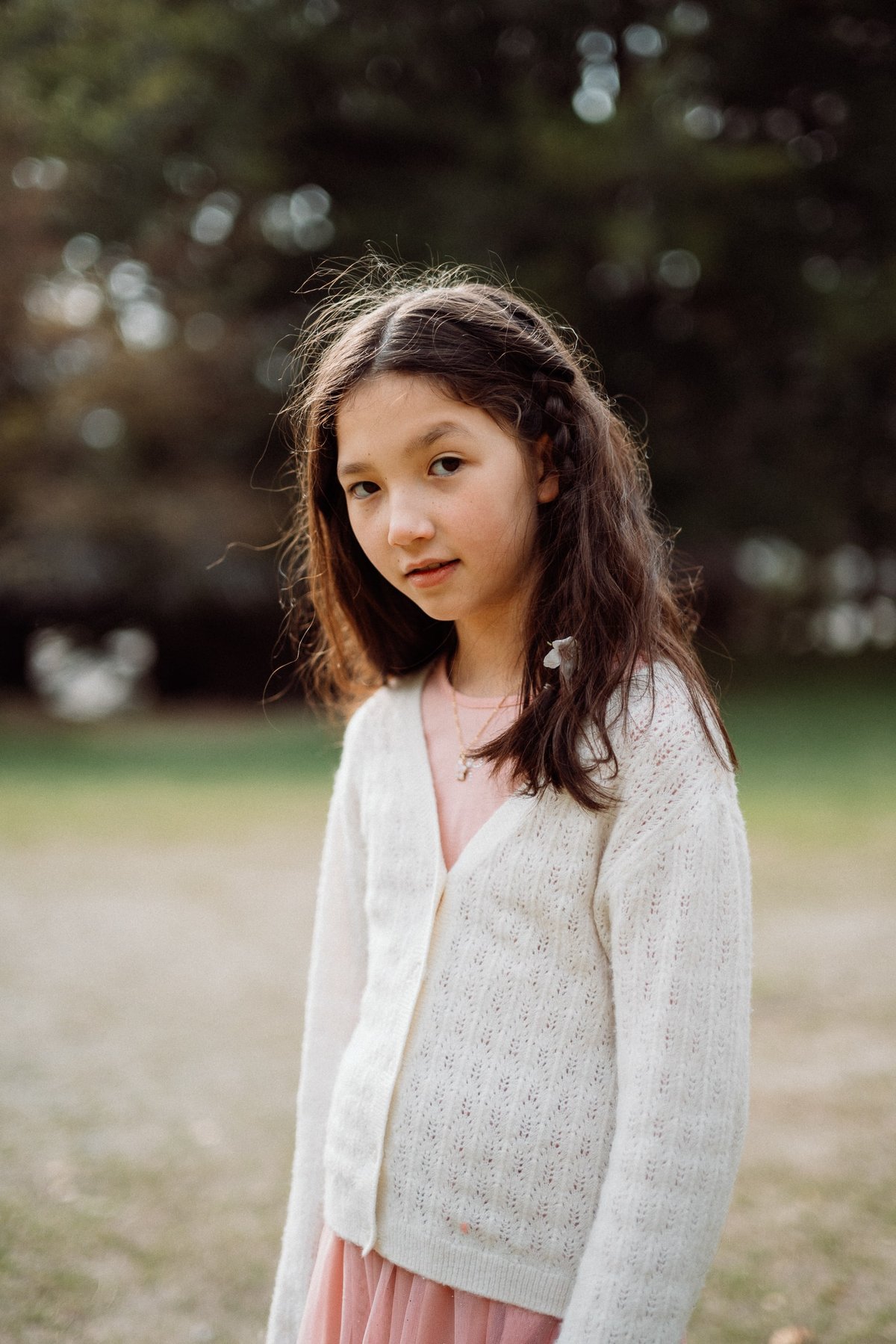
Sample using Core I with Adobe Color using a Leica M11.


Sample Core II.2 using Adobe Standard as the base profile, using the Nikon Z8.
Core I through Core IV are great for portraits as they have been optimized for skin tones. In the set, you will also see some looks labeled “Mild”. These are based on the Core looks, but the effects have been turned down a little to reduce contrast and saturation, making them better optimized for landscape photographers or other high-contrast scenes.
Core III.2 is slightly warmer, using stronger reds and a design inspiration living somewhere between a Kodak Ektar and Provia.

Below Core II.1 was used on a photo taken with the Fujifilm X-Pro2 with the Kipon 40mm f0.85 lens. Some mild editing was performed, mostly with the color grading tool.
In previous versions, I tried to tune different looks based on camera brands labeled C1 and C2. Instead of this labeling, I’ve just consolidated some of the looks down and included a few alts to eliminate confusion. Every camera was released every year, so trying to keep looks tuned for different brands just wasn’t working.
CLASSIC STYLE
11 Enhanced Looks to Capture Those Classic Cinetones
The Classic Looks are based on the original core looks, but they’ve had additional styling to reduce contrast and saturation. Blacks are more lifted, and sometimes the highlights are muted, with blues pushed a little more towards teal. These give you a more traditional feel, as you could expect from well-processed film stocks, while still having the DNA of the original Core looks.
Classic looks with slightly lifted blacks.
RETRO STYLE
13 Enhanced Looks To Push That Retro Style
Labeled with R+ or R++
Often when we think of film photography, we think of the lower quality film look, where the film was mishandled, expired, or poorly processed. This produces a lot of color shifts with a more distressed feel. The Retro looks simulate some of that with stronger color shifts, muted highlights, and grain added.
Here is a sample of 2b – Retro – Core II.3 – R+
In this image, I kept the Nikon Camera Portrait profile loaded. It was taken with the Nikon Z8, a 26mm at f4, and a Glimmer Glass Filter at 1/4 power.
Pair the Retro looks with some diffusion filters like a Glimmer Glass 1/4 or Black Pro-Mist 1/4, and you get a very film-like style.

The R++ has the heaviest effect.
While all the looks were originally designed to be used with Adobe Standard, here, Camera Portrait from the Nikon Z8 was used to give the red tones more prominence. You can use various camera profiles to help guide the looks. Fujifilm Astia and Camera Portraits, along with the other brands, work great for a retro look with prominent red tones.
Here is a sample using Core VI – R++


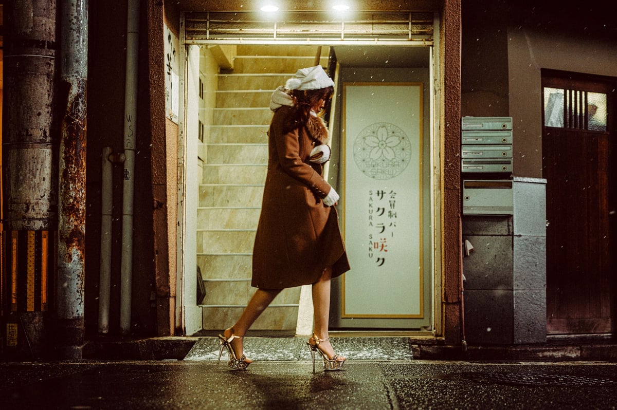
SEPIA STYLE
10 Unique Sepia Looks
10 unique looks that produce a range of images with strong sepia tones. Sepia tones range from a milder ‘Casual’ look, great for lifestyle photography, to a very dramatic effect for night scenes.
The above was shot on the Nikon Z6, and Cine Nights – Sepia IV was applied, with some adjustments to exposure and contrast. A diffusion filter was also used in front of the lens.
The image was shot with the Leica M11, Sepia I with Fine Grain applied, and a radial gradient was used to lift her exposure. Noise reduction and sharpening with Topaz AI, no other color or tonal adjustments made.
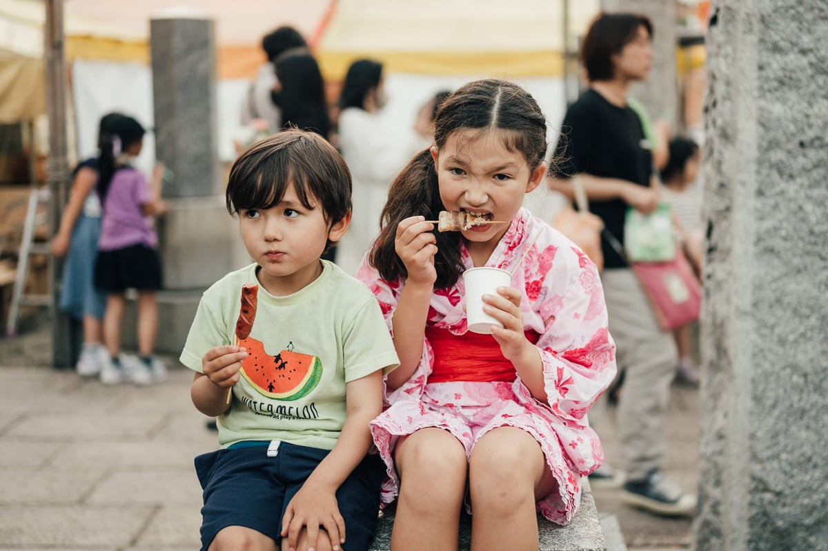
Street Photo taken with the Canon EOS R using Sepia VI with some light editing with tonal adjustments and gradients.

The above looks produce stronger warm tones while still maintaining some blues and greens with a shift towards teal for a nice harmony between highlights and mid-tones.

EXTRAS
Color Grading and Grain Effects
The pack includes some useful Color Elements. These play with the Color Grading effect in Lightroom to add a little extra color toning to your images. They are great for using native camera looks that already look great, or you can use them on top of any of the Core looks to add a little extra color styling.
Often, I mouse over these effects to quickly examine them and see if any could enhance the image further.
Grain comes in various levels, from Fine to Heavy, and within these are variations that can be adjusted from Crisp to Soft.
Crispy will preserve some of the image’s sharpness, while Soft will reduce some for a more analog feel.
Here is medium grain – Crisp. How you plan to display the images will affect which grain settings work best. Small prints or Instagram look nice with a heavier grain, while bigger prints or web display often look nicer with a finer grain.

ADDITIONAL INFO
How To Install
Unzip file. Right-click in the preset panel in Lightroom. Click Import.
If you use an older version of Lightroom that uses lrtemplate files, you can find them in the folder “ForOldLightroom.”
These older template files do work well, but you will lose some of the color-grade effects.
I try to keep these backward-compatible, but some looks take advantage of the new color-grade tool. Some looks in the latest V3.00 update may not look exactly as intended in older Lightroom versions because I use new Color Grading tools. The new versions of Lightroom use Midtone colors with the Color Grading tool, whereas older versions use the Split Tone Tool. However, I rarely use the Midtones in the color grading tool, and everything else loads fine, and most looks still look great.
Using Lightroom CC
These Presets work in Lightroom Classic and Lightroom CC. I frequently switch between editing on my tablet with Lightroom CC and Lightroom Classic. The only difference is that Lightroom CC does not let you adjust the Camera Calibration settings, but the adjustments do still load when in Lightroom CC.
How To Update
Download the new presets. Right-click in your preset window and import new ones. You can click the new zip file directly when importing. These will load without overwriting your older presets, so you can keep what you like from them while transitioning to these new looks.
TIPS
These Presets are not designed to work perfectly in every situation. I design different looks to work in different lighting conditions, so some work better for portraits, like Core I—Core IV, and others work better at night, like Core V—Core VII. However, you can use whatever is working.
For example, I labeled the Sepia look ‘Casual’ and ‘Night.’ The Night presets work better at night but are usually too intense under daylight.
Also, because the looks bake in color shifts into the curves, you can sometimes get different effects by under-exposing by a full stop or over-exposing by a full stop. In wooded and forest areas, under-exposure can really give you deep, rich greens. Sometimes, overexposing and reducing contrast in bright beach environments can give you really nice pastel Kodak Portra looks.
Use exposure and white balance to tune your image for the look. Also, when I edit, I use the presets 95% of the time, then I may adjust some Hue or Saturation individually to really dial in skin tones or coloring. Most of the time, when editing for my lens reviews, I’m not doing a lot of editing, just using the presets with basic White Balance and Tone Adjustments.
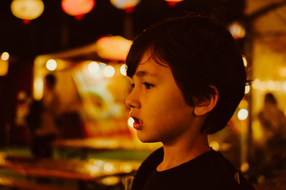
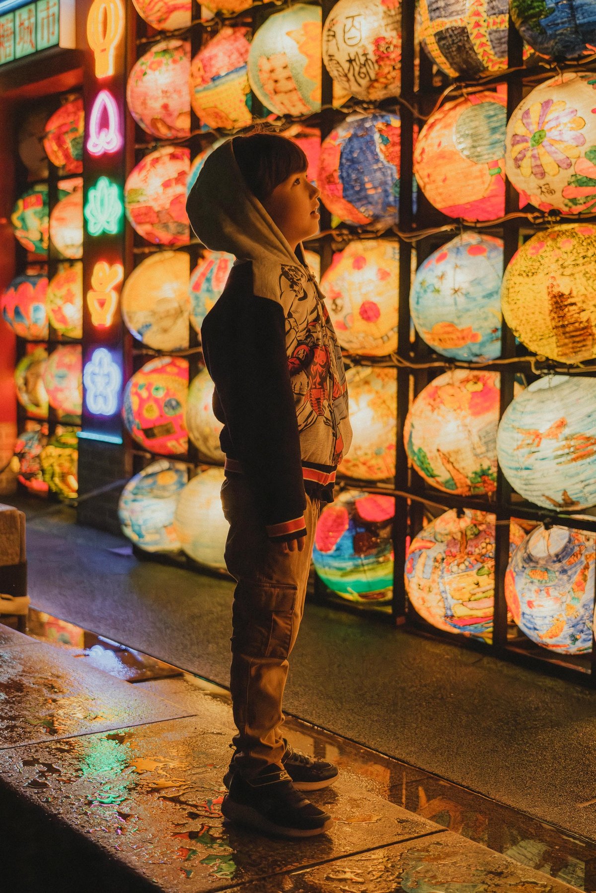
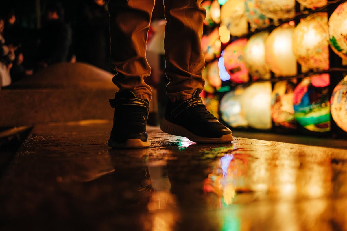
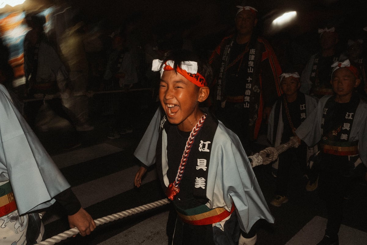
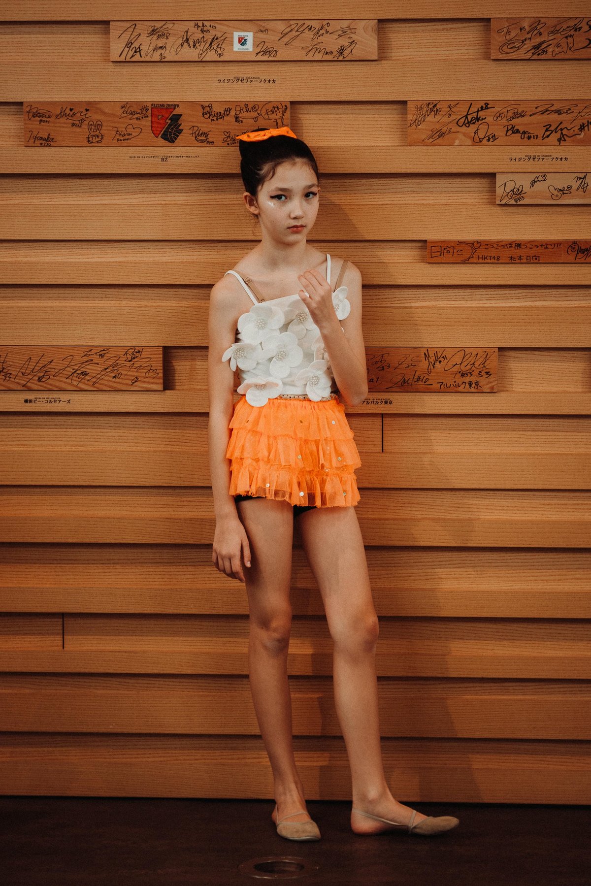
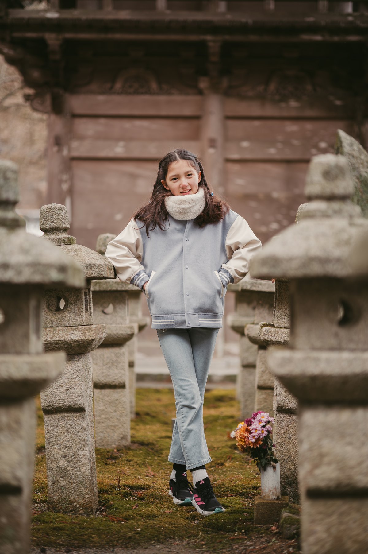
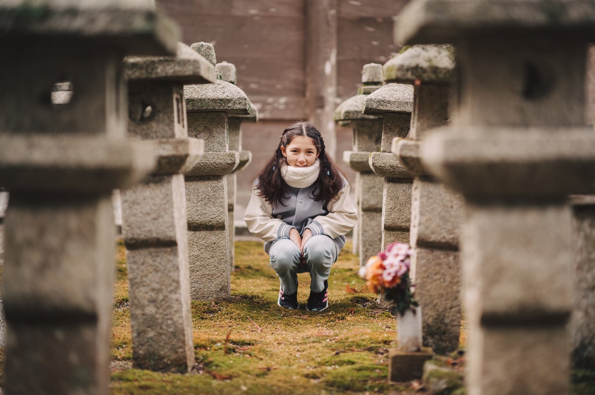
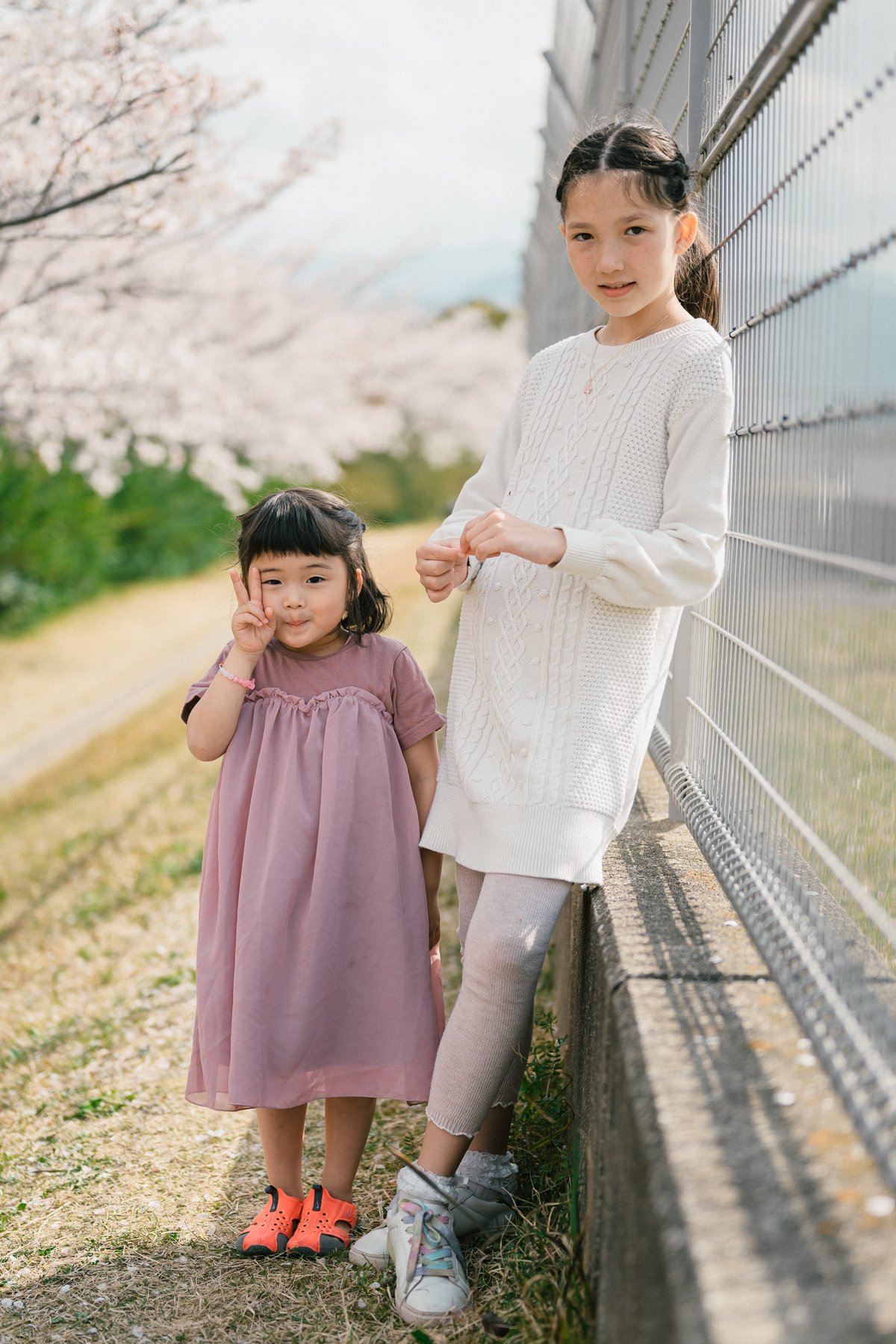
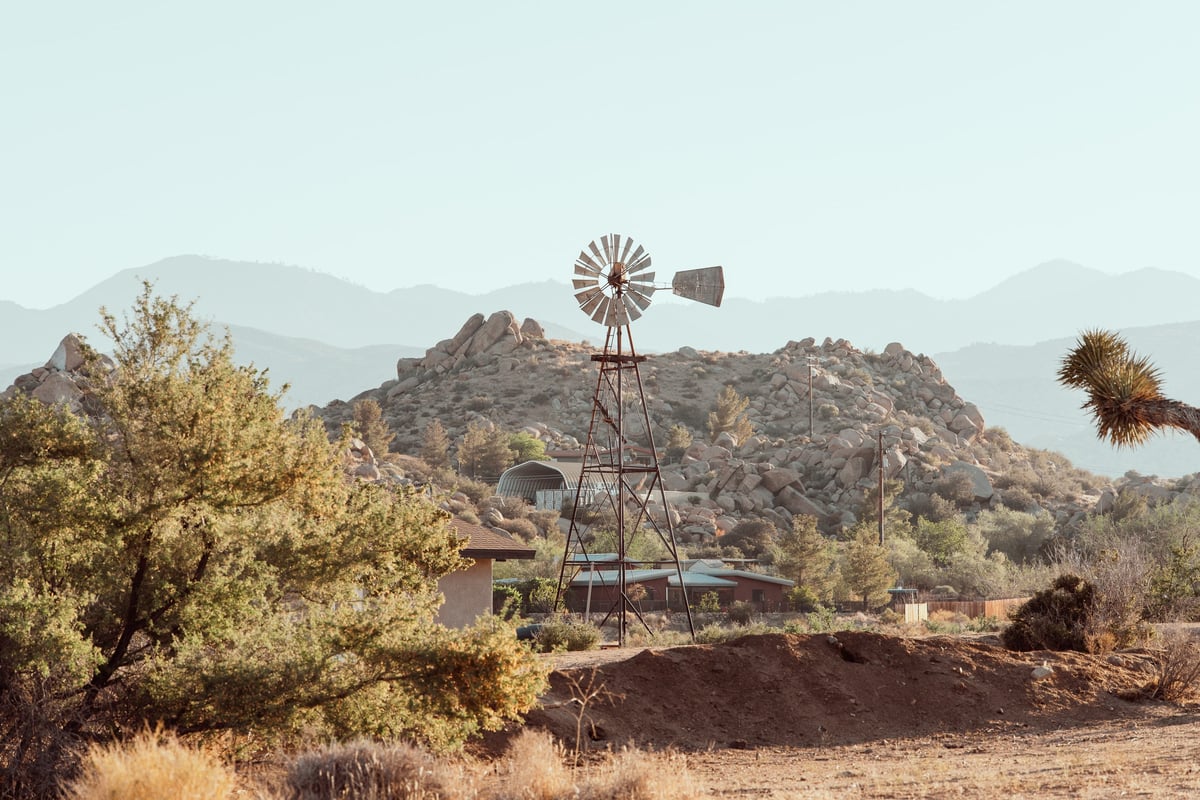
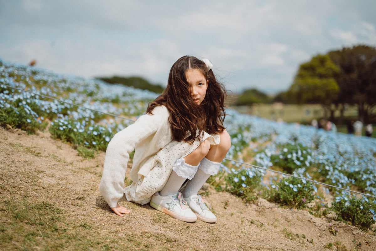
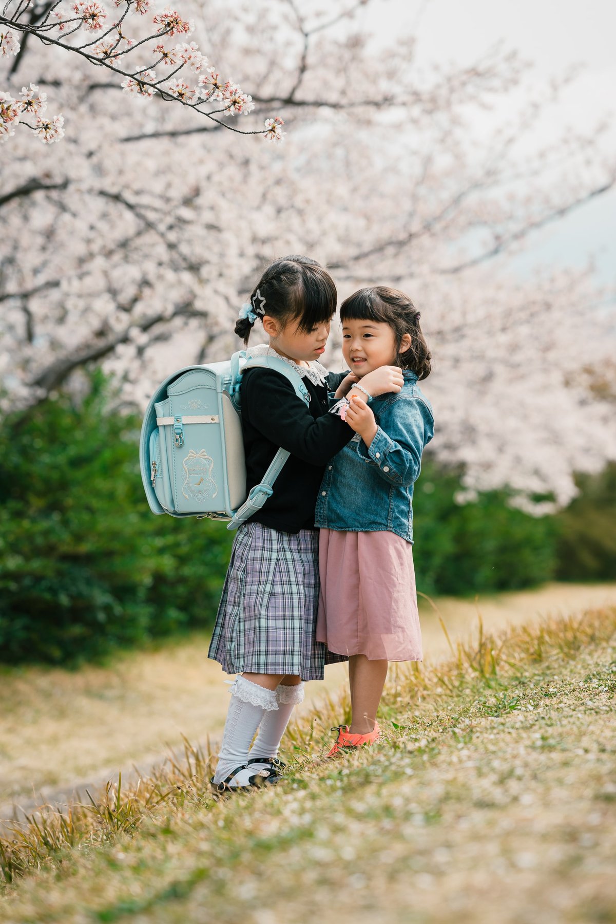
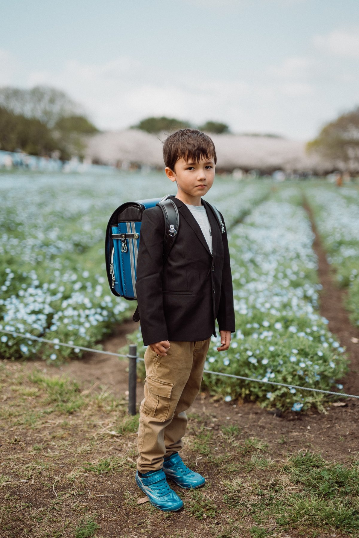
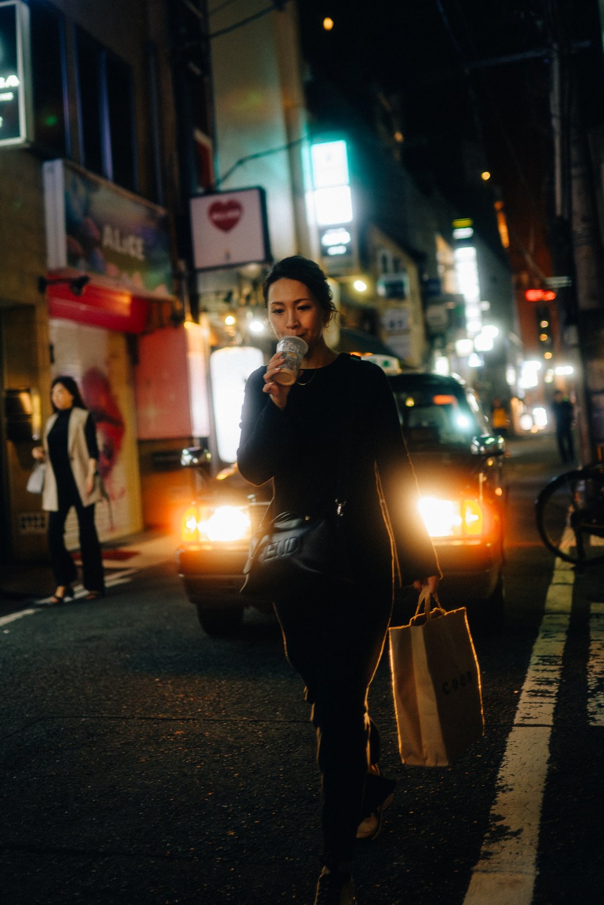
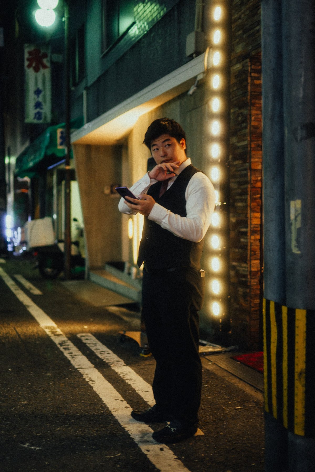
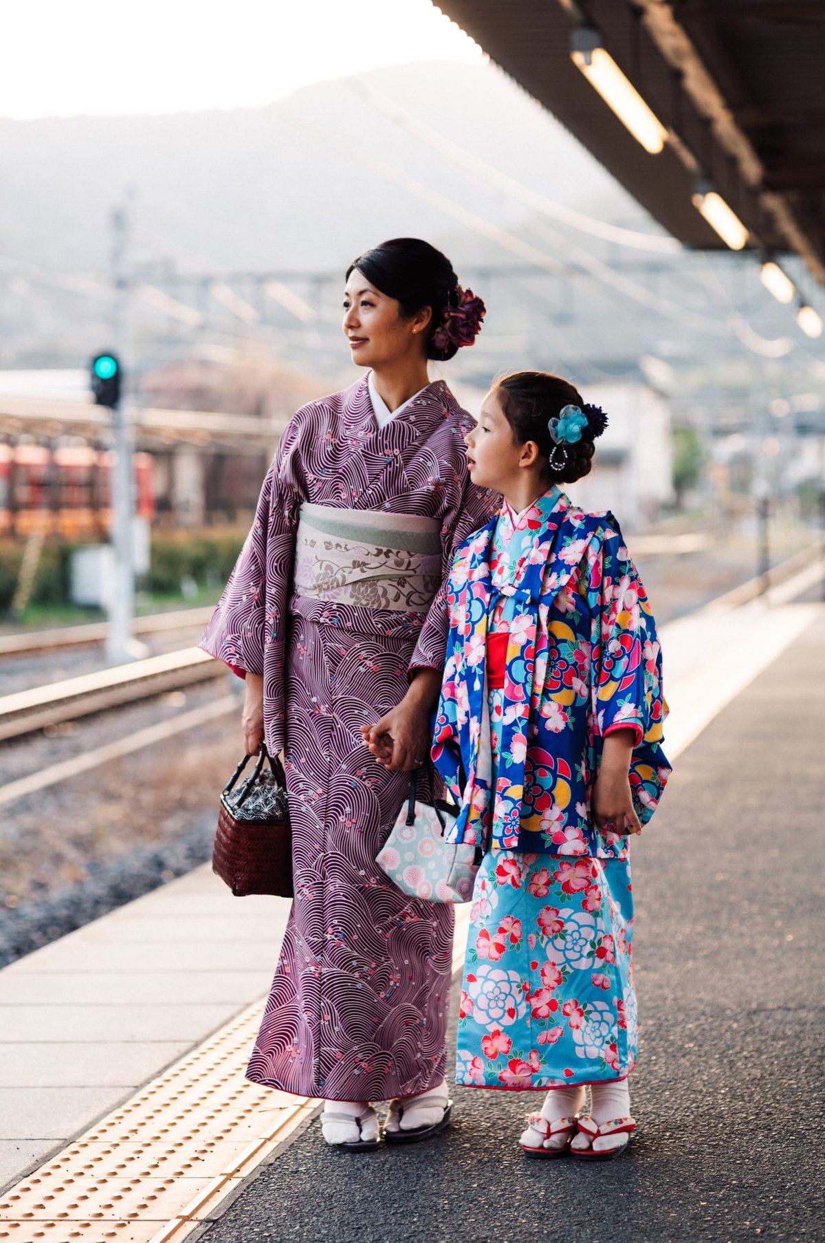
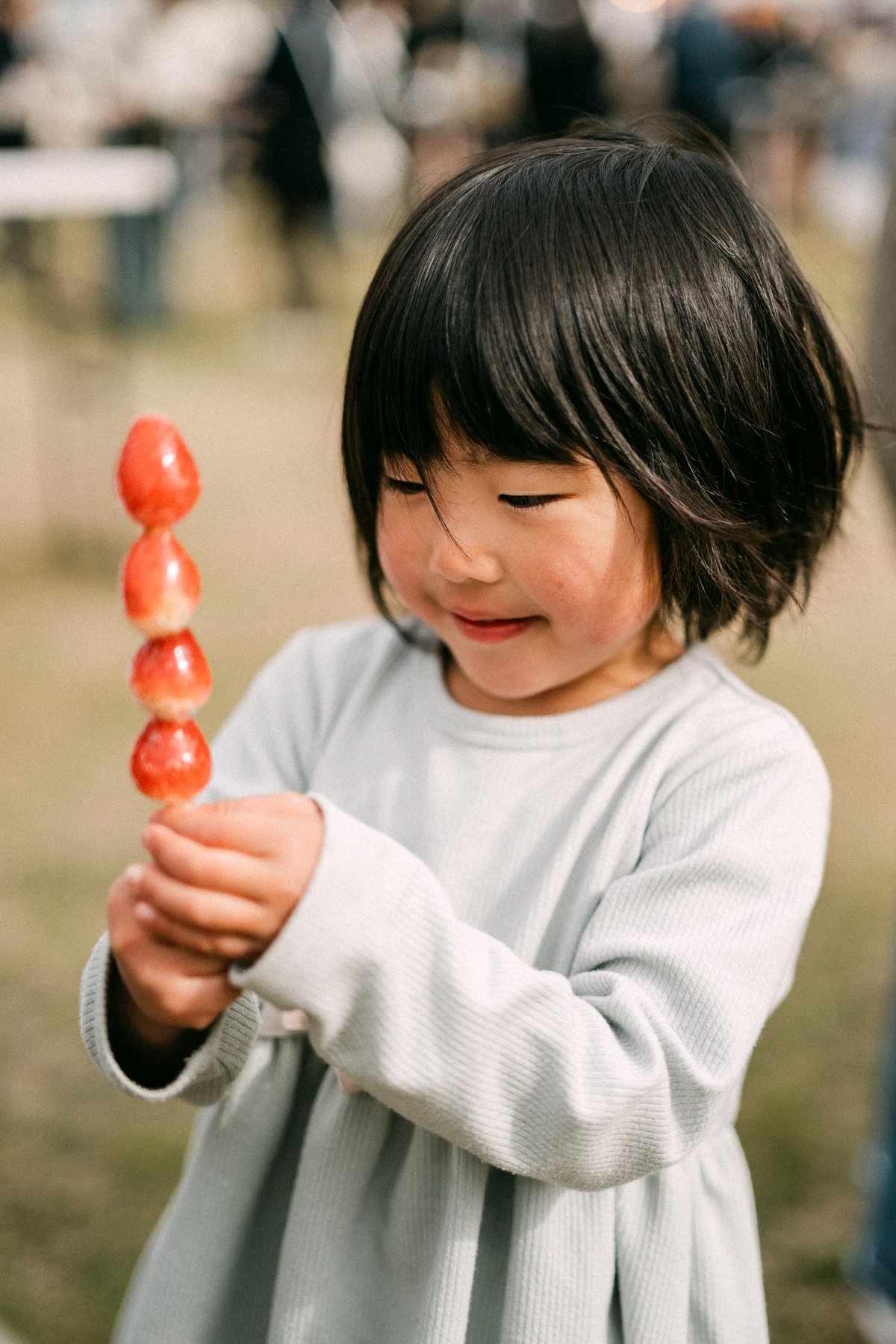
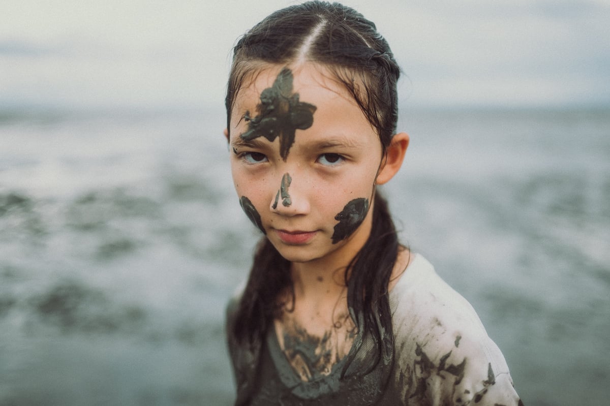
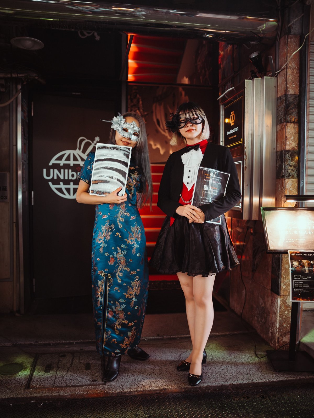
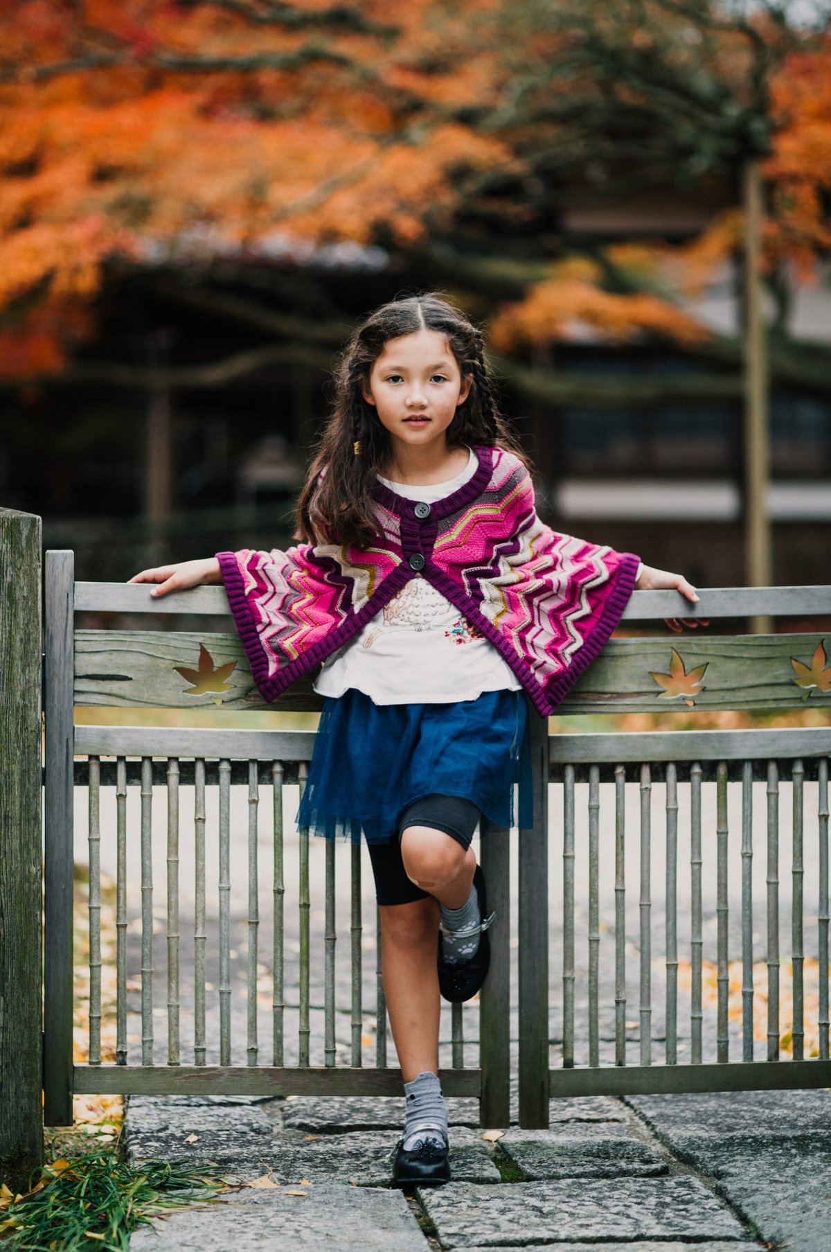
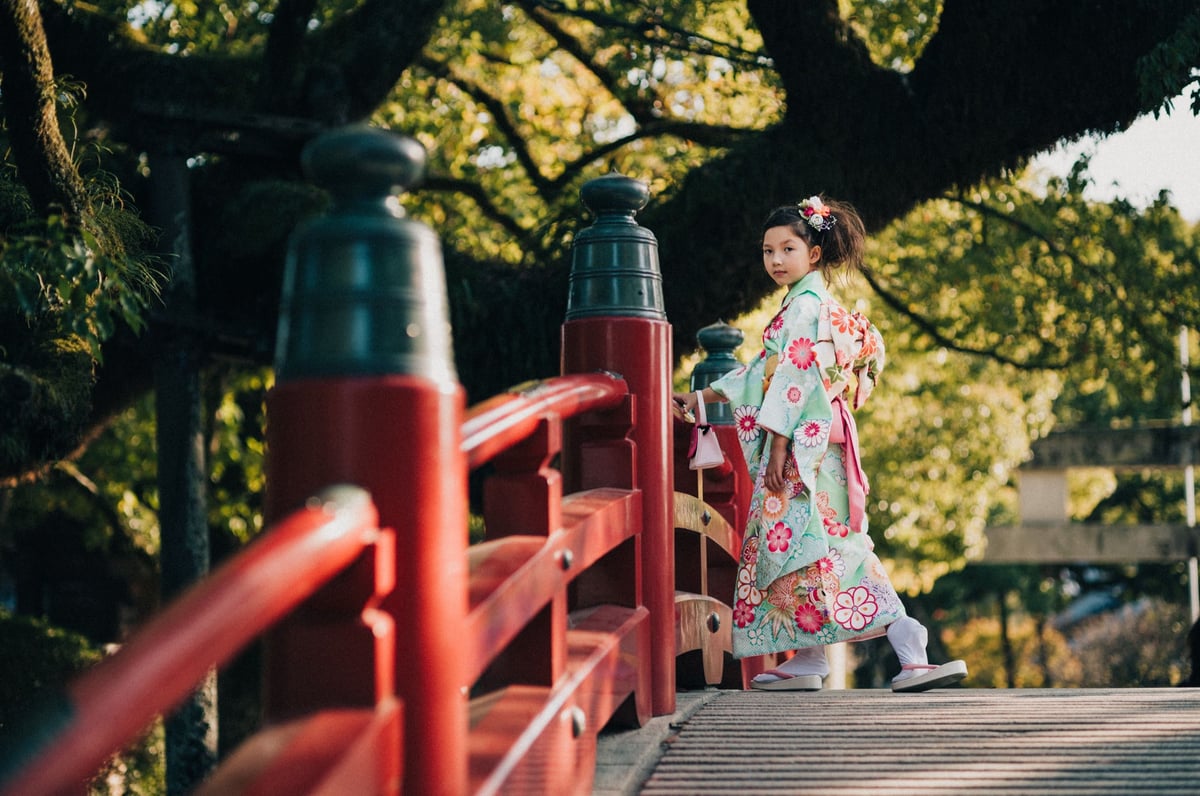
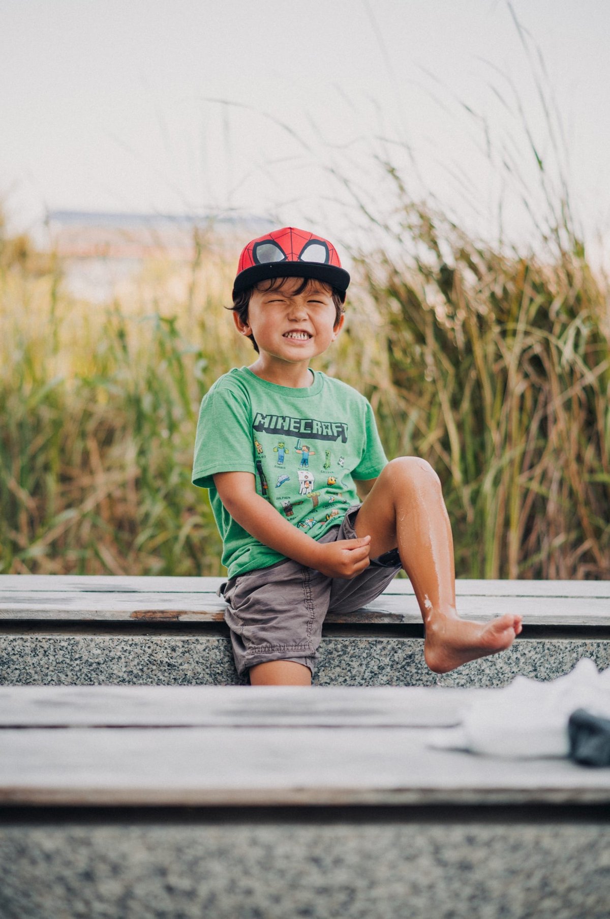
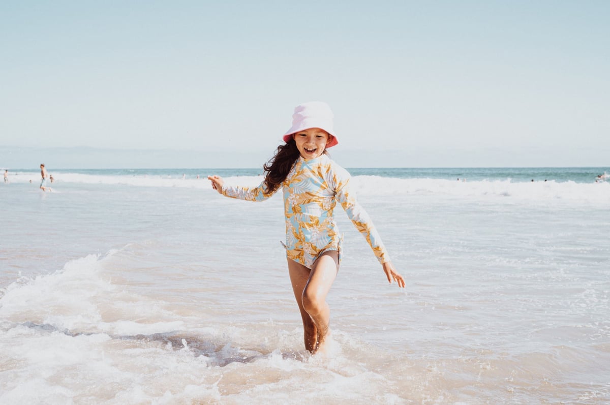
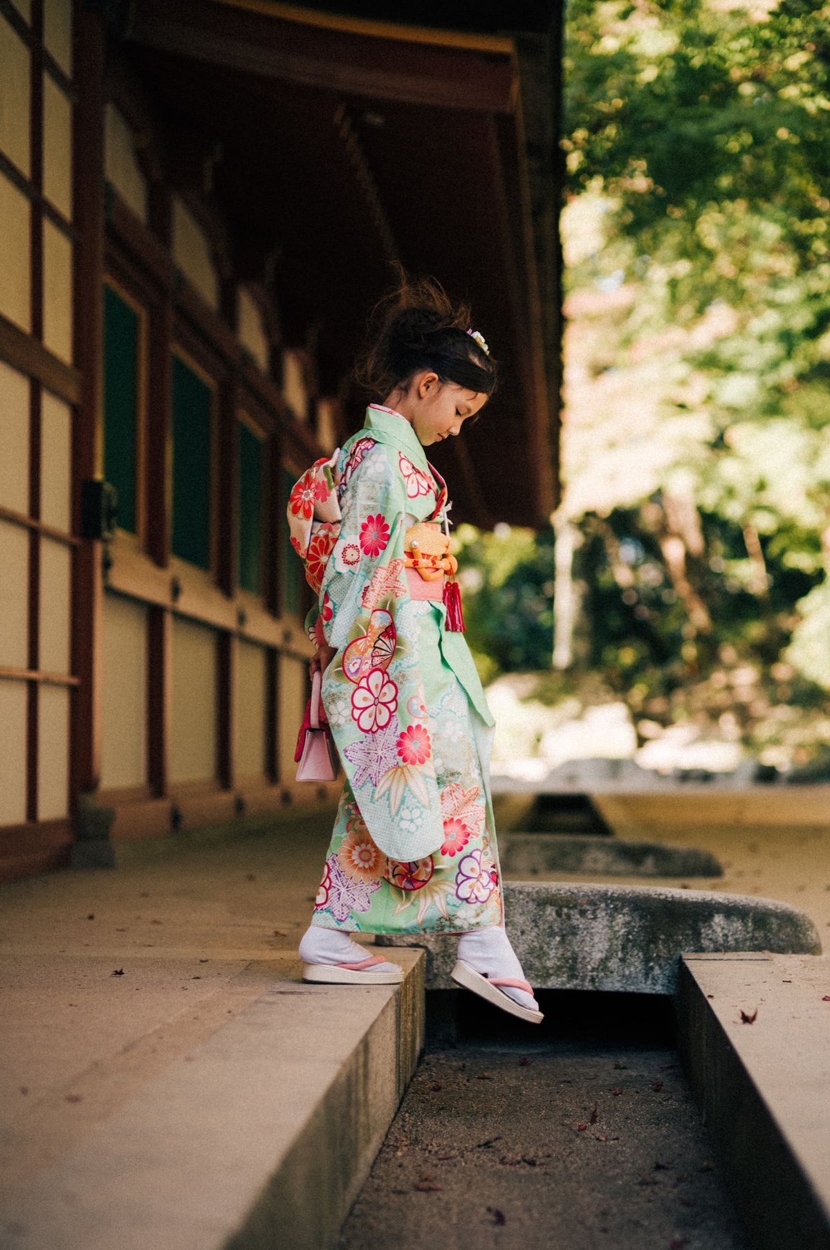
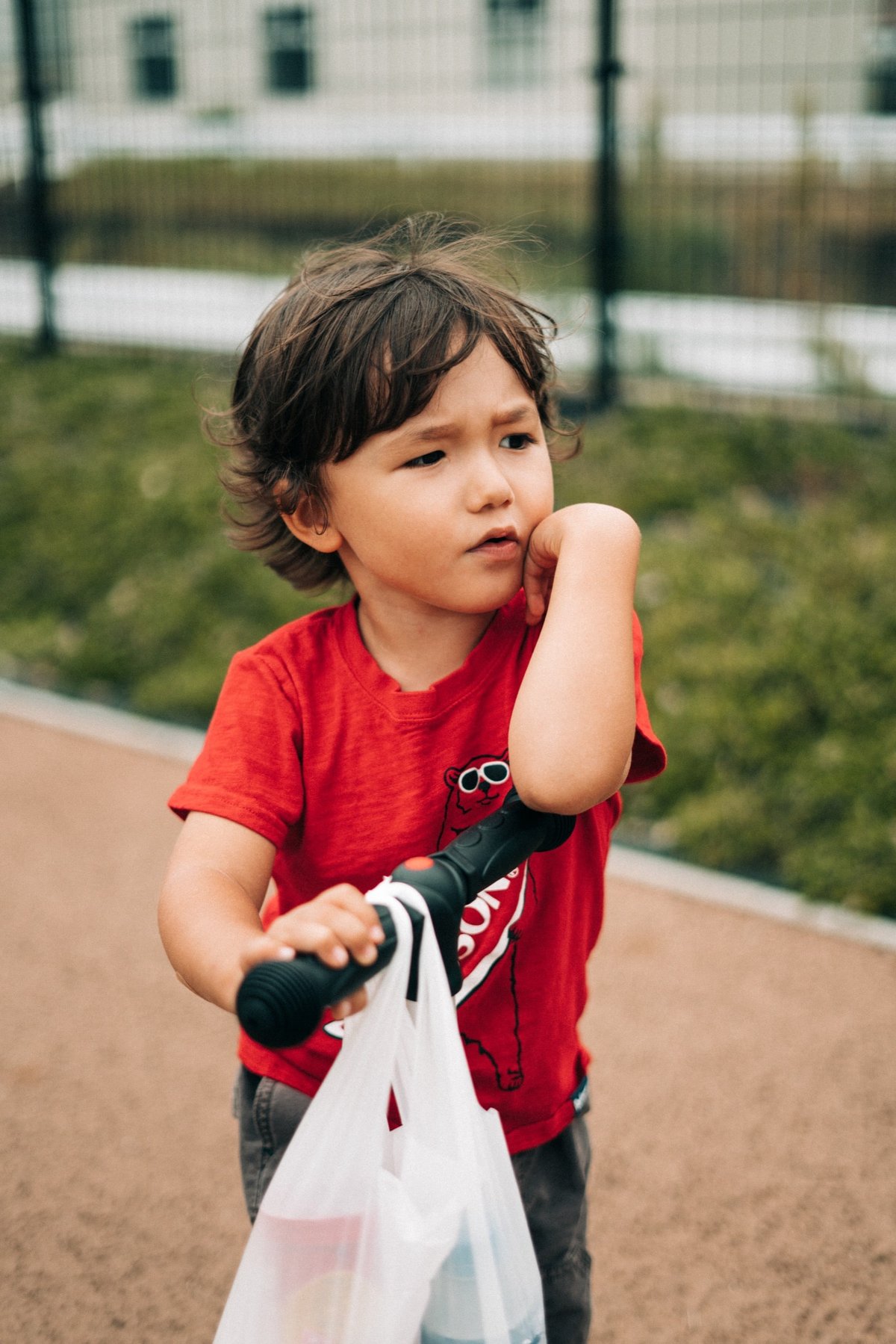
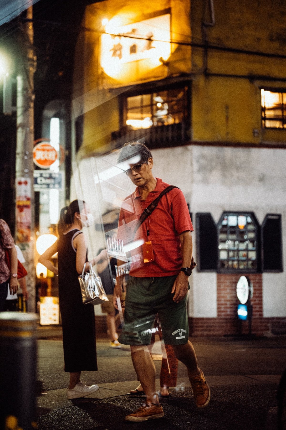
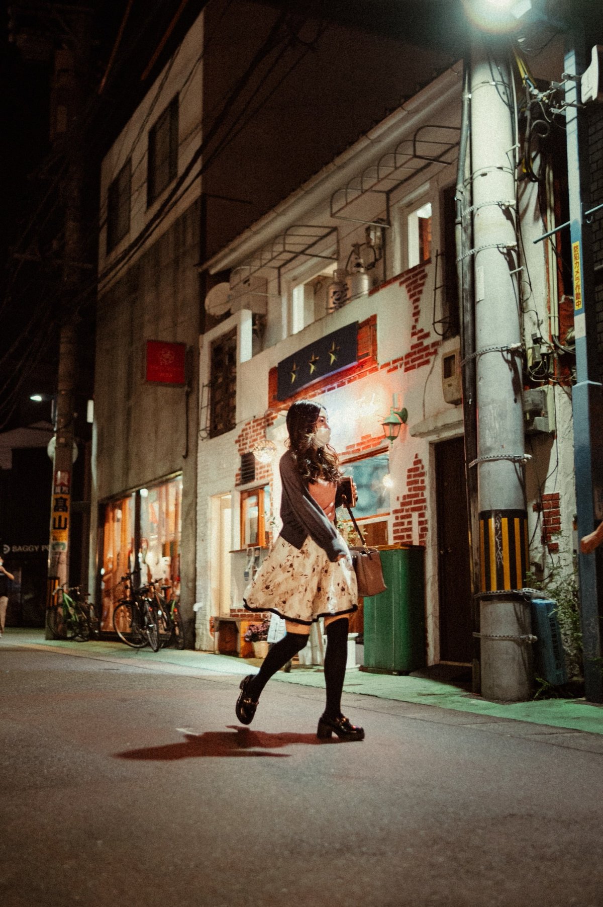
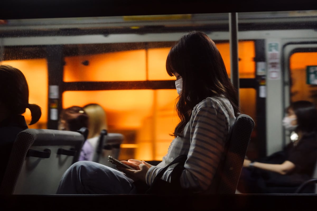
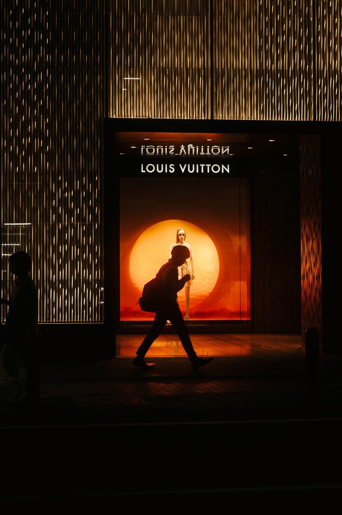
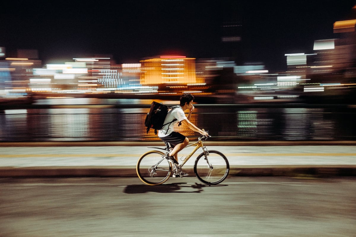
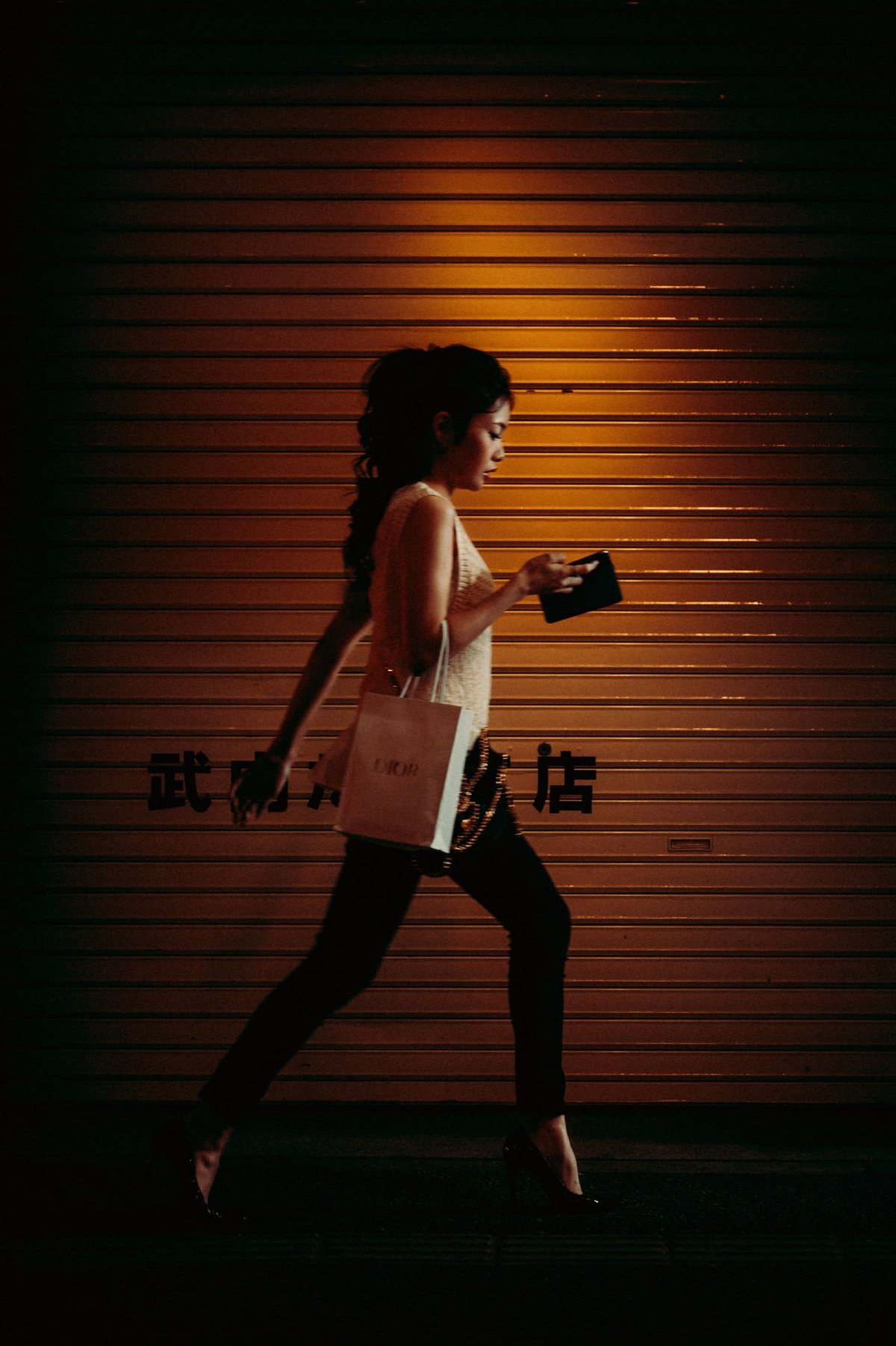
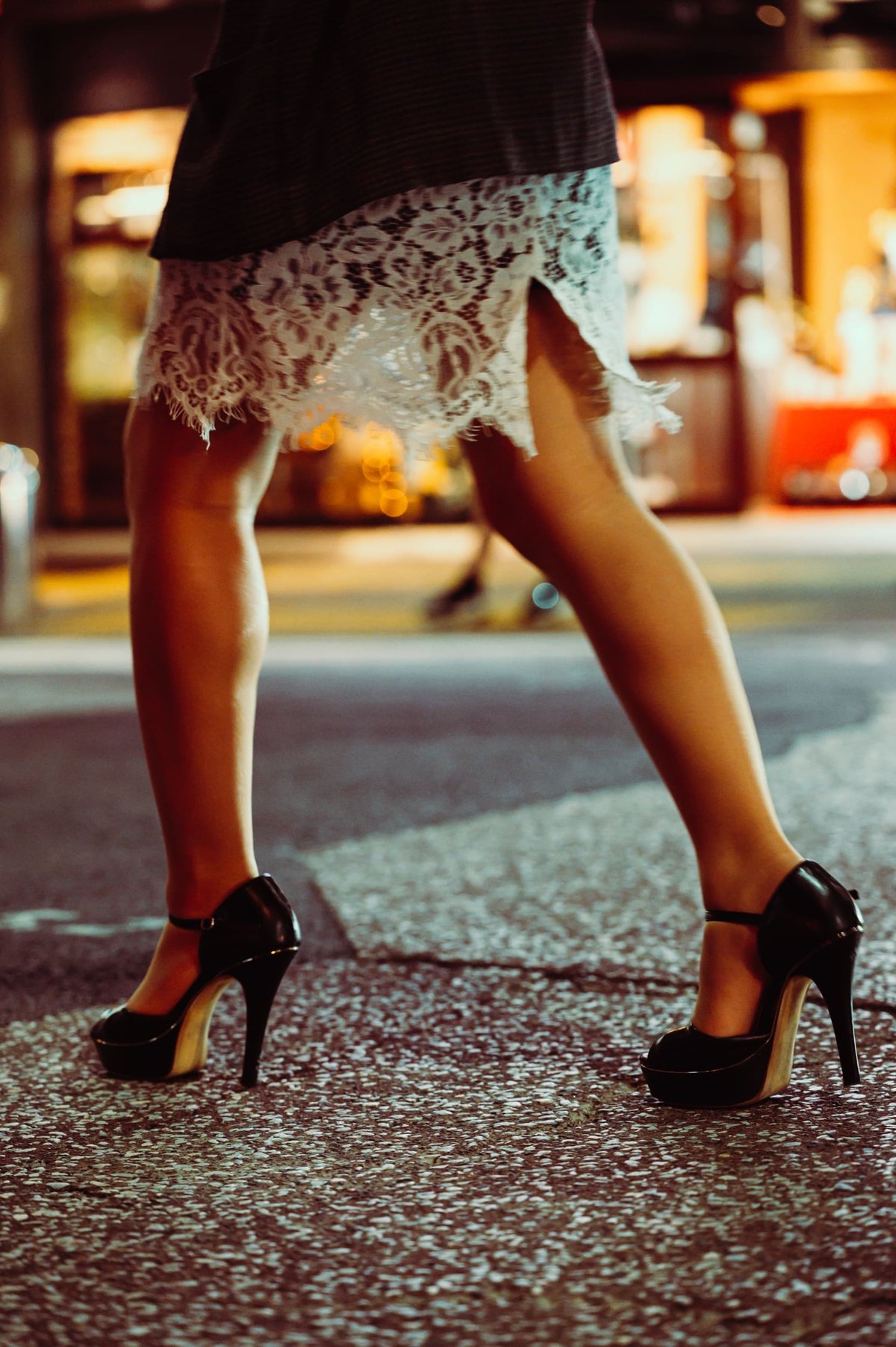
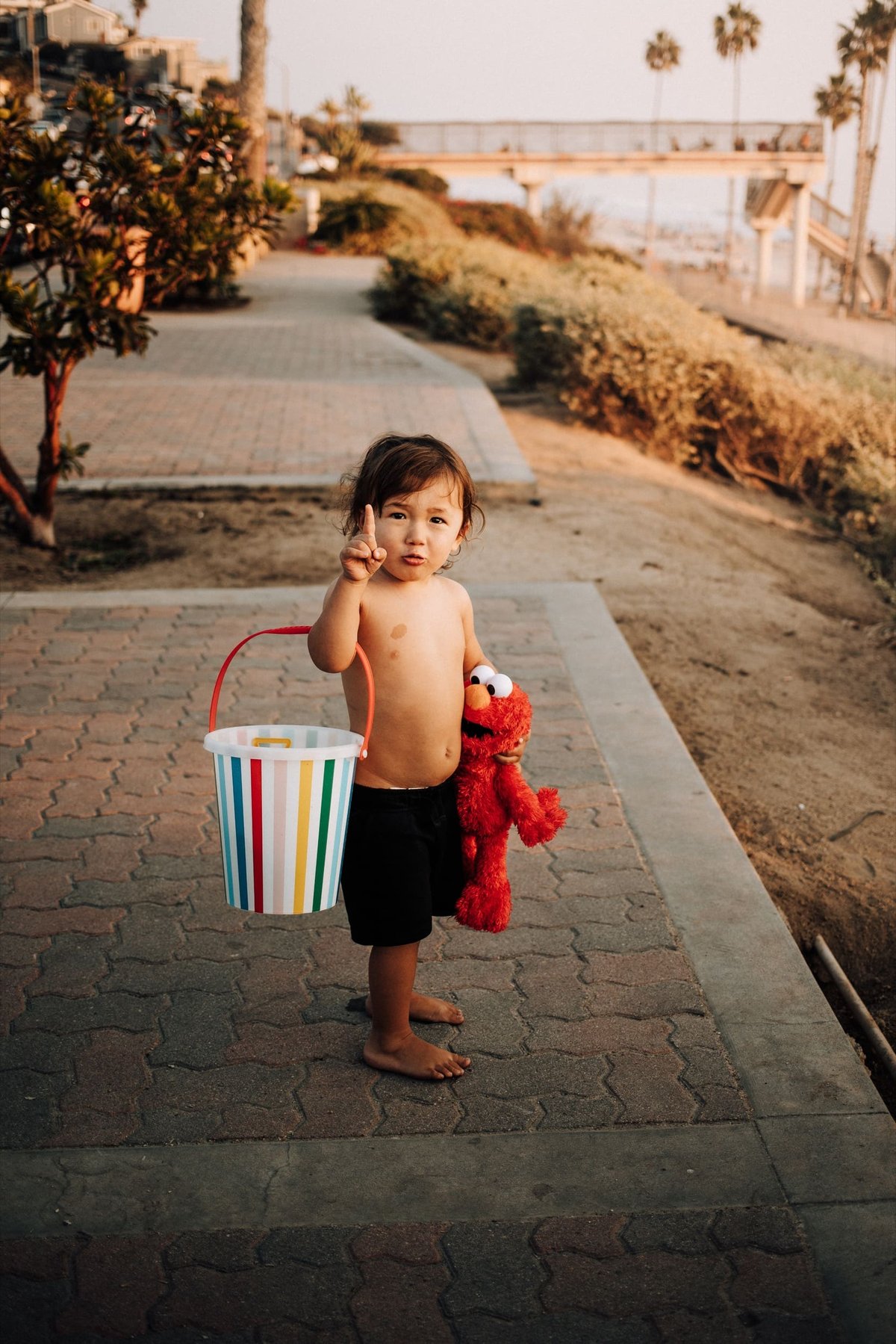
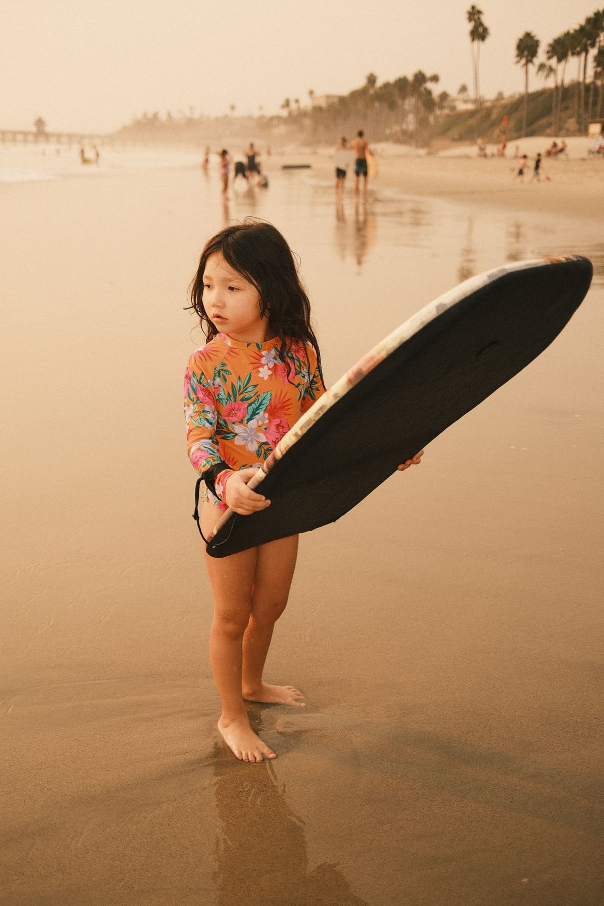
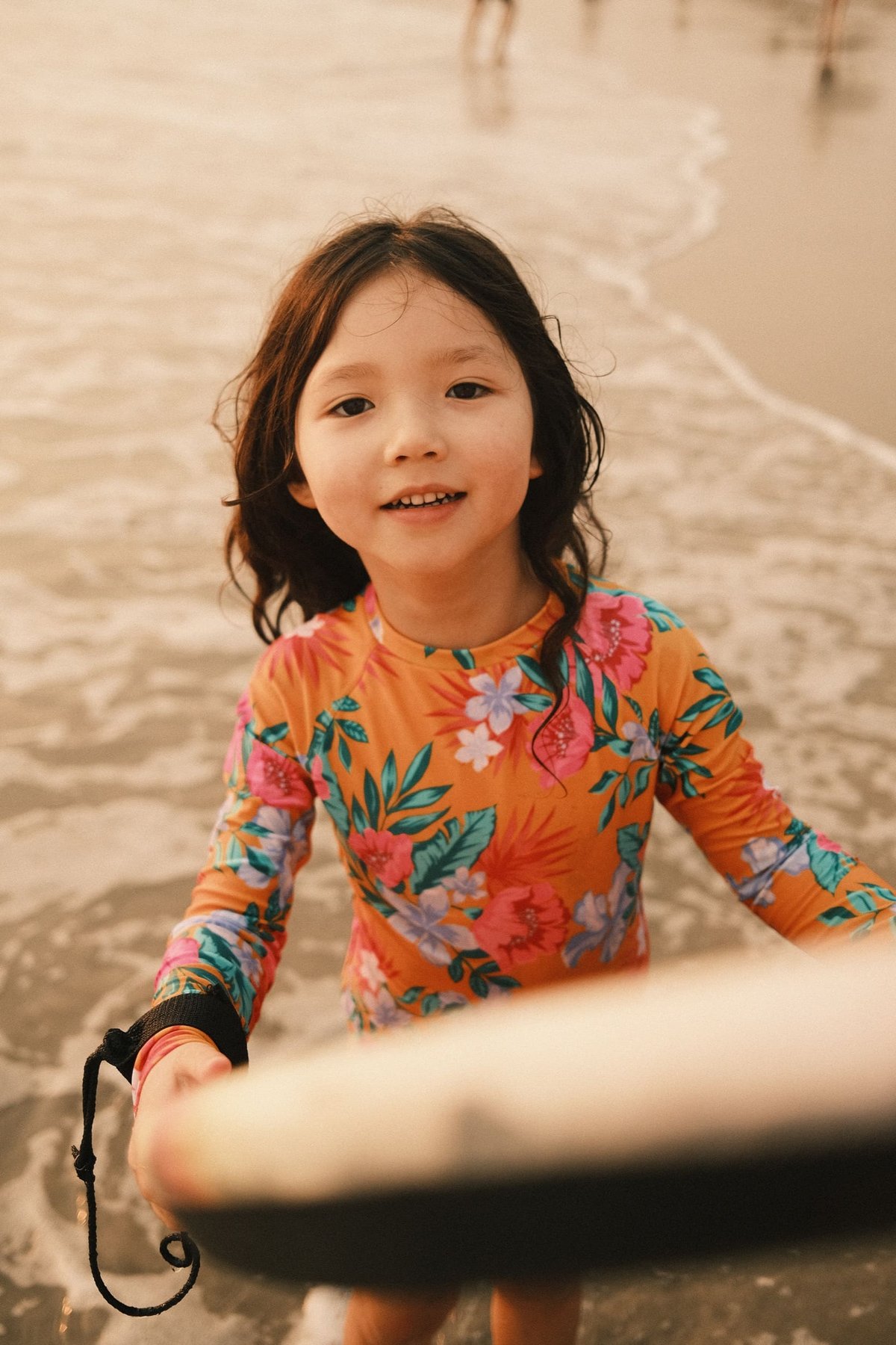
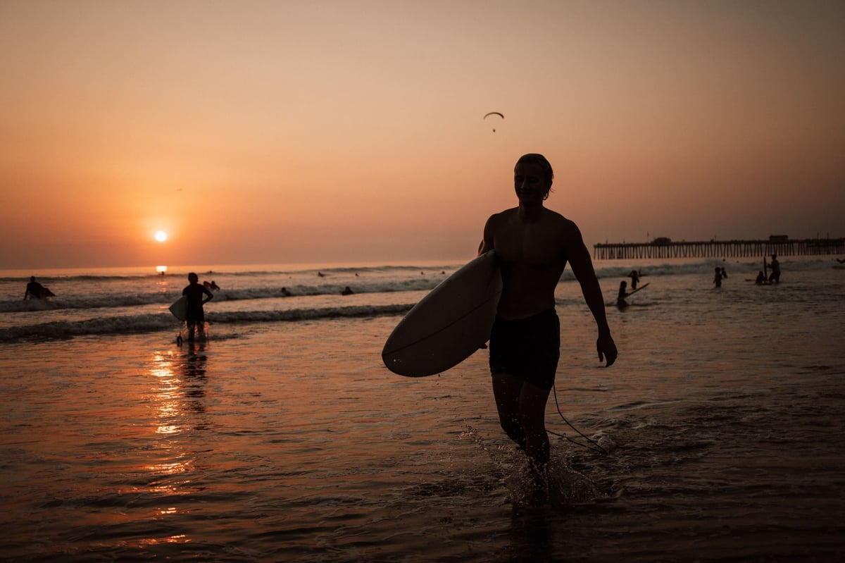
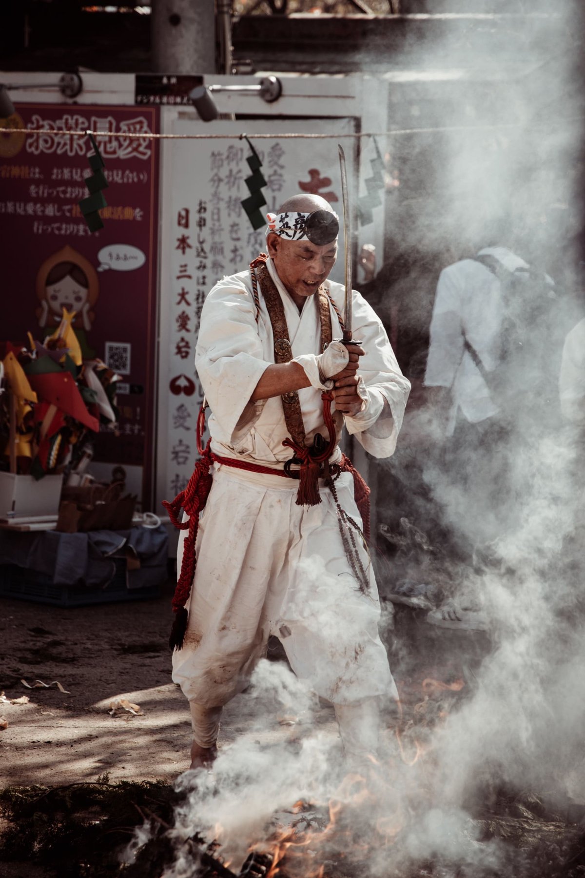
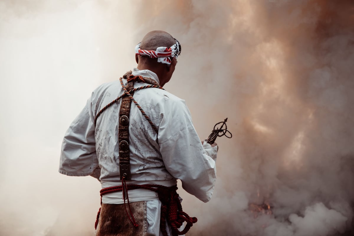
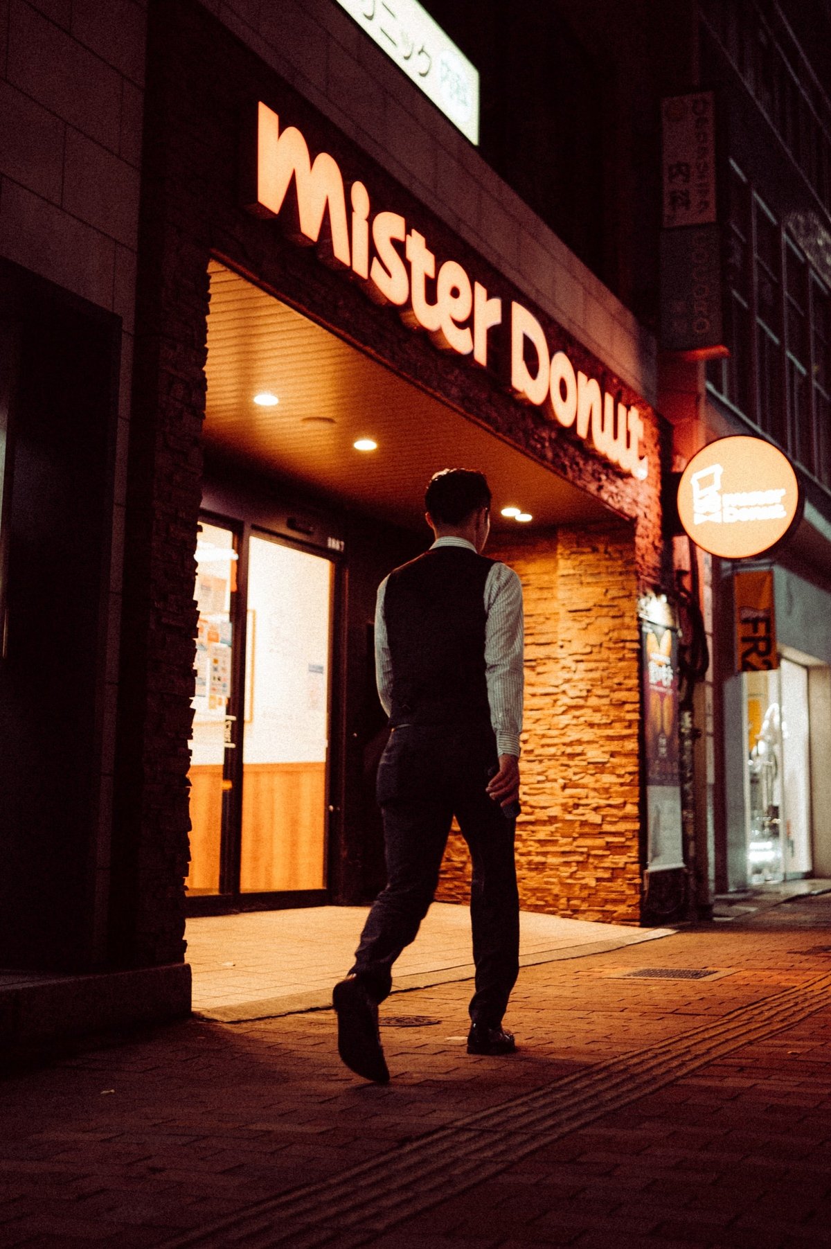
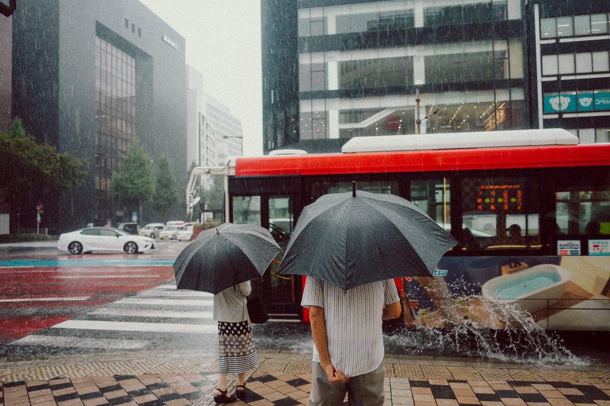
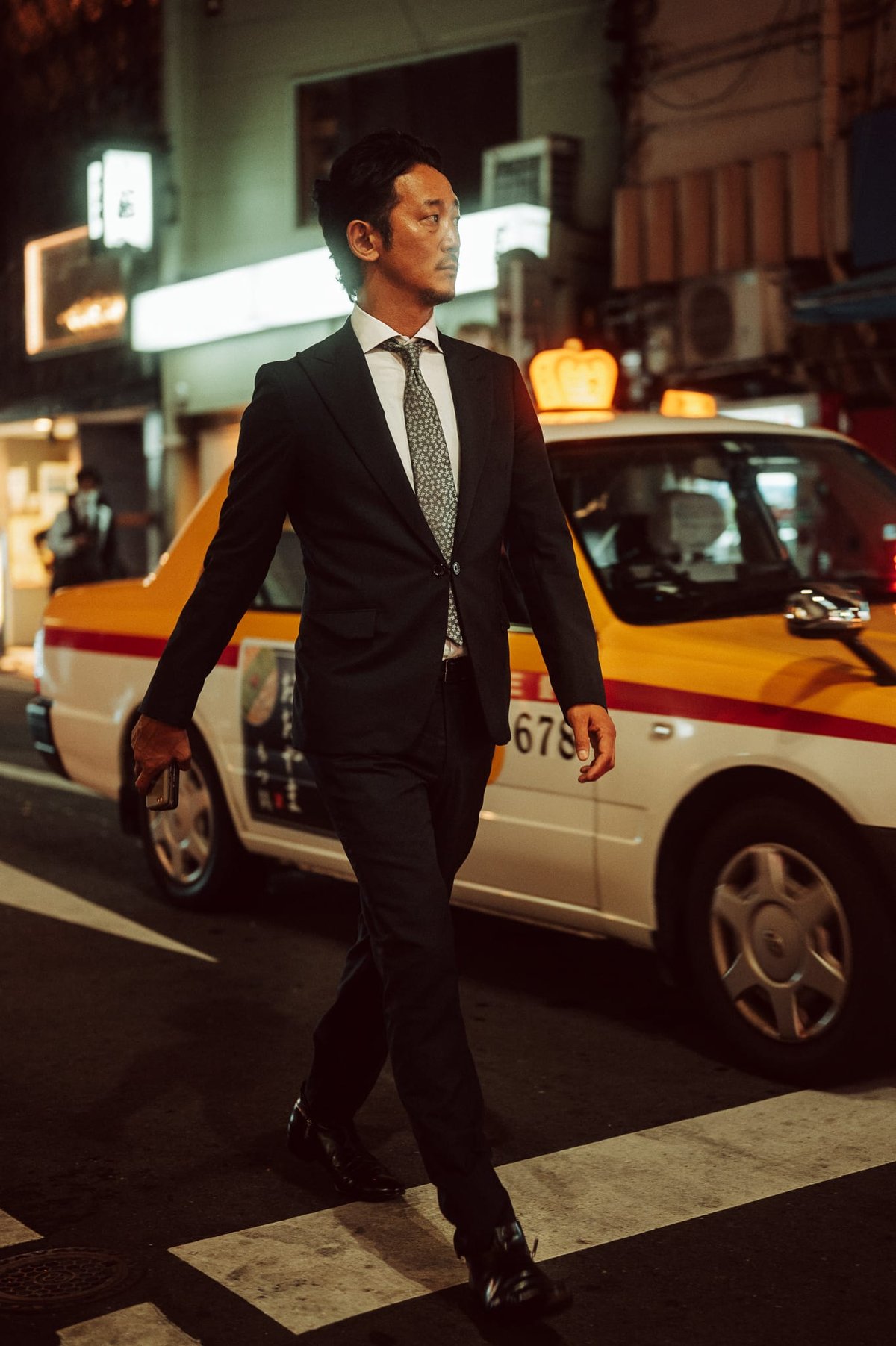
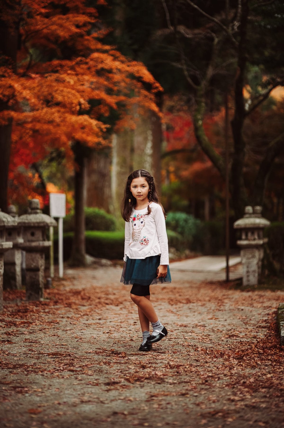
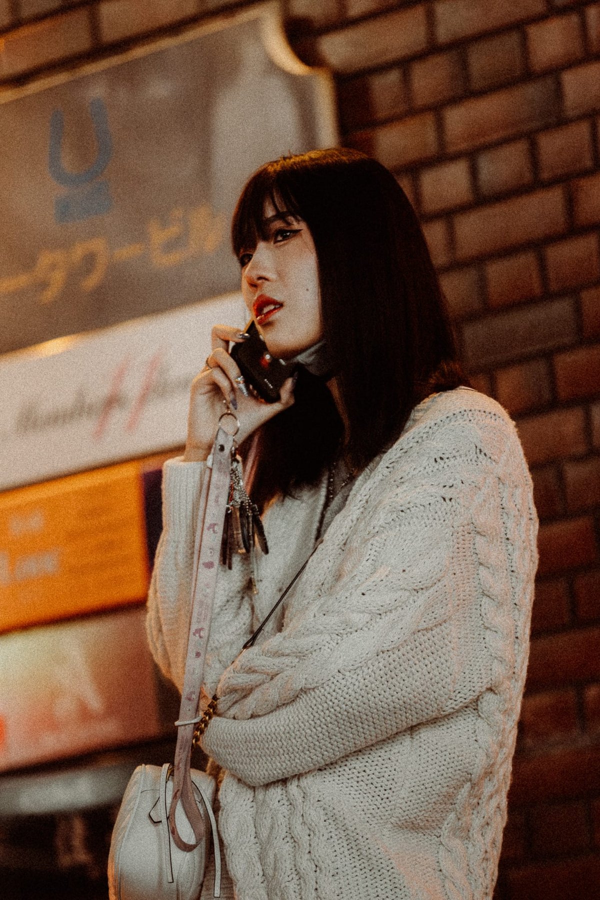
Core Color – Sample Gallery
I often get asked if these presets will work for Nikon, Sony, Canon, and Leica. If you’re in Lightroom and you load Adobe Standard as a profile (or the new Adobe Color, which is punchier), Adobe has built these profiles to provide a similar baseline. Not all camera colors will match exactly with Adobe Standard, but you won’t see as wild a difference between loading a Nikon Portrait profile and a Sony Portrait profile as you would with the camera’s built-in profiles.
Since these profiles aren’t built to match film 1:1, just the feeling of film, they’ll work with any camera, and I’ll often stack them with various Camera profiles like the Nikon Portrait if I want some punchier Reds or the Fujifilm Classic Chrome if I want that shifted vibrance. I find I can play around with them to shift things how I like. There is no wrong color grade or wrong color.
As of 2026, I generally shoot with white balance set to daylight, almost always, or to cloudy when needed, and apply presets and adjust white balance from there. This is more how film works with a fixed white balance, and I like having that restriction.
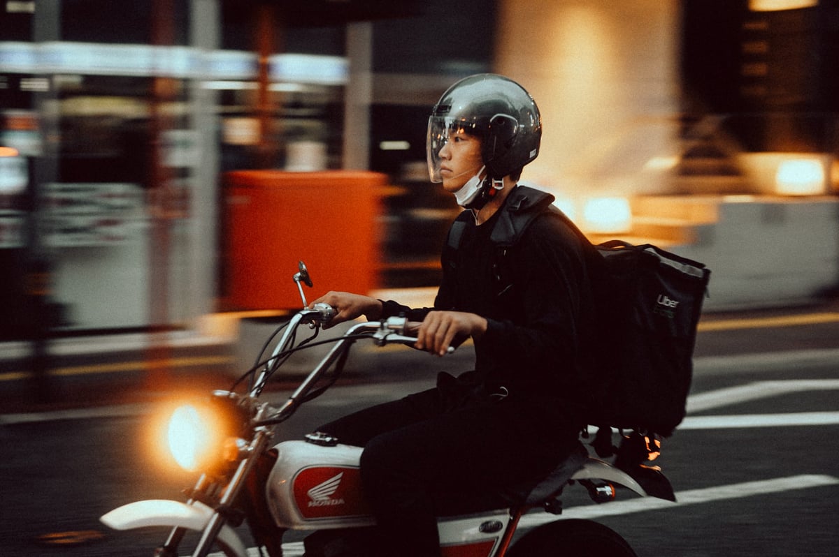
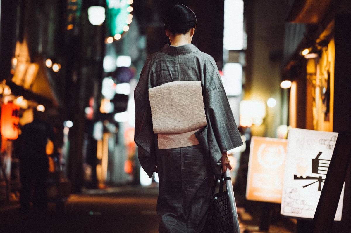
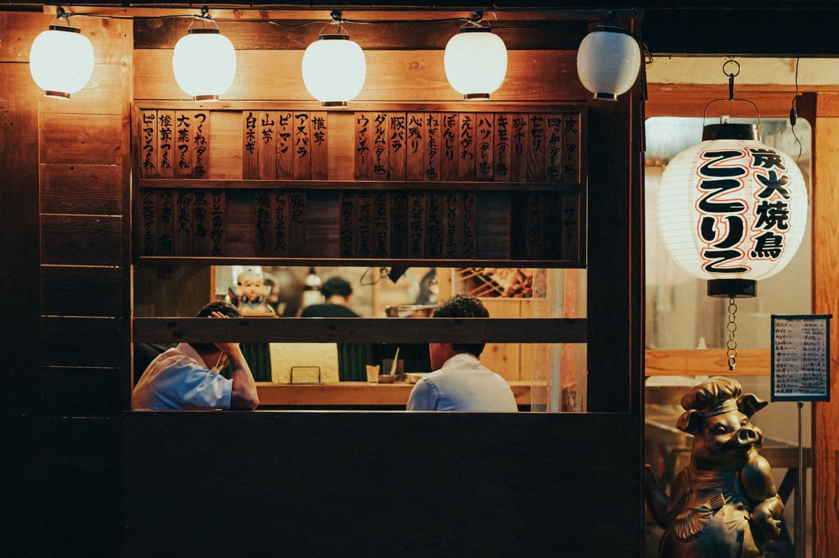
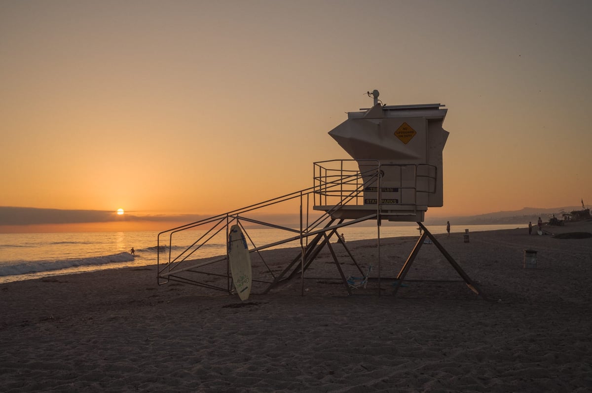
Here is a sample gallery of the presets used on various cameras over the years. From the Canon R, Sony A7rIII, Leica M11, Nikon Z6, Fujifilm X100V, etc.