
Lightroom has just released a nice update that brings in a few new features and performance improvements.
Typically when Lightroom does their updates they are usually small little baby steps to a better product, which is great as it allows us to adjust and get used to the new features gradually, compared to if they were to overhaul everything completely in one go. But occasionally, Adobe will implement a small change that completely changes the way the software can be used, and sometimes it’s game-changing.
In this round of updates, they did two things that are already having a big impact on the way I work which I will explain in this article.
What’s New With Lightroom 10.0.
- The software is way snappier. Performance has improved and everything loads up and responds noticeably quicker. It’s the first time I’ve seen Lightroom really push this level of performance in an update that’s actually this noticeable.
- They’ve added new color controls which don’t seem significant, but they really are. And this is what I want to touch on.
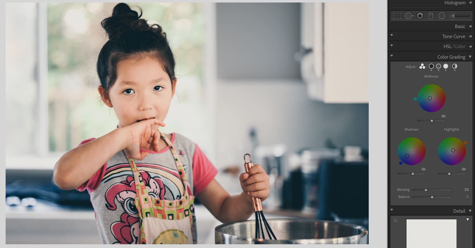
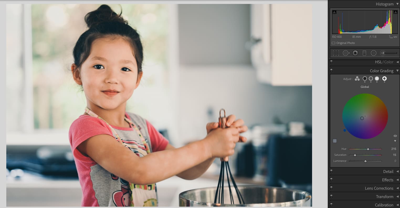
The big thing here is the new tool Color Grading. If you’re looking for where your split tones went, they are gone, this replaces them.
A lot of what you get with the Split Tones is actually here, in fact, if you have made presets that use split tones, they will be applied to this new tool.
You can still do everything with these new color wheels that you could do with split tones but they’ve added a new Midtone color wheel, a global hue adjustment, and the ability to adjust the blend, balance, and luminance of each wheel.
The reason I call this game-changing is that often you’ll get small shifts with some color balance and if they happen in the mid-tones, the only way to fix them was to fiddle with the curves, which makes it really hard to finesse the perfect colors since you have to adjust multiple curves to get those in-between colors, like orange, violet, or peach. Having the mid-tone color adjustment makes it so much easier and quicker to fix the colors that are off.
Even better, the global Hue adjustment is great for quick and dirty color fixes.
My Problem With Color Wheels In The Past & How Adobe Fixed It
Using color wheels in different programs has always been a hit-and-miss user experience. Sometimes they’re too sensitive, sometimes they’re not sensitive enough, and sometimes they’re sticky and have velocity controls. I’ve typically always hated them. If I want to drag the point in a color wheel, I don’t want it to fight me.
Lightroom fixed this and these color wheels are a breeze to use.
How it works is it’s a free control that works the same way your mouse works, you can adjust it however you want on the first pass, and it doesn’t fight you, it doesn’t mess with your mouse velocity, it’s just drag and drop. Once it clicks in place, it stays on that color value and you can slide it around to adjust the saturation of that color. Then if you want to adjust the HUE, a new controller appears at the outside of the color wheel that you slide around. It’s so easy and so quick, finally, I love using the color wheels.
Using Luminosity For A Filmmick Fade
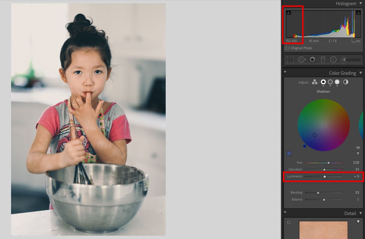
We also now get blend controls and luminance controls. Basically, if you like that faded look, or want to reduce your dynamic range for that film look, you can now do that here with a very simple slider.
Move the luminance slider up, and you lift those blacks. This is much easier and quicker than doing it with curves, although, you still have a bit more control when using the curves.
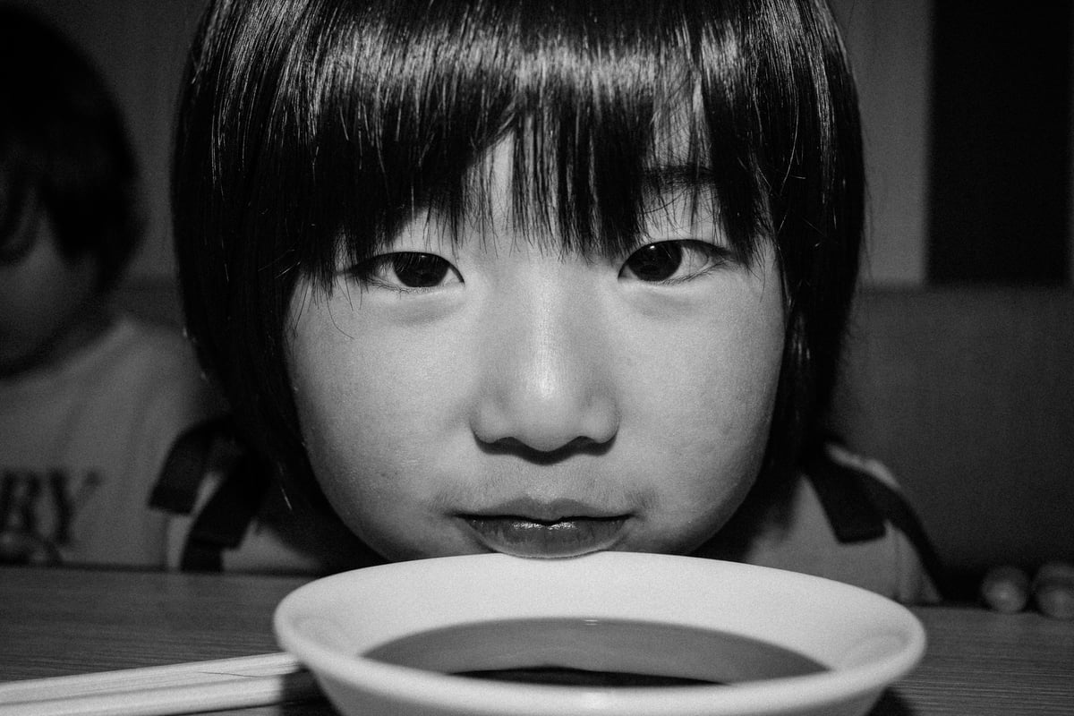
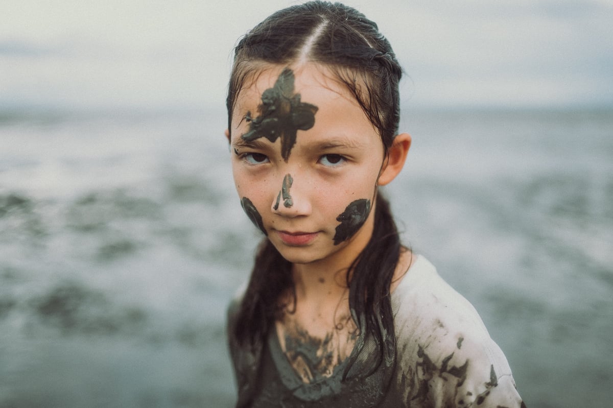
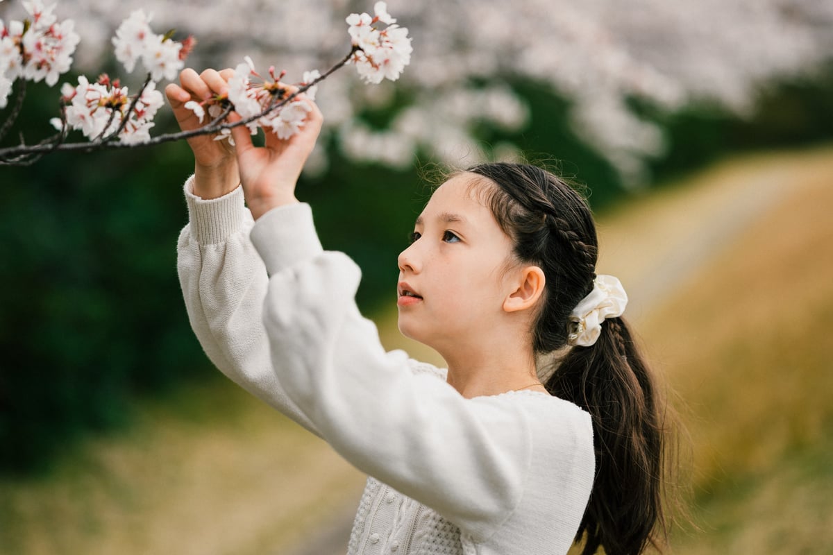
Samples Of Some New Color Grades With Lightroom 10.0
These are all shot with the Nikon Z6 using the 35mm or 85mm f1.8 with natural lighting. My first attempt at using the color wheels.
Here I was trying to make the shadows a bit blue, keeping the mid-tones peachy, and I threw a little bit more warmth into the highlights, kinda a peachy blue which I think is fun for the context of this scene. I also brought down the highlights with the luminance, because the window outside had a lot of peak whites in it that were distracting.


Leave a Reply