With every new generation of cameras, Fujifilm introduces a few new features. This guide goes over what each of these features does and should help you decide if the new JPG effects are worth the upgrade, or if you should use them yourself.
The New Fujifilm JPG Effects
Aside from the new color simulators, Eterna and Pro Neg, there are a few new color effects that were brought over from the X-Pro 3 or X-T4 to the new generation cameras. The effects can be mild, but add them all together and they can have a big impact on the overall look.
All samples in this article are shot with the Fujifilm X100V and processed with X Raw Studio.
What Is Clarity
Clarity is a new tool and it can have a nice effect for adding punch to images giving a deeper contrast or adding an almost soft glow effect by going the other way.
The Clarity here looks totally different than the Clarity you’re probably used to in Adobe Lightroom, it attempts to simulate a soft filter effect, by mostly blooming out highlights.
The different looks of clarity will have different effects when applied to a whole batch of images. Sometimes -1 Clarity has a big effect depending on the lighting or background. These images I’m using should give you a good idea of how it affects the contrast and what it will do to the overall look.
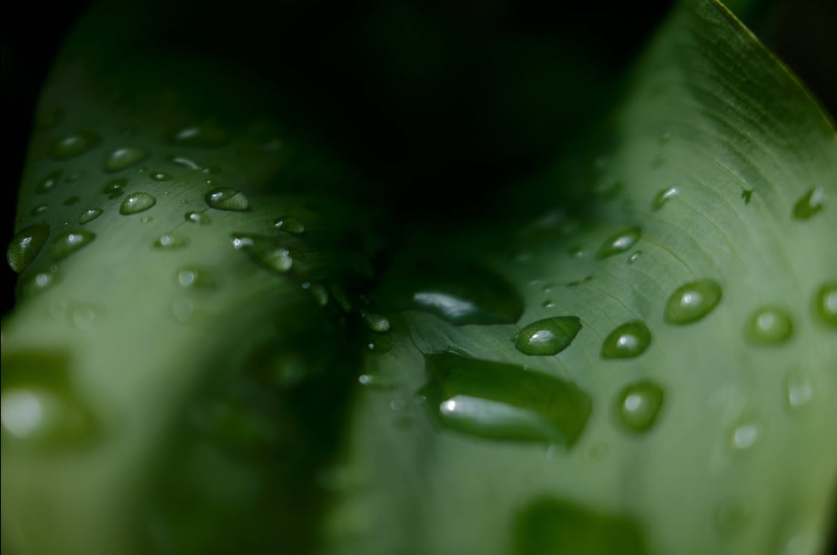
The clarity gives you values from 0 to +5 or -5. I took samples at +- 2 and +-5. Here is what it looks like.
Clarity 0

Clarity +2
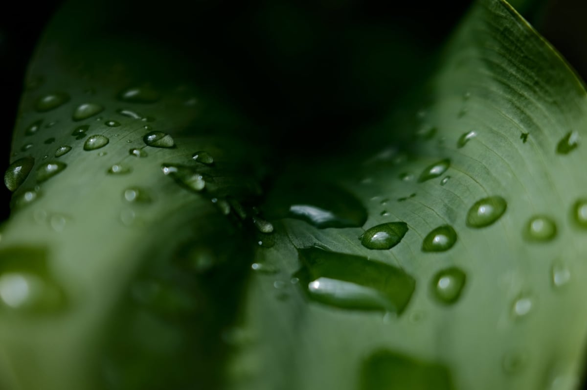
Clarity +5
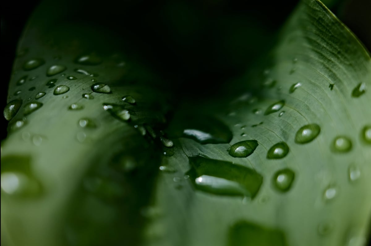
Clarity -2

Clarity -5
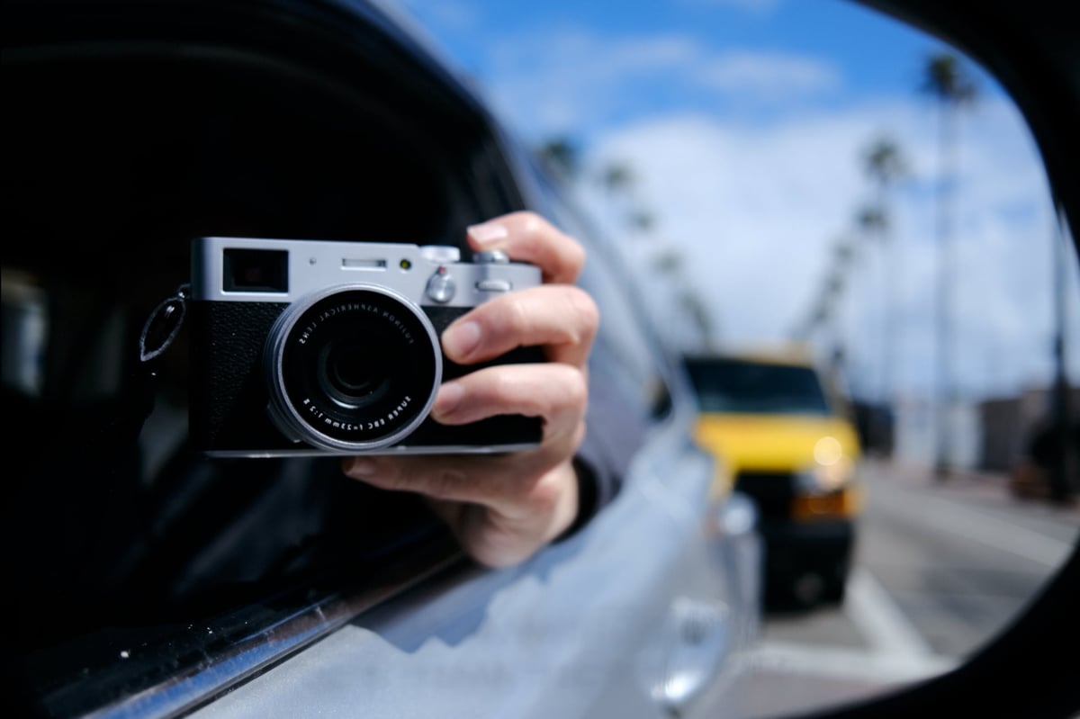
What Is Color Chrome
Color Chrome is an effect added to Fujifilm cameras to make certain colors “pop” in digital photos. This unique feature increases contrast and saturation, giving photos more depth and vividness. With Color Chrome, you can dramatically enhance blues, greens, and other hues to create stunning images.
We initially saw Color Chrome with the X-T3 and it’s made its way into all the new cameras. Now Fujifilm added a new Color Chrome Blue.
The Color Chrome looks have two settings, Strong or Weak. I’ll show you Strong so you can see the full effect.
These are screenshots taken from X RAW Studio so my alignment isn’t perfect.
Color Chrome All Off
Color Chrome – Strong
It’s a subtle effect but you will notice it when applying it to a broad range of images. It brings out a little color depth.
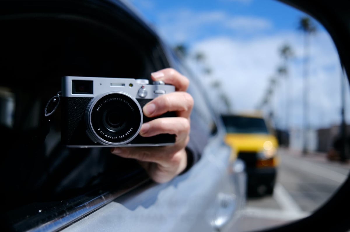
Color Chrome Blue – Strong
The Color Chrome Blue effect only really affects blue. When shots don’t have any blue in them, the effect makes no difference.
When there is blue in the photo, like with this sample, it really punches up the contrast of the blue. It looks like it is lowering the luminance of the blue colors.
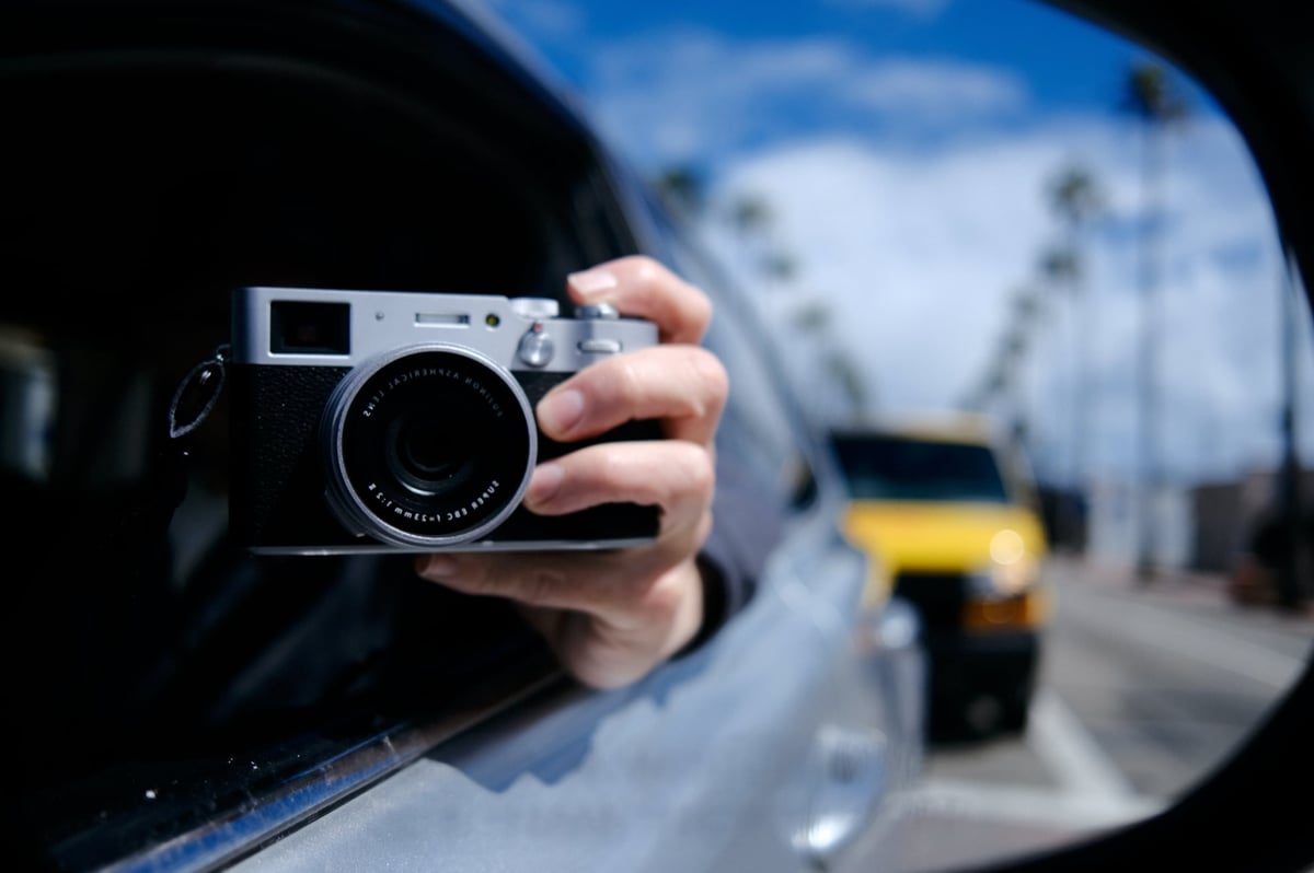
Color Chrome + Color Chrome Blue
When you combine both Color Chrome effects it can have a very punchy look. These samples also have a +2 Clarity applied.
These effects can really be used to bring to life some of the older film simulations. I absolutely love Astia now. Actually, all the samples on this page are shot Astia.
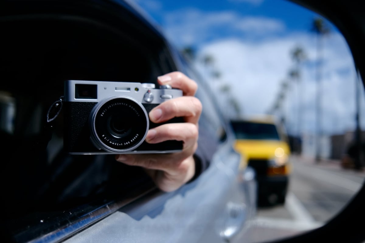
I also haven’t seen Fujifilm mention this in any of their documents, but sometimes they do update the film simulators as the processors improve in power. They improved Veliva a few years ago with the X-T2.
What Is Grain
Fujifilm has built a really nice-looking natural grain pattern with different settings.
Weak or Strong with a Small or Large pattern.
I found Fujifilm JPGs tend to eat fine details as part of the in-camera noise reduction process. Adding a Weak – Small grain to the images really helps mask this while giving the images a nice organic touch. You can also get around this by lowering the noise reduction and then introducing the grain effect, for good detail and a nice film-like grain that masks the digital grain that might naturally be in the photo.
Here are some samples of what the different Fujifilm grain patterns look like. Click to see the full-size 100% crop.
No Grain

Grain Weak – Small
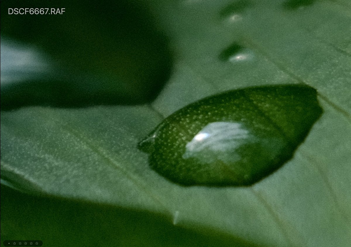
Grain Weak – Large

Grain Strong – Small
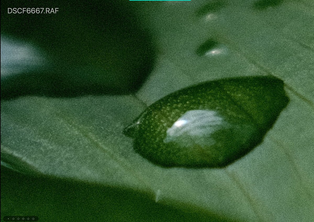
Grain Strong – Large
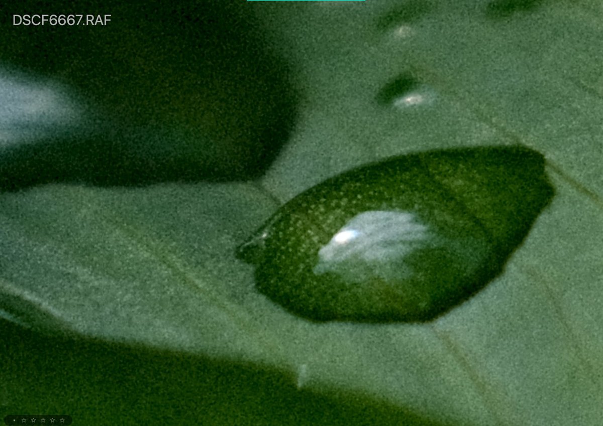
New Color Effects | Conclusions
There are a few other tricks the cameras offer like the multi-exposure settings and Dynamic Range Priority, but none of them will affect your images the same way as these three new effects above.
If you’re a Fujifilm JPG shooter and were on the fence about upgrading or a RAW shooter on the fence about shooting JPG these new tools could make it worth it. The only thing that’s missing is the ability to add a fade.
There are a few negatives to using the color effects, it uses quite a bit more processing power. This causes a few-second lag after taking a single photo forcing you to wait a few seconds before you can take another shot. This also drains your battery a little faster.
How I Like To Use JPG Effects
I’ve like shooting with Color Chrome and Color Chrome Blue on Strong with a +2 Clarity. If I shoot portraits I’ll sometimes go -1 on Clarity. I’ve been finding in many situations more than -1 is too much. It starts to look too much like a haze effect.
+1 Color has also been great with Classic Chrome and Classic Neg.
Classic Neg has a unique tonal curve but it’s a little too dark sometimes in the shadows so I’ll lift the shadows usually -2 and bring down the highlights -1.
I’m almost always using a weak and small-grain setting.
I’ve been pretty happy with these results. Also, don’t forget to revisit Astia with the new Color Chrome Effects. I think you’ll be surprised by the results.
**This website contains affiliate links. We will earn a small commission on purchases made through these links. Some of the links used in these articles will direct you to Amazon. As an Amazon Associate, I earn from qualifying purchases. |
Hi Alik
Another great post (such a great resource for Fuji shooters). I think this is the first actual analysis of the new JPEG options I have seen. (And as we all know, all Fuji users should be shooting JPEG!). I did have a couple of questions about the “How I’ve Been Shooting” section…..
– when you talk about +1 saturation with the classic film sims, do you mean clarity? Or something else?
– for classic neg are you shooting + 2 shadows and – 1 highlights?
Astia has always been my standard set-up (although -1 on highlights and shadows and +2 on colour) so excited if is going to get even better!
Cheers
Ben
+1 saturation. Sorry, it should read +1 Color.
For classic Neg I do -1 highlights which brings the highlights down. And -2 Shadows which bring the shadows up. It’s not really intuitive and has the opposite effect. +1 on highlights makes this brighter, but +1 on shadows makes things darker this always confuses me but at least now they have a visual curve display. I want lighter shadows so -2, and I want darker highlights so I do -1.
I found Classic Neg was just producing too much contrast so I try to undo it a little.
Thanks – very helpful. I will have a fiddle. You are right – the curve display is very useful and quite surprising vs the numbers!
I await your analysis of black and white JPEGs!
Have a good weekend (or as good as is possible right now….)
Hello Alik,
Great post and good explanations, as usual !!
I tried to add grain using my X-T2 (weak grain), but to my taste it’s a little bit too grainy. Grain Weak – Small as presented in your post seems interesting though !
IMHO Astia is a good simulation for landscape photography, not too harsh, not too saturated. It’s a good way to share quickly a JPG to your friends or family of a landscape photo.
Have a nice day
Thanks, I do actually wish there was an even milder grain and even a milder setting for clarity for the -1. Sometimes -1 is too much. Astia is looking great on landscapes, I agree. I donno why but I never liked it in the past, but lately I feel like it’s looking better. Maybe they did an upgrade?
Yes maybe they did an upgrade of the applied tone curve. I don’t even know if Astia gives the same result on my X-T1 and on my X-T2. I never tried to take the same photo of a landscape with both cameras to check the rendering.
Hello, thanks for your work sharing, much appreciate 🙂 Just a question, when I’m using Clarity, it takes 1-2 second to write de JPG on the card so it is not usable on my X100V… Is it the same with your camera?
Yes. One way to work around this is to shoot RAW with Clarity set to 0. Then convert your keepers to JPG and add the clarity back.
I wonder what you think about LUTs. I am severe color blind so I tried Lightroom and other photo editing software and people generally but people do not like my edits rather than Fujifilm JPEG OOC. I really do not like JPEG so I tried a few LUTs like teal and orange luts. They are really good. Also because they do not change, they make my photograps consistent. I really wonder your opinion about LUTs on postprocessing for people with color problems.
I believe Sean Tucker is also color blind, You should check out his work. He keeps keeps saturation to a minimum with just a hit of color for his street stuff. Last I saw he was used a lot of the Darkroom App with Fujfilm JPG files and he would apply a filter with some nice warmth then just turn it down a bit.
When he does portraits he said he doesn’t really like to touch the red / pink tones since those are the colors he struggles with so he kind of lets the camera do that. But I guess it all depends on what colors are the issue.
Regarding your Luts, I would say you have to be careful about where you get them from. Some people that design them are really bad at making sure they are consistent across photos with different balances and tonal ranges. Some are good. Mastin Labs are all pretty good, but sometimes they’re just a little too saturated. But in your case it’s probably better to desaturate most of the the colors a little and rely on some split tones with complimentary colors.
Orange and teal is a very popular look right now so you can never go wrong with that. It’s gaining a tone of momentum with the street crowd but it looks like it’s dying off with the adventure/landscape crowd. Now I see people just sort of muting out all the colors and letting the teals come through in the highlights. It’s getting really weird actually, but sometimes it looks cool.
There is a girl Instagram I follow that does a nice teal orange look. I like her old stuff. Her new stuff is drifting into that crazy muted teal look that’s burning through the New York scene right now. Check her out on Instagram – Heathergillich
Here is a look I just built you can try, just copy it and make it a preset. It’s been working across most images, just tweak the oranges and teals and exposure so they’re not too intense. It’s a pretty safe look since the colors are for the most part muted. But if you’re out doors you might want to turn down the teal a touch on that split tone. It’s a faded retro look, not sure what you’re going for. You can unfade it with the curves and add back in contrast too and it should still work.
For me personally I use Luts on almost everything I do except for my landscape stuff where I tune everything by hand. So yeah, presets are great.
https://uploads.disquscdn.com/images/de21b7f3f188b153477ff2f8b58a74b91a7e6524192f5d31b3533bcb81d36c2f.png
Hi Mate… do you shoot everything right in camera… or do you apply all these effects in post?
I do like half an half. Depending on what I’m doing and how much time I want to spend editing something. I do like making a lot of my own in-camera looks with this https://alikgriffin.com/how-to-use-fujifilm-x-raw-studio/
Great article but it seems the pics are missing. Mind updating?
Should work now.. I was using a before / after image comparison slider and that seems to not be working at the moment. I replaced the images with a standard display.
Thanks for letting me know.
Really useful article, but I’m wondering : do we have the Color Chrome / Blue effect on the fujifilm XT-2 ? Or i have to do an update ?
Nobody is talking about and it’s hard to find an answer, so i hope getting an answer there.
It is new, think it came to their cameras around late 2019 or early 2020.