
Micro-contrast has been a hotly debated topic in photography over the years. We’ve heard it called lens pop, Zeiss pop, 3D Pop, inter-tonal detail, micro-contrast, etc.
Why is it so complicated to explain? Explaining the phenomenon is difficult because we’re dealing with photon science, which is still very messy with inconsistent ideas. But I will try.
What Is Micro-Contrast?
Micro-contrast is how well the light is structured when it hits the sensor. It’s like an analog version of bit depth, 8-bit vs 10-bit.
To add some validity to this claim, I have noticed that controlled lighting seems to improve it, which means photon coherency and structure play a role. This is similar to how the grain of ISO 12800 under direct sunlight looks better than the grain at ISO 12800 in low light when the shutter is adjusted to the same exposure.
If you’re always under direct studio lighting or outside, it might not be as obvious which lens has better micro-contrast; they all look pretty decent. But you’ll benefit from the lower-element lenses with less glass under natural lower lighting with less photon coherency. So it seems anyway.
The science should be pretty obvious; you all know what chromatic aberrations are, and you’ve all seen that picture of a prism producing a rainbow. With each added element, the different frequencies of light will bend slightly, so more elements at the perfect geometry or coatings can be added to try to keep it all aligned, but it can never be perfect since it’s all on a spectrum. Then, of course, there are impurities in the glass and on the surface that can chip away at that structure of light. That makes sense, right?
Micro-Contrast Samples
For these samples, I adjusted the histograms in Lightroom to match exposure. Sometimes, an image seems brighter, but that’s just the lens’s characteristic.
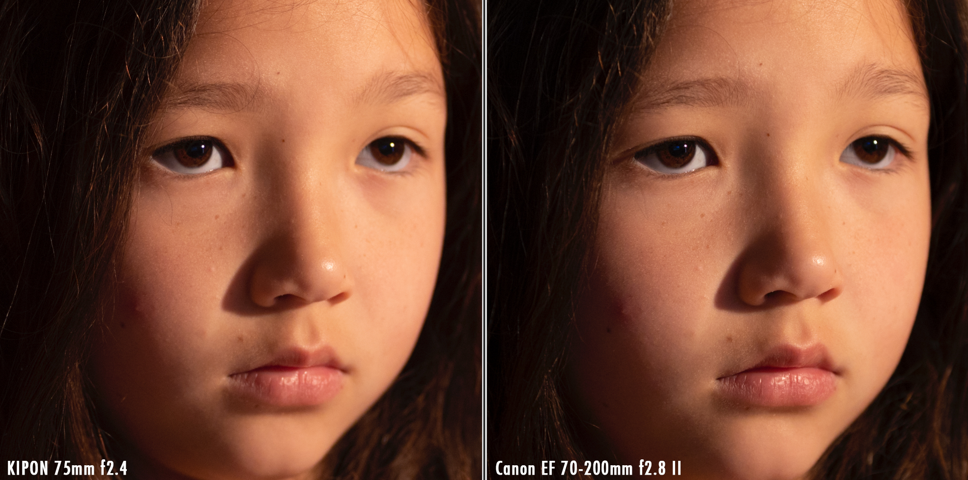
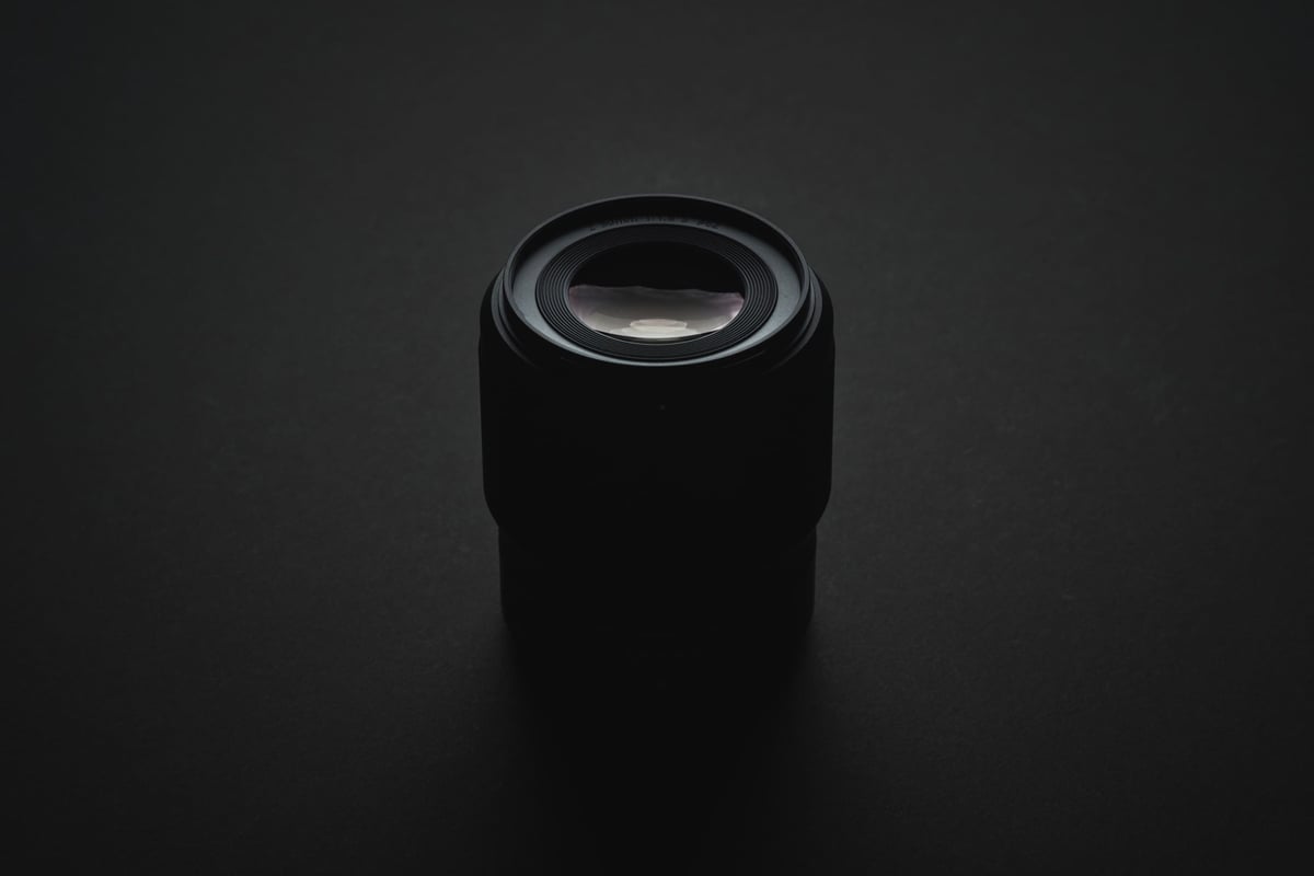
Kipon 75mm f2.4 vs Canon EF 70-200mm f2.8 II
I compared the Kipon 75mm f2.4, a 5-element lens in 5 groups, to the Canon 70-200mm f2.8 II, which uses 20 elements in 15 groups.
This is a perfect example because the Canon lens is noticeably sharper with better contrast. It should technically have better coatings as well. As you can see, the Kipon blacks are not fully black, likely some internal light scatter, or it’s catching some flare from the light, which I, unfortunately, did not flag off. I did try to move it into a position in front of the lens where it was not directly causing flare. These Kipon lenses also produce a little bit of glow.
Natural Lighting
This natural lighting shot handheld on the Canon R. Taken only a few seconds apart, Kipon was shot at f2.8 at ISO 2000 and Canon at f2.8 at ISO 2500. I wasn’t planning on using this as my test run, so I didn’t lock the ISO, but it showed good results, so I’ve shared it.
The difference between all these samples is subtle; try to look at the colors and tones, not the sharpness. Look for how they transition and blend.

Looking at the left side of the image, it’s very clear that the colors and tones in the cheek are smoother, almost like there is more color and tonal information, even though the Canon image is sharper and has better global contrast.
Highlights on the Canon image also tend to get slightly blotchy and lack color.
Controlled Lighting
This is a controlled lighting shot on the Canon R, and both lenses are set to f2.8 at ISO 1000. It’s not too bright and not under a strobe since I wouldn’t want the light coherency to be too good so as not to show results.

The Kipon image came in slightly warmer with more saturation, so I pumped the Canon image a little to match. Also, the focus plane here did not perfectly match. The Kipon is just slightly front-focused, making it look a little softer, and her face angle changes somewhat. I just couldn’t get it perfect on a manual focus of 75mm with a 7-year-old who wouldn’t sit still. I tried.
When looking at the two samples, it should again be obvious that the Canon has slightly better global contrast. However, the tones look a little muddier and a little blotchier overall compared to the Kipon—just tonally, it’s not as rich.
The highlights on the Canon become blotchy and yellow, and the warm cheek tones on the Kipon feel a little more lively and have a smoother and calmer transition into different colors and tones.
Sitting back, the Kipon looks cleaner, even though the Canon image is sharper with deeper blacks. But it’s not as obvious here, I don’t think, as with natural lighting.
Close-Up | Natural Lighting
Here is a 50% crop. The Kipon again has better shape and color transitions, but the Canon is sharper.
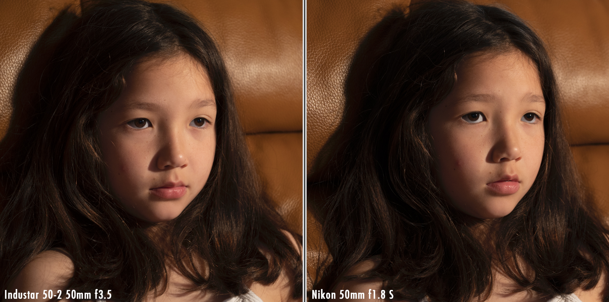
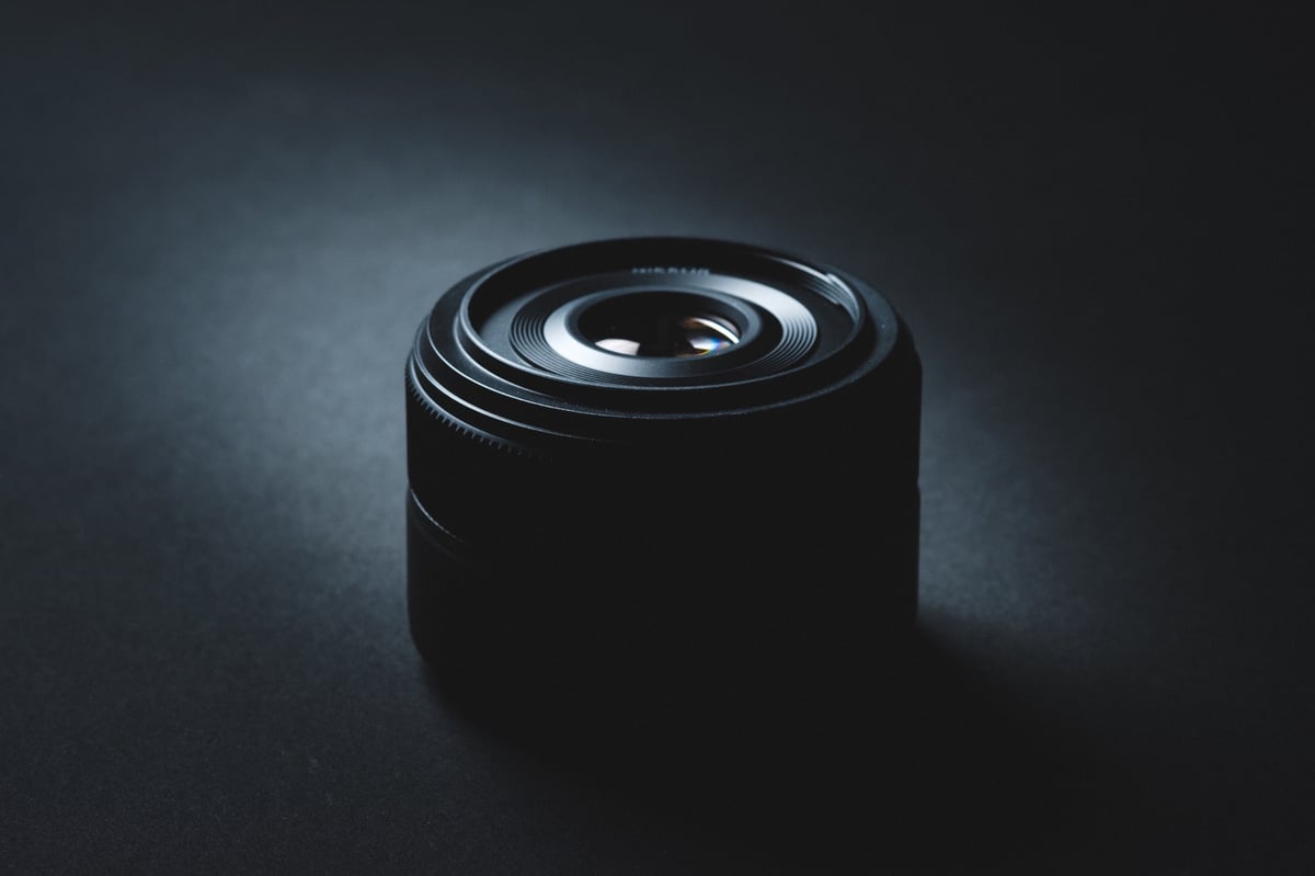
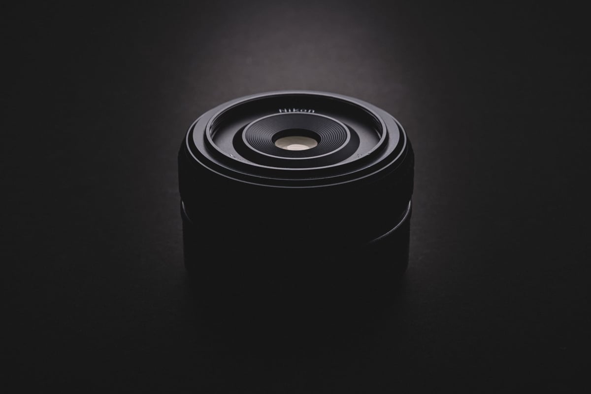
Industar 50-2 vs Nikon 50mm f1.8 S
Now we’re on a Nikon Z6, which does have a heavier AA filter, and this will likely change the look and probably reduce the micro-contrast as it’s just one more thing to interfere with the photon structure. Maybe I’ll retest these one day on a Nikon Z8.
This sample is not as obvious since the Nikon 50mm f1.8 is still a decent lens for Micro-Contrast.
I’m trying not to be biased since I am a believer, so I left both samples on my computer, woke up the next morning forgetting which was which, and immediately thought the Industar 50mm f3.5 image was better tonally, but it’s harder to tell now as a JPG with web compression, especially if you’re on a consumer monitor or smartphone.
I want to point out that these two images are also corrected to match, but straight out of the camera, the Industar always produced a prettier look with nicer colors, and I don’t know why; maybe it’s just a warmer lens, and that always looks good on portraits.
However, even when corrected to match, the highlights hold more color information, the Industar image color transitions and tonal transitions are smoother, and the warm tones are rosier, making the image feel more realistic. Overall, the global contrast is slightly better on Nikon, where the blacks are blacker.
Regarding sharpness, the Nikon is only slightly sharper than the Industar here at f4.
Nikon 24-120mm f4 vs Industar 50-2
It’s not the best sample, but I’ll put it up because why not? I went through many lenses quickly, so not everything was well executed.
It’s hard to tell which is better here because the faces don’t match, but the Industar here feels richer and smoother. The Nikon zoom lens feels a little muddier.
I’ve been generally unhappy with the Nikon 24-120mm lens’s color and tonal rendering. The highlights tend to glow, and they usually feel a little flat. It’s a great lens, but the color and tonal rendering are not fantastic; it’s kind of a muddy lens with what it does to the colors.

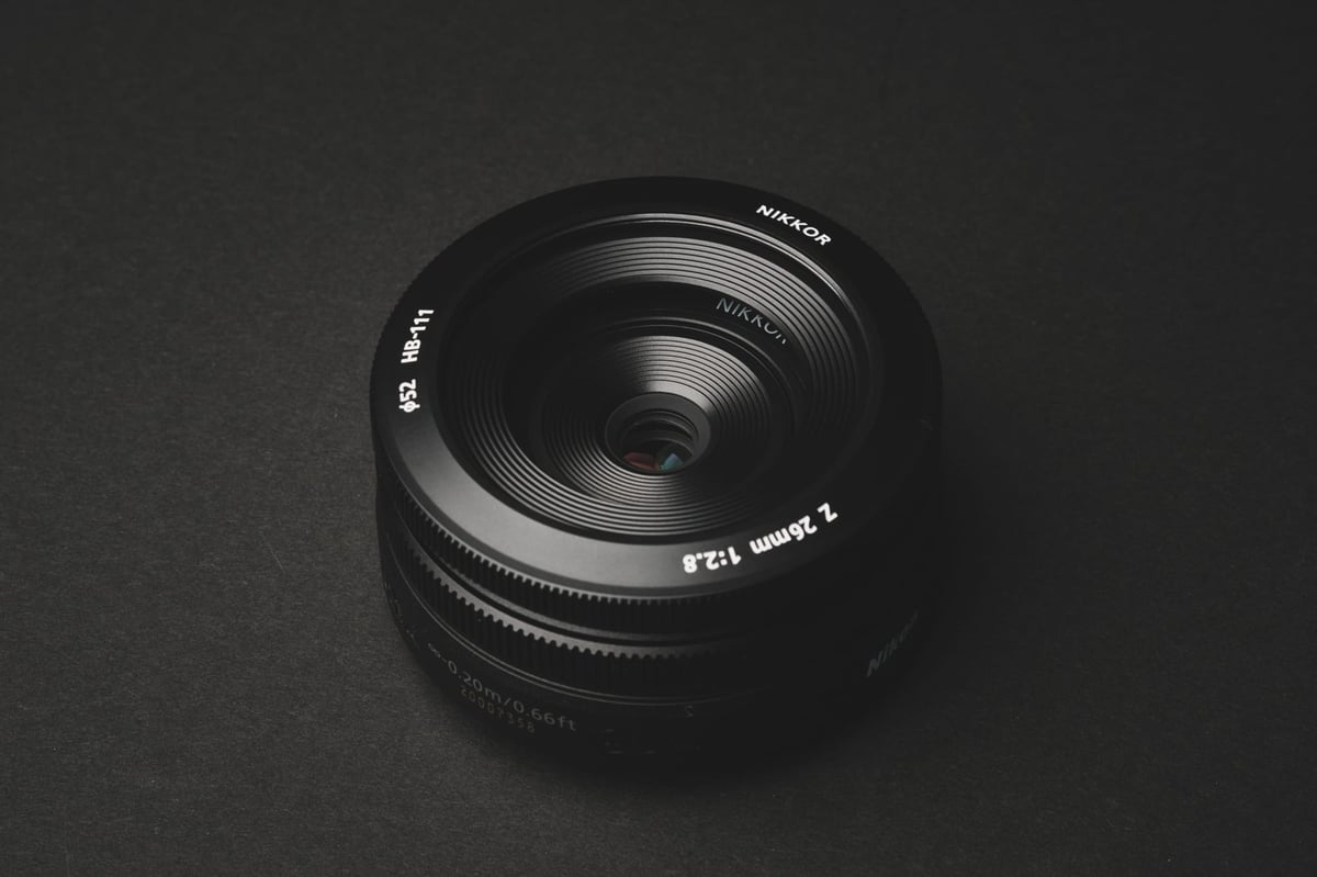
Nikon 50mm f1.8 S vs Zeiss Plannar 50mm f2
Here is a Zeiss 50mm f2 vs the Nikon 50mm f1.8 S.
This one is very tricky, as both lenses are very good, so I spent a little more time trying to WB them and match their exposure. These two have a dramatically different rendering. The Zeiss T* coatings push the shadows and mid-tones much deeper. This is likely why Zeiss lenses feel like they have more “Zeiss Pop” since they have that stronger contrast in the shadows and mid-tones.
I tried to adjust some settings to make them match. I had to add a little more saturation and warmth to the Zeiss, as the Nikon had more saturation. Nikon could be adding baked-in profiles since the Nikon profiles should be color-balancing the lenses.
The Nikon lens has a bigger front element and uses more elements at 12 in 9 groups. The Zeiss uses only 6 elements in 4 groups. Nikon has all the latest modern technology, whereas the Zeiss was released in 2006.
To me, the Nikon has better saturation and sharpness, but the Zeiss has a slightly nicer shape and more pop, although the shadows feel muddier on the Zeiss.
It’s hard to say what I like better here; I’m leaning toward the Nikon. When you flip to black and white, the Zeiss image jumps out slightly. This could actually just be from deeper contrast in the mids and shadows, more so than a micro-contrast thing.


Micro-Contrast Is It Real? | Bottom Line
While it might not seem like a big deal in these side-by-side images, over a larger body of work, shooting in various situations, the higher micro-contrast lenses generally shine through, becoming a lot more obvious.
I generally don’t worry too much about micro-contrast when buying a lens; if a lens looks good, it looks good. However, there are so many other attributes to consider that also make an even bigger difference. A lens’s coatings, its optical formula, aspherical elements, and focus technology can also significantly affect the look of the image.
A lens with no aspherical elements will produce a much more dramatic look with its classic bokeh compared to a lens loaded with aspherical or other exotic elements for that perfect field curvature.
When you buy a lower-element lens, you’re stripping out a lot of tech that was refining the look. This inevitably contributes more to the classic rendering, a classic field curvature, and unique focus falloff, which, to some people, just looks cooler.
I personally like to have a few lower-element lenses in the mix since their rendering is noticeably different from our modern lenses, including the better color tonality. However, sometimes, the modern lenses look amazing as well. The Nikon 35mm f1.8 is one of the best-looking 35mm lenses in terms of its artistic rendering. I love that lens even though it has a more modern feel to it.
We should also pay attention to our zoom lenses. A 16-element Nikon 24-120mm does not have as nice a tonality as a 13-element Nikon 17-28mm. The 17-28mm has so much more life, even though there is only a 3-element difference. Are lower elements causing better micro-contrast, or is the design making something better happen in the 17-28mm? I’m not sure here; it’s probably a combination of both.
In all my lens reviews, this “lower element lenses have a better micro-contrast theory” has been pretty consistent, as, without fail, higher element lenses generally have the worst tonality in the way they render. But there also does seem to be something happening with lens design where some lenses with close to the same number of elements can outperform. Maybe the chemistry (index of refraction), geometry, or glass thickness is also at play. This makes sense as none of our elements are 100% translucent. You stack twenty UV filters over your lens, and you should expect to see a drop in image quality.


Leave a Reply