With every new generation of cameras, Fujifilm introduces a few new features. This guide goes over what each of these features does and should help you decide if the new JPG effects are worth the upgrade, or if you should use them yourself.
The New Fujifilm JPG Effects
Aside from the new color simulators, Eterna and Pro Neg, there are a few new color effects that were brought over from the X-Pro 3 or X-T4 to the new generation cameras. The effects can be mild, but add them all together and they can have a big impact on the overall look.
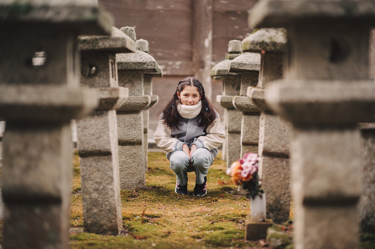
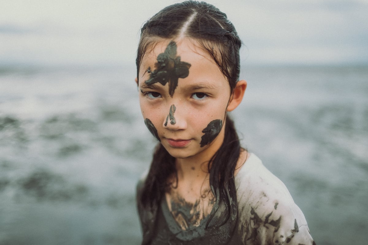
All samples in this article are shot with the Fujifilm X100V and processed with X Raw Studio.
What Is Clarity
Clarity is a new tool and it can have a nice effect for adding punch to images giving a deeper contrast or adding an almost soft glow effect by going the other way.
The Clarity here looks totally different than the Clarity you’re probably used to in Adobe Lightroom, it attempts to simulate a soft filter effect, by mostly blooming out highlights.
The different looks of clarity will have different effects when applied to a whole batch of images. Sometimes -1 Clarity has a big effect depending on the lighting or background. These images I’m using should give you a good idea of how it affects the contrast and what it will do to the overall look.
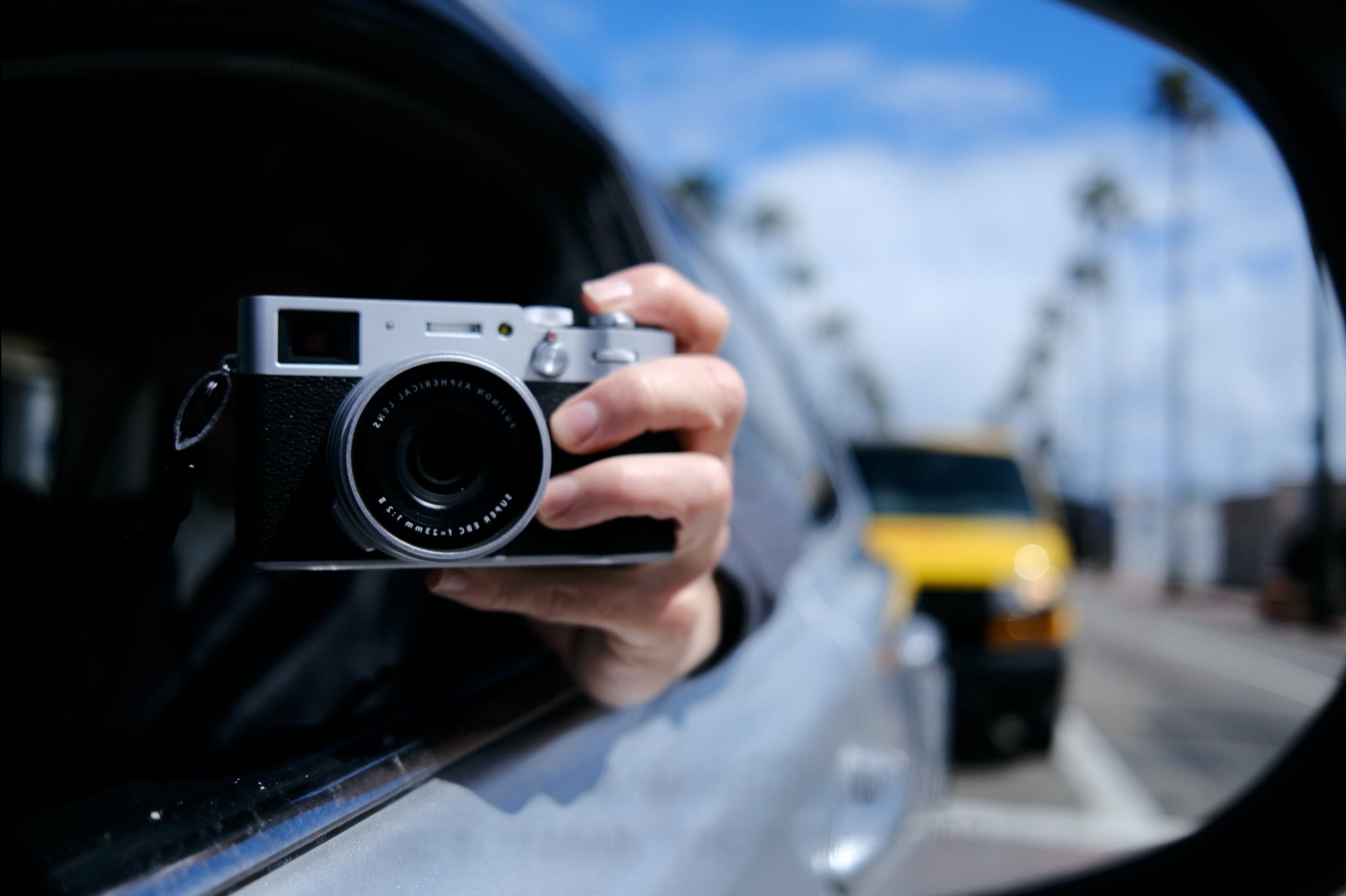
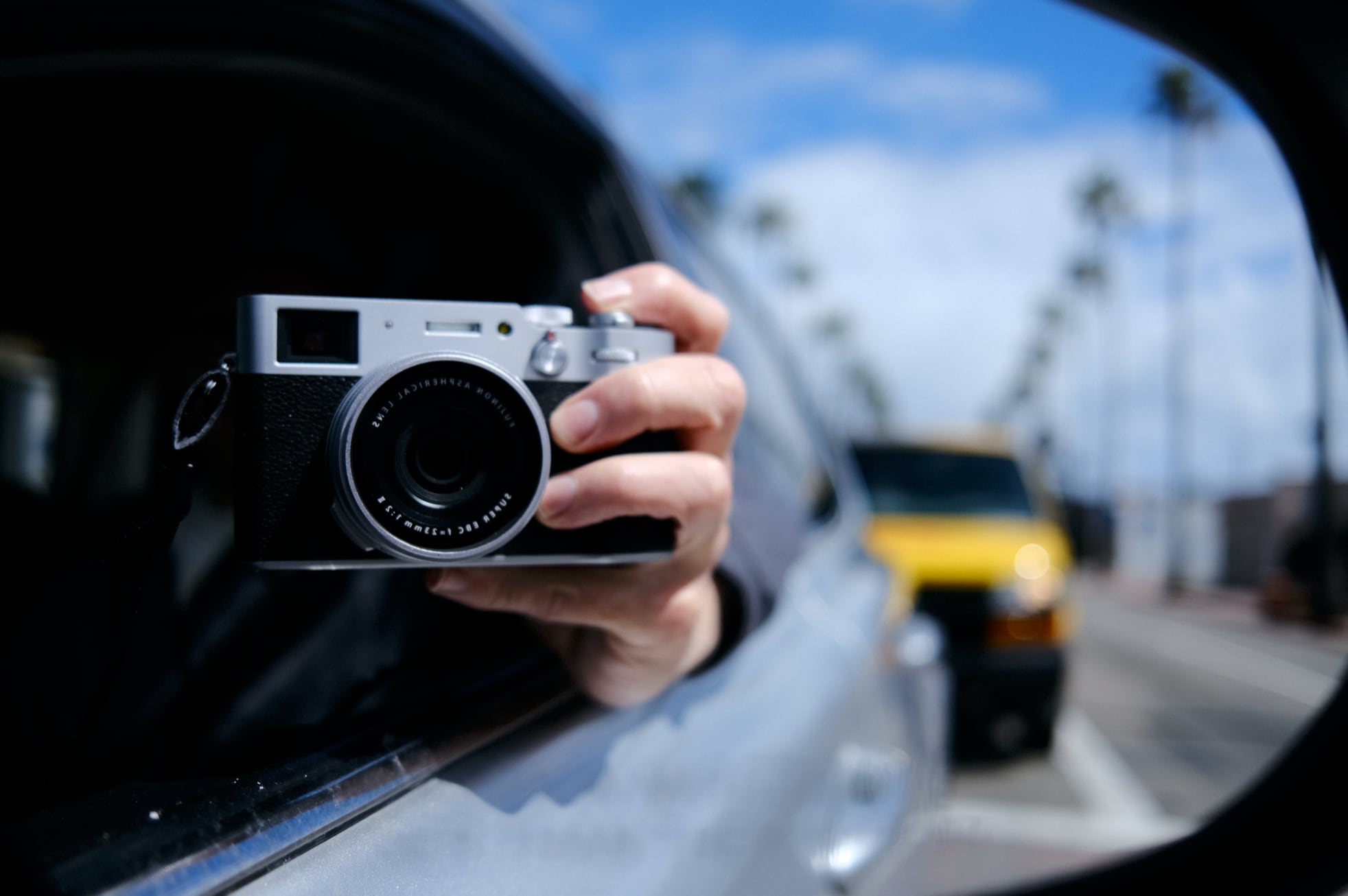
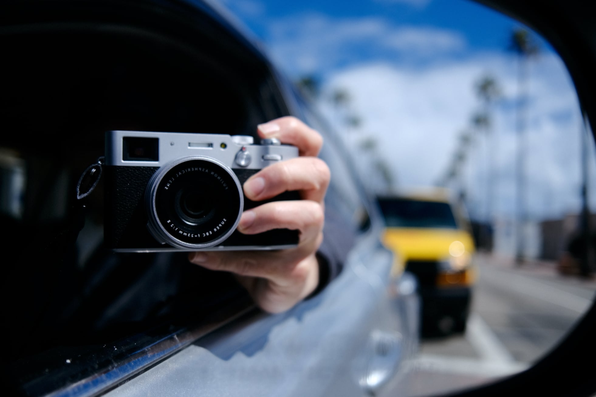
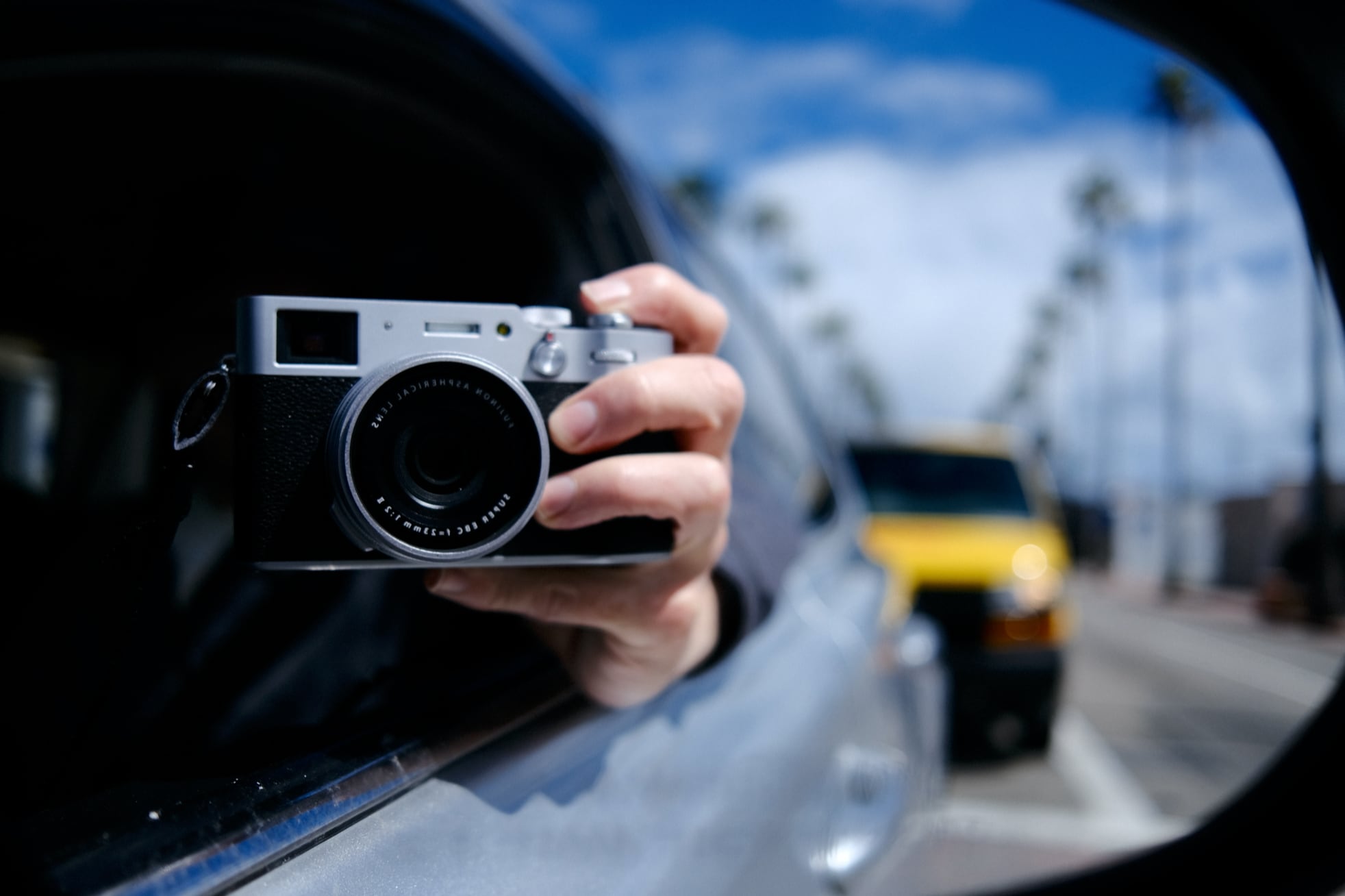
The clarity gives you values from 0 to +5 or -5. I took samples at +- 2 and +-5. Here is what it looks like.
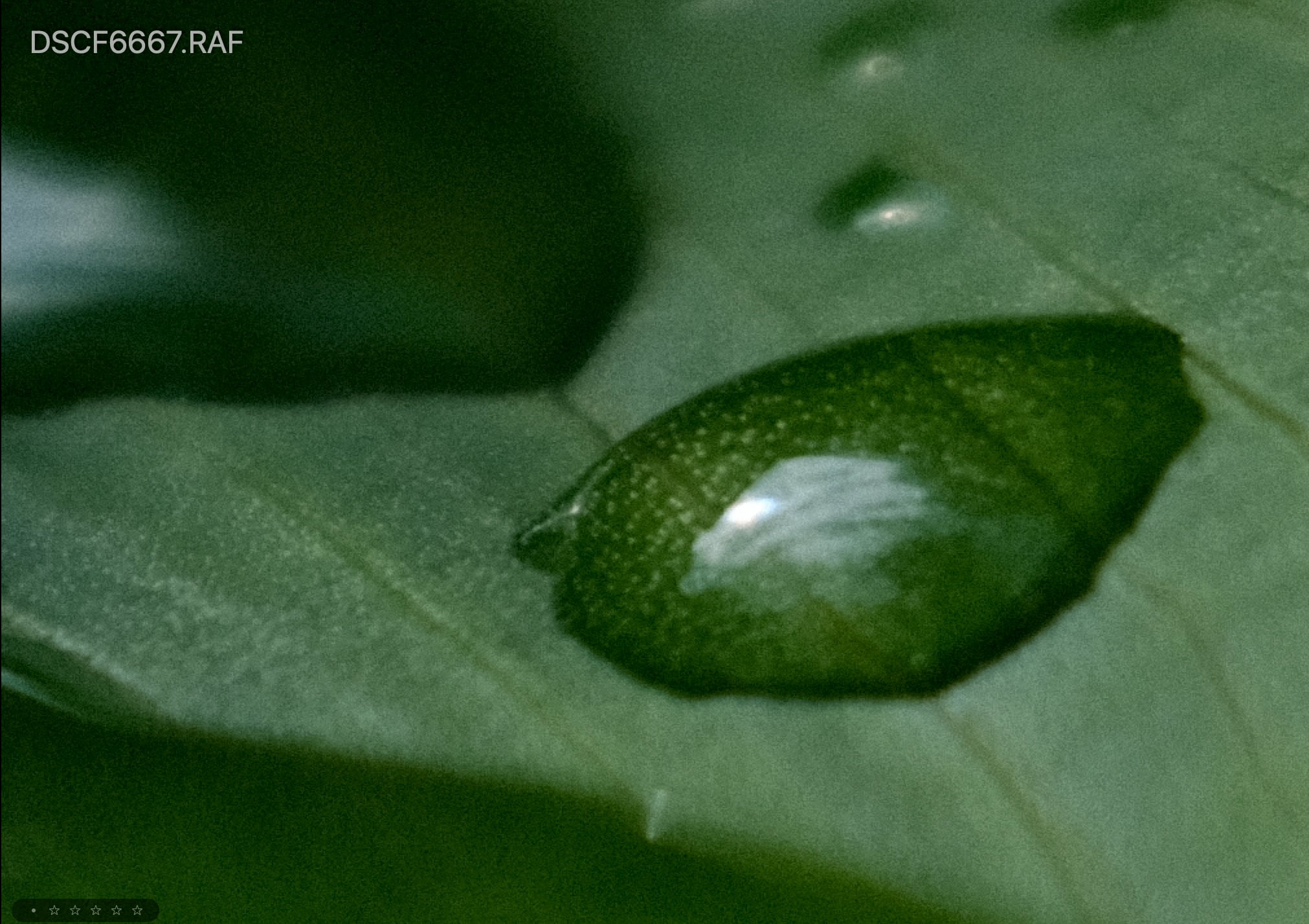
Clarity 0
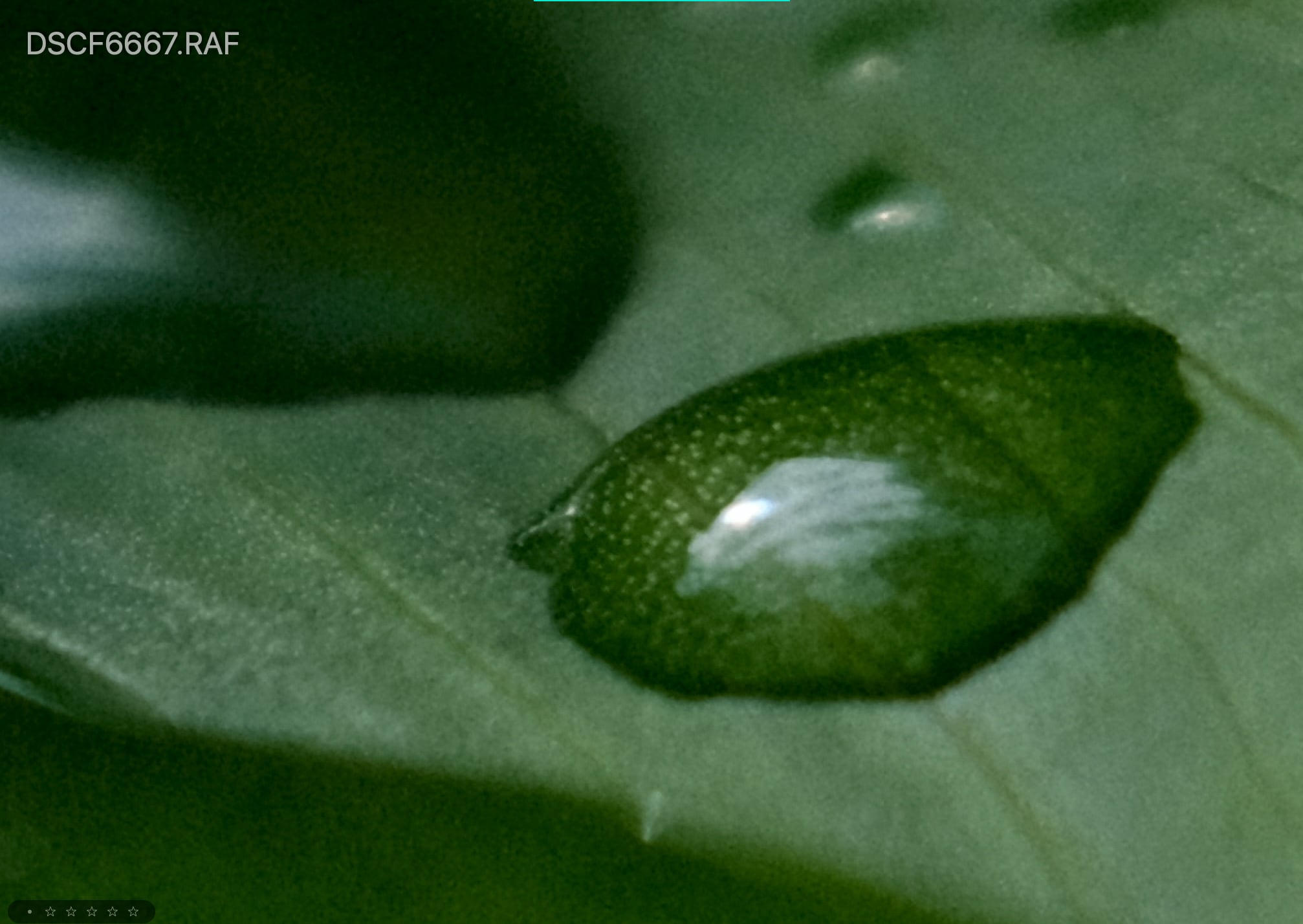
Clarity +2

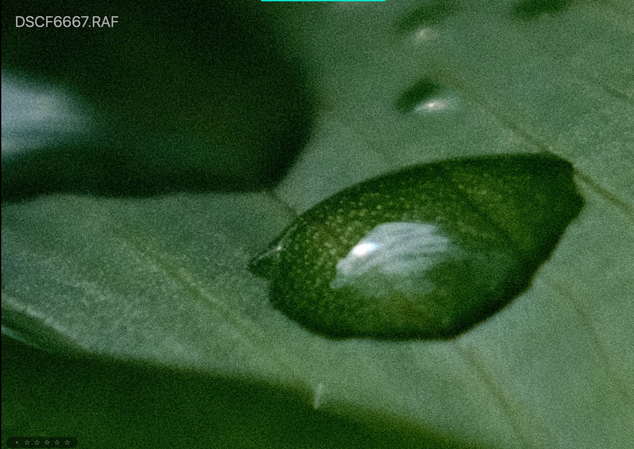
Clarity +5
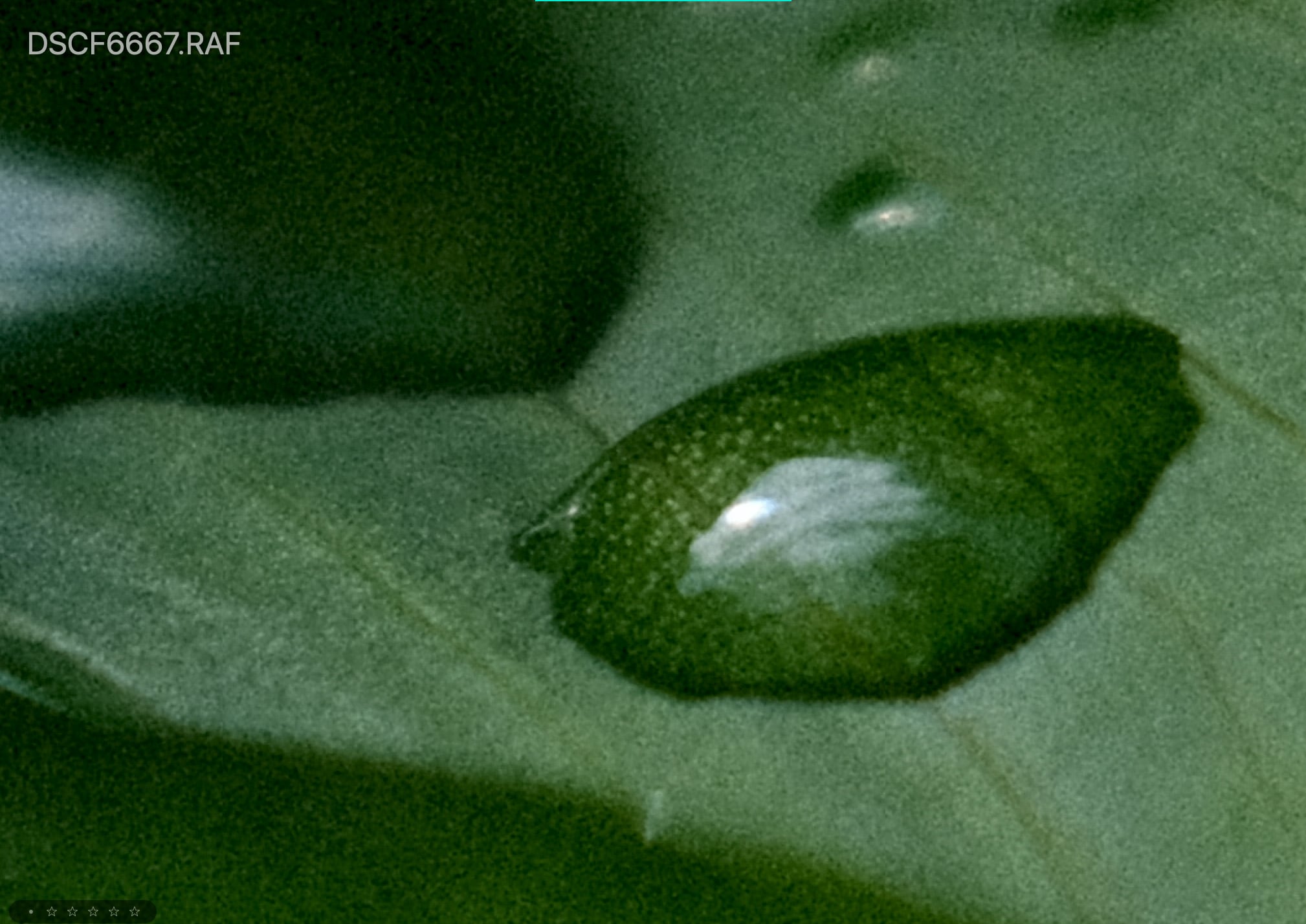
Clarity -2
Clarity -5

What Is Color Chrome
Color Chrome is an effect added to Fujifilm cameras to make certain colors “pop” in digital photos. This unique feature increases contrast and saturation, giving photos more depth and vividness. With Color Chrome, you can dramatically enhance blues, greens, and other hues to create stunning images.
We initially saw Color Chrome with the X-T3 and it’s made its way into all the new cameras. Now Fujifilm added a new Color Chrome Blue.
The Color Chrome looks have two settings, Strong or Weak. I’ll show you Strong so you can see the full effect.
These are screenshots taken from X RAW Studio so my alignment isn’t perfect.
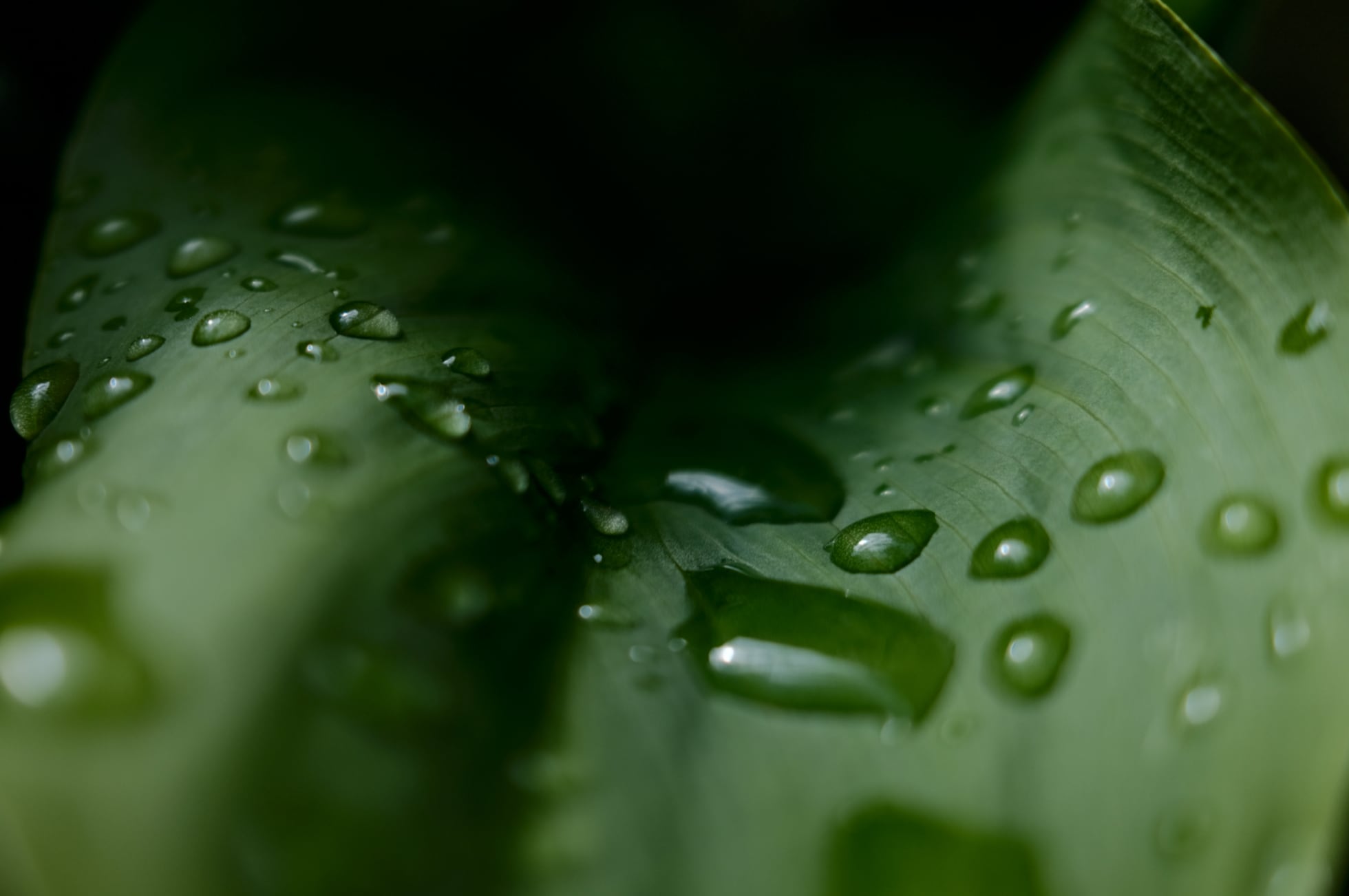
Color Chrome All Off
Color Chrome – Strong
It’s a subtle effect but you will notice it when applying it to a broad range of images. It brings out a little color depth.
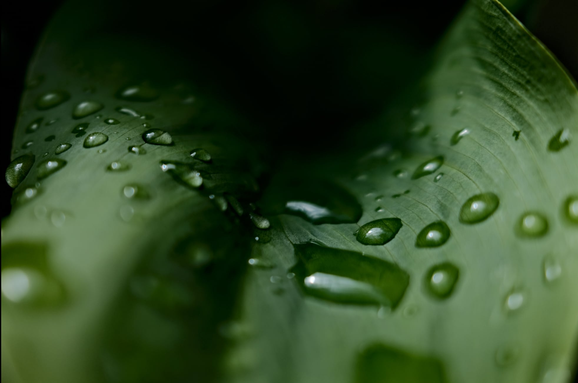
Color Chrome Blue – Strong
The Color Chrome Blue effect only really affects blue. When shots don’t have any blue in them, the effect makes no difference.
When there is blue in the photo, like with this sample, it really punches up the contrast of the blue. It looks like it is lowering the luminance of the blue colors.
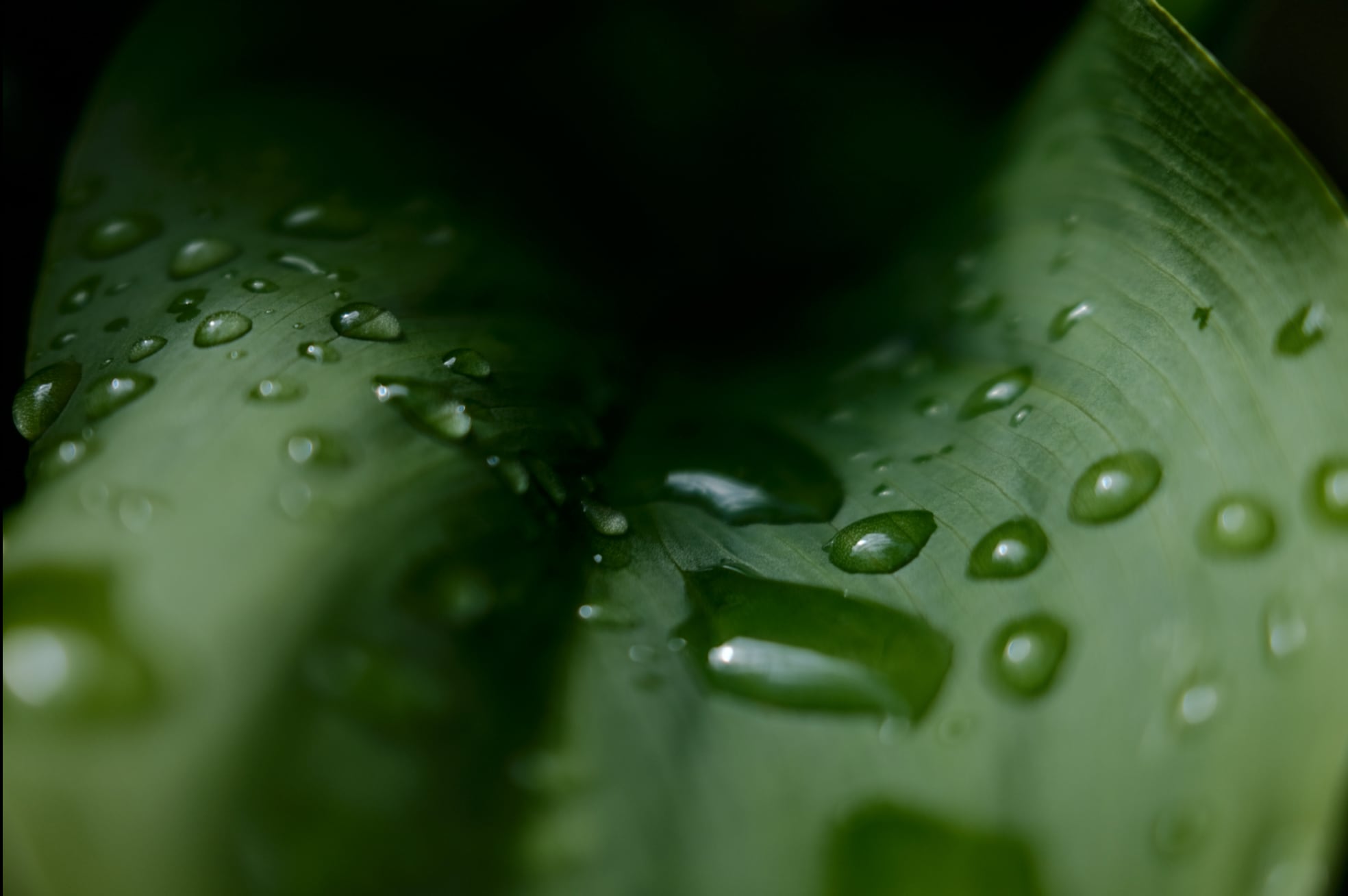
Color Chrome + Color Chrome Blue
When you combine both Color Chrome effects it can have a very punchy look. These samples also have a +2 Clarity applied.
These effects can really be used to bring to life some of the older film simulations. I absolutely love Astia now. Actually, all the samples on this page are shot Astia.
I also haven’t seen Fujifilm mention this in any of their documents, but sometimes they do update the film simulators as the processors improve in power. They improved Veliva a few years ago with the X-T2.
What Is Grain
Fujifilm has built a really nice-looking natural grain pattern with different settings.
Weak or Strong with a Small or Large pattern.
I found Fujifilm JPGs tend to eat fine details as part of the in-camera noise reduction process. Adding a Weak – Small grain to the images really helps mask this while giving the images a nice organic touch. You can also get around this by lowering the noise reduction and then introducing the grain effect, for good detail and a nice film-like grain that masks the digital grain that might naturally be in the photo.
Here are some samples of what the different Fujifilm grain patterns look like. Click to see the full-size 100% crop.
No Grain

Grain Weak – Small
Grain Weak – Large
Grain Strong – Small
Grain Strong – Large
New Color Effects | Conclusions
There are a few other tricks the cameras offer like the multi-exposure settings and Dynamic Range Priority, but none of them will affect your images the same way as these three new effects above.
If you’re a Fujifilm JPG shooter and were on the fence about upgrading or a RAW shooter on the fence about shooting JPG these new tools could make it worth it. The only thing that’s missing is the ability to add a fade.
There are a few negatives to using the color effects, it uses quite a bit more processing power. This causes a few-second lag after taking a single photo forcing you to wait a few seconds before you can take another shot. This also drains your battery a little faster.
How I Like To Use JPG Effects
I’ve like shooting with Color Chrome and Color Chrome Blue on Strong with a +2 Clarity. If I shoot portraits I’ll sometimes go -1 on Clarity. I’ve been finding in many situations more than -1 is too much. It starts to look too much like a haze effect.
+1 Color has also been great with Classic Chrome and Classic Neg.
Classic Neg has a unique tonal curve but it’s a little too dark sometimes in the shadows so I’ll lift the shadows usually -2 and bring down the highlights -1.
I’m almost always using a weak and small-grain setting.
I’ve been pretty happy with these results. Also, don’t forget to revisit Astia with the new Color Chrome Effects. I think you’ll be surprised by the results.
Leave a Reply to lyrklaunavan Cancel reply