
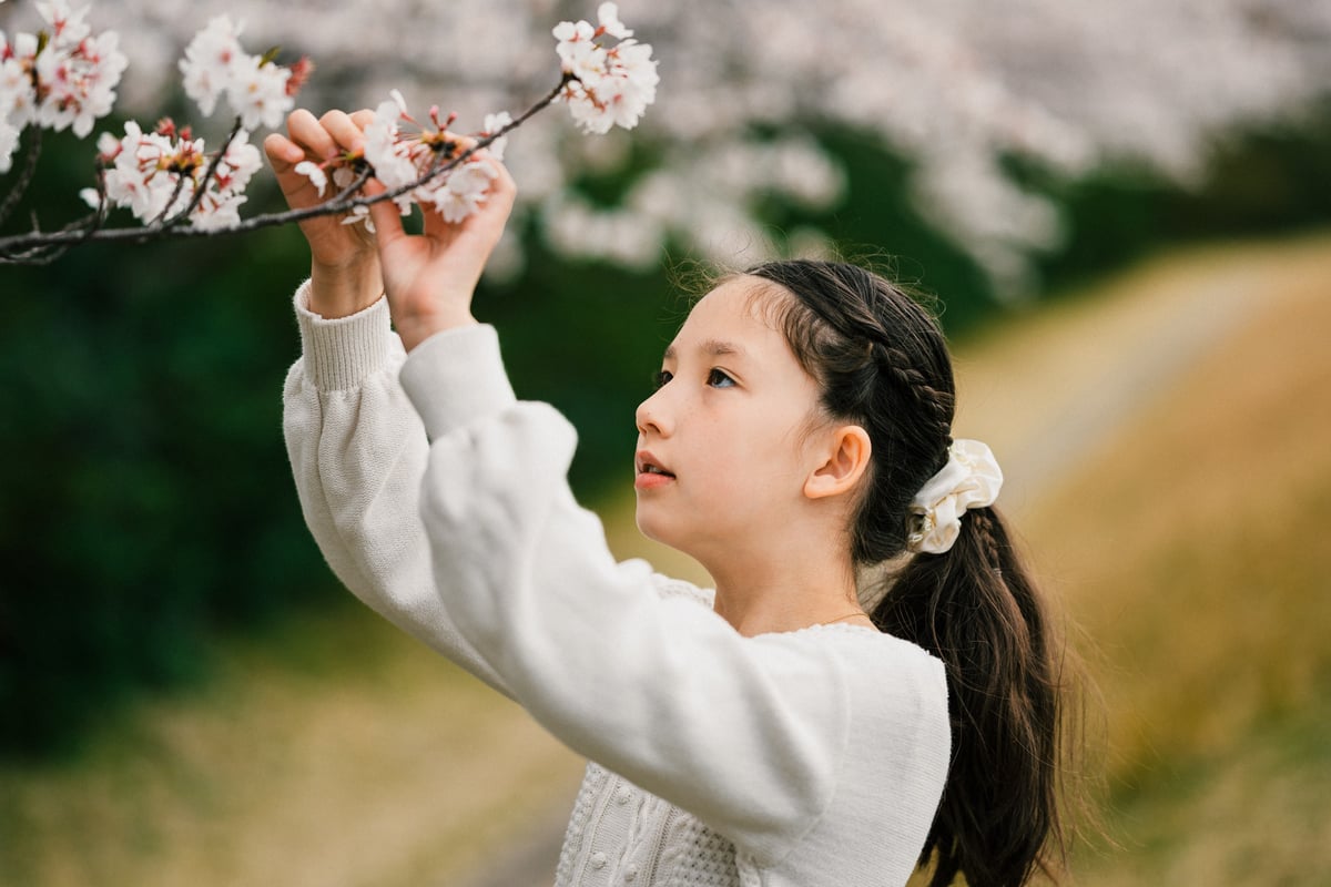
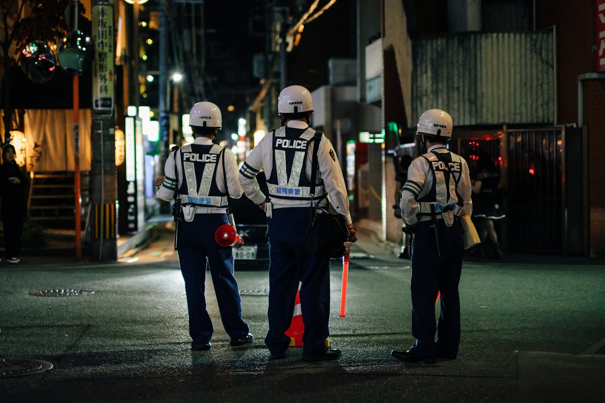
I’ve heard rumors that the Sony A7r III has improved its handling of colors compared to the A7r II, but I have never seen any samples. When the Sony A7rIII arrived, it was the first thing I noticed, and wow!
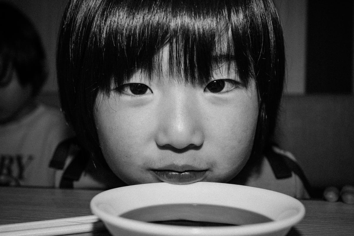
I feel like the colors are between Nikon’s look and Olympus’s, with very soft and neutral tones. Previous Sony profiles were rough, harsh, and digital, especially when shooting in mixed lighting. You almost always had to adjust the colors to get things looking natural, especially when dealing with skin tones where things were a bit pink with notes of harsh yellows. This has all been improved, and overall, it feels like the camera is now smarter when trying to render accurate colors. There is still something about the yellows that scream Sony to me with the Standard profile, but at least my daughter doesn’t look like the Simpsons anymore, and the colors all around feel more natural.
As a side note, Fujifilm has mentioned that as they get faster processors, they can add new color profiles and improve how colors work. I’m sure the same is true with Sony, and it would seem the in-camera color engine is more than just a preset of colors but a fairly processor-intensive task. I think we could benefit even further here from some new profiles, but this is a great first step.

So, the new Sony colors are usable right out of the can for the first time. Or am I just losing my mind and suffering from new toy syndrome? You tell me why I’ve posted many samples from complicated lighting situations that would have sent the Sony A7rII into a tailspin.
In my case, I think that the new toy syndrome with this camera is very unlikely because I’m usually very critical of Sony cameras and am a borderline troll. I was fed up with the Sony A7rII, its terrible battery life, ugly colors, and god-awful buffer, so I was ready to jump ship to Nikon. But I’m glad I didn’t, I feel like Nikons are only designed for old people anymore, with their circa 1988 UI menu system and that weird mirror flappy thingy, both of which always bug me. This new UI in the Sony A7r III is great, it’s just like the A6500 which I also lovd. So I’m back on the Sony train, baby, and it feels great!

I also noticed the Sony A7r III handles itself better in mixed lighting than the A7r II. AWB is still a little slow but better than before. The Nikons and Canons are still a touch better in the AWB department.

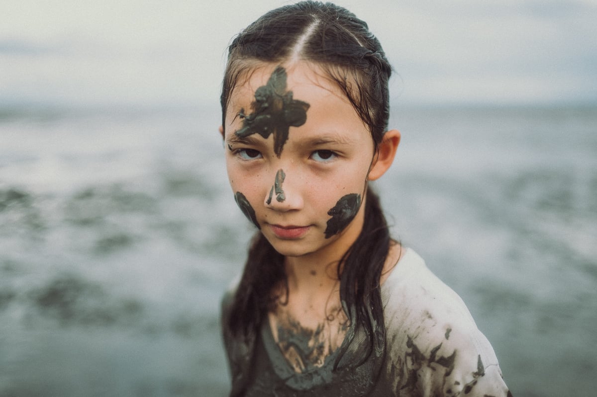
Some of these samples may look a little extra pastel, but that’s how I adjust the tones in Lightroom. I spike the whites while lowering exposure and highlights. This tends to strip the harshness of the highlights, making the colors look very rich. Then, with curves, I usually do an S-curve and sometimes lift the blacks and slightly bring down the highlights.
I wouldn’t mind slightly adjusting the profiles to give better color harmony, but I can live with this.


Now that Sony has proven they can make a nice camera with usable colors, all that’s left to do is to stop trying to sell us a P.O.S. that means a piece of shit, 300 dollar+ vertical grip, and they’ll be a real camera company. I guess Sony has Fisher Price still making some of their accessories; at least they’re not making their cameras anymore. 🙂 Well, maybe I did lose my eyecups on the first day I used this camera. Can these things just be permanently attached to the camera already? All the cool cameras do it. (I’m just bitter the grip was so expensive; it’s not terrible, but nowhere near the quality of the Fujifilm X-T2 grip.)
Speaking of which, with Fujifilm stealing the mirrorless APS-C show and encroaching on Sony’s mirrorless full-frame dominance with their somewhat affordable medium-format camera, Sony is being forced to step up their game, and it’s looking rather good and only getting better. I’m very happy with my current setup: Sony full-frame mirrorless and Fujifilm APS-C with Voigtlander Leica M-Mount lenses that work with both systems.

For all these sample images, I shot JPEG (shhh, don’t tell the Fro guy). I made some basic tonal adjustments (mentioned above) and no color adjustments except for removing some saturation in a few shots and completely removing saturation in one of the shots. The lenses I was using were the Zeiss Sonnar 35mm f2.8 and the Sony 50mm f1.8, even though I just got through telling you I use Voigtlander.
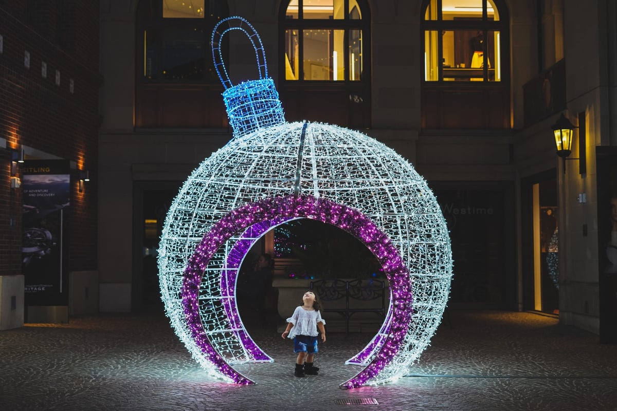
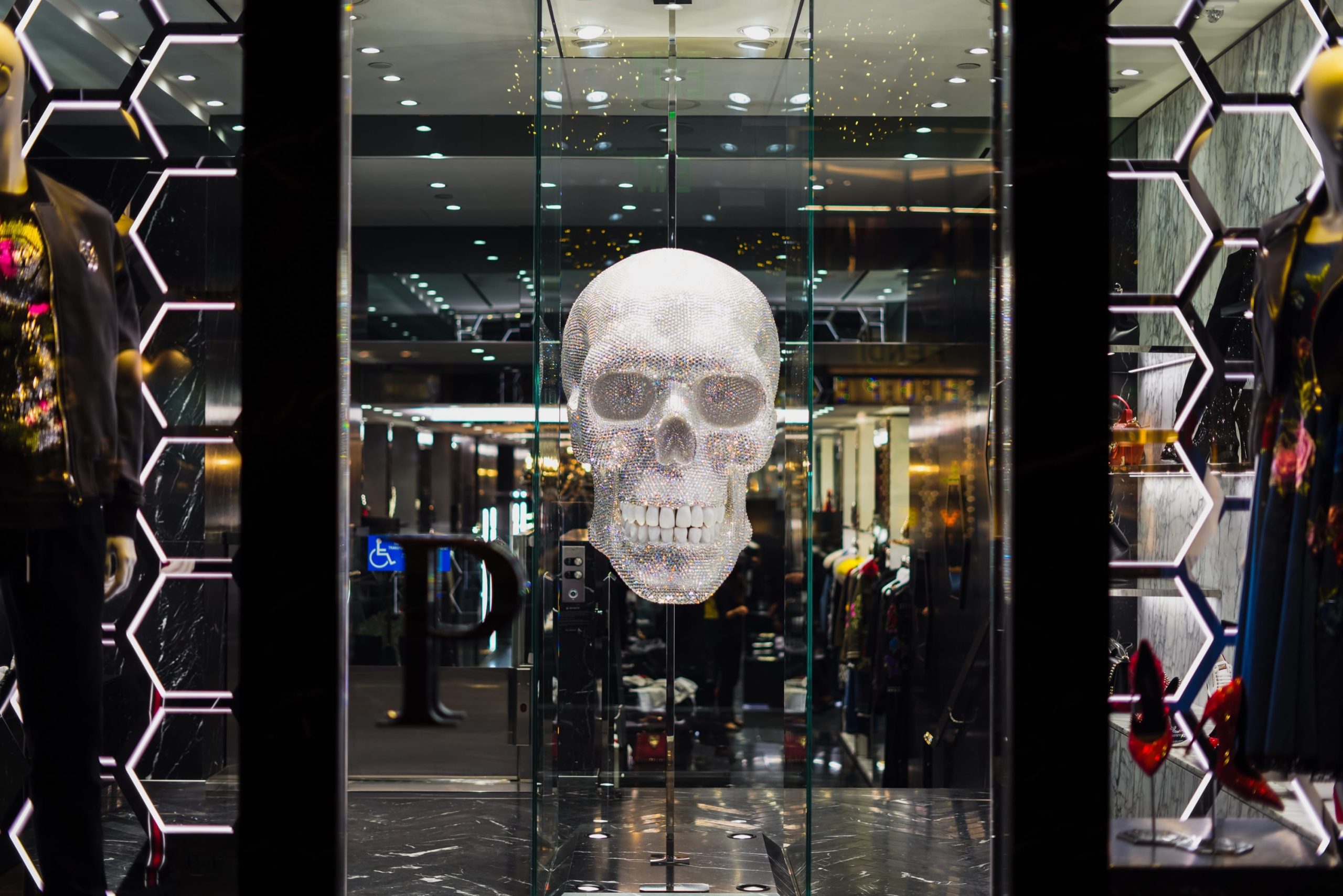
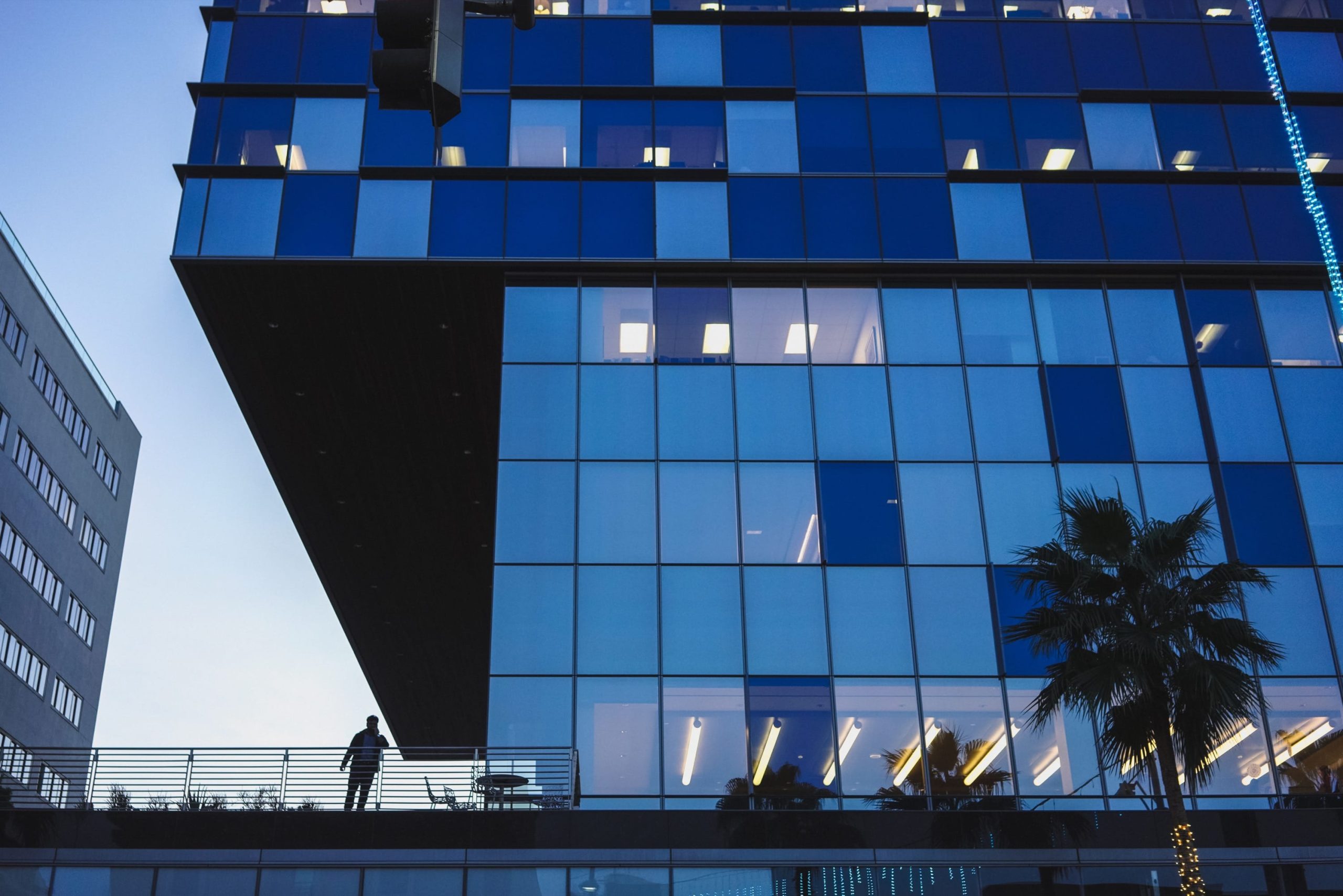
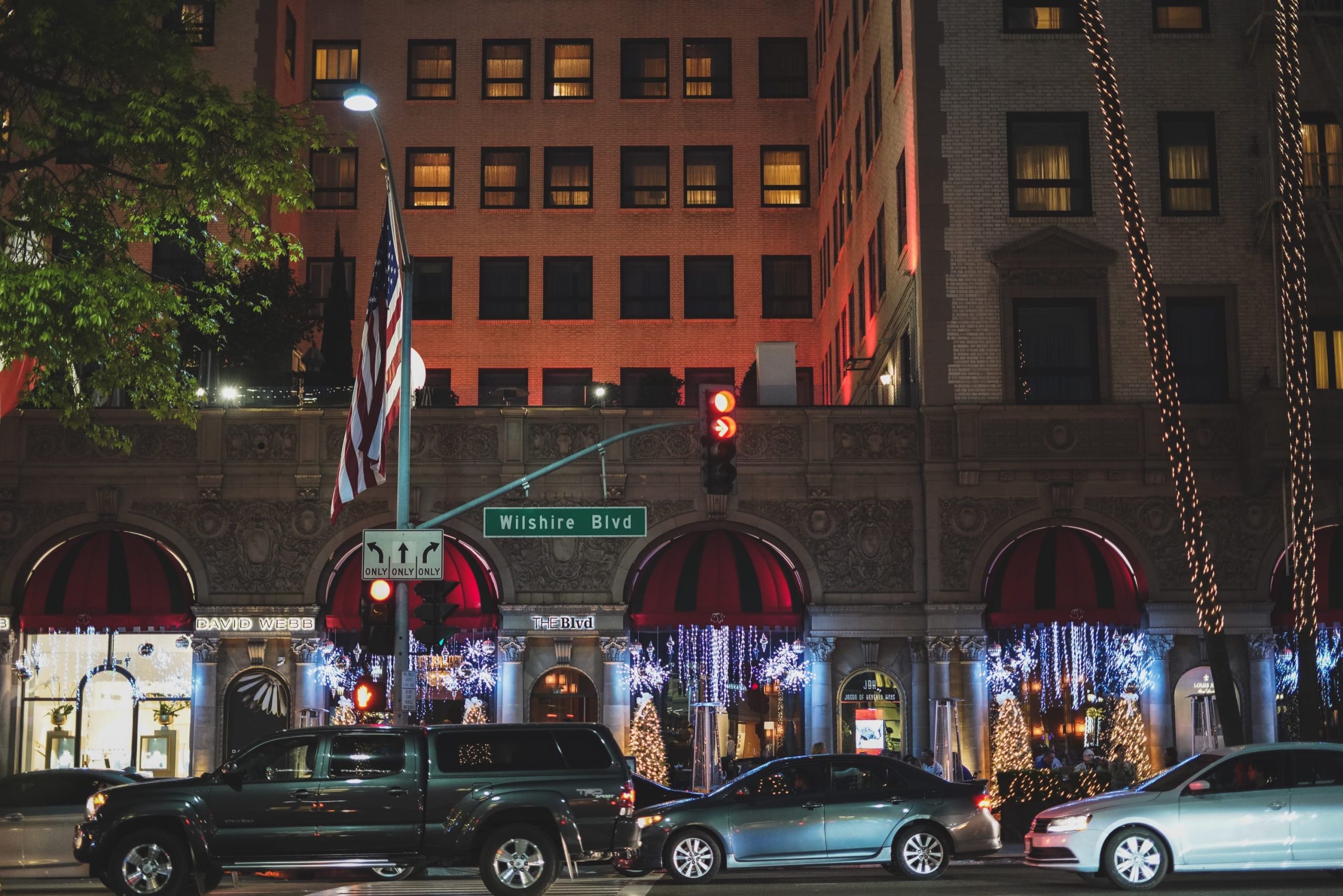
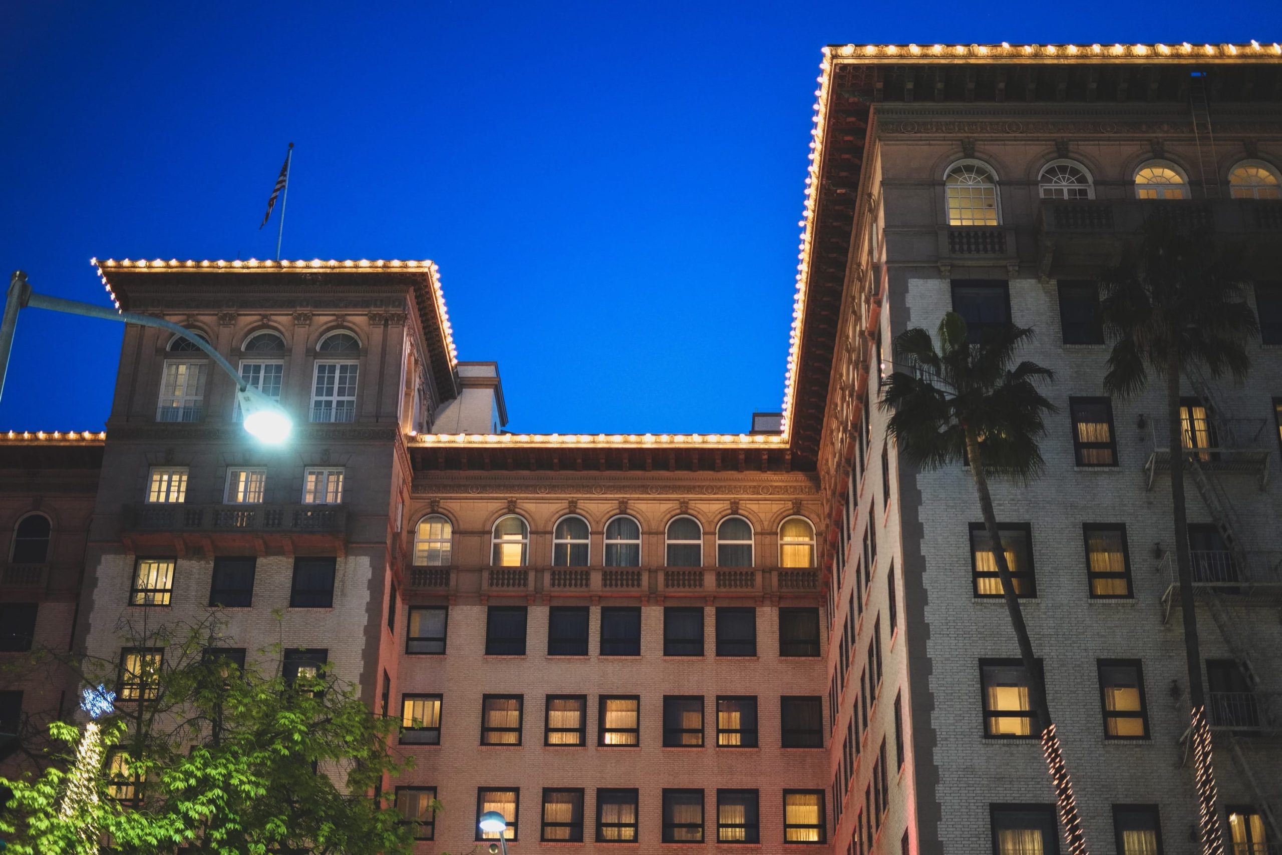
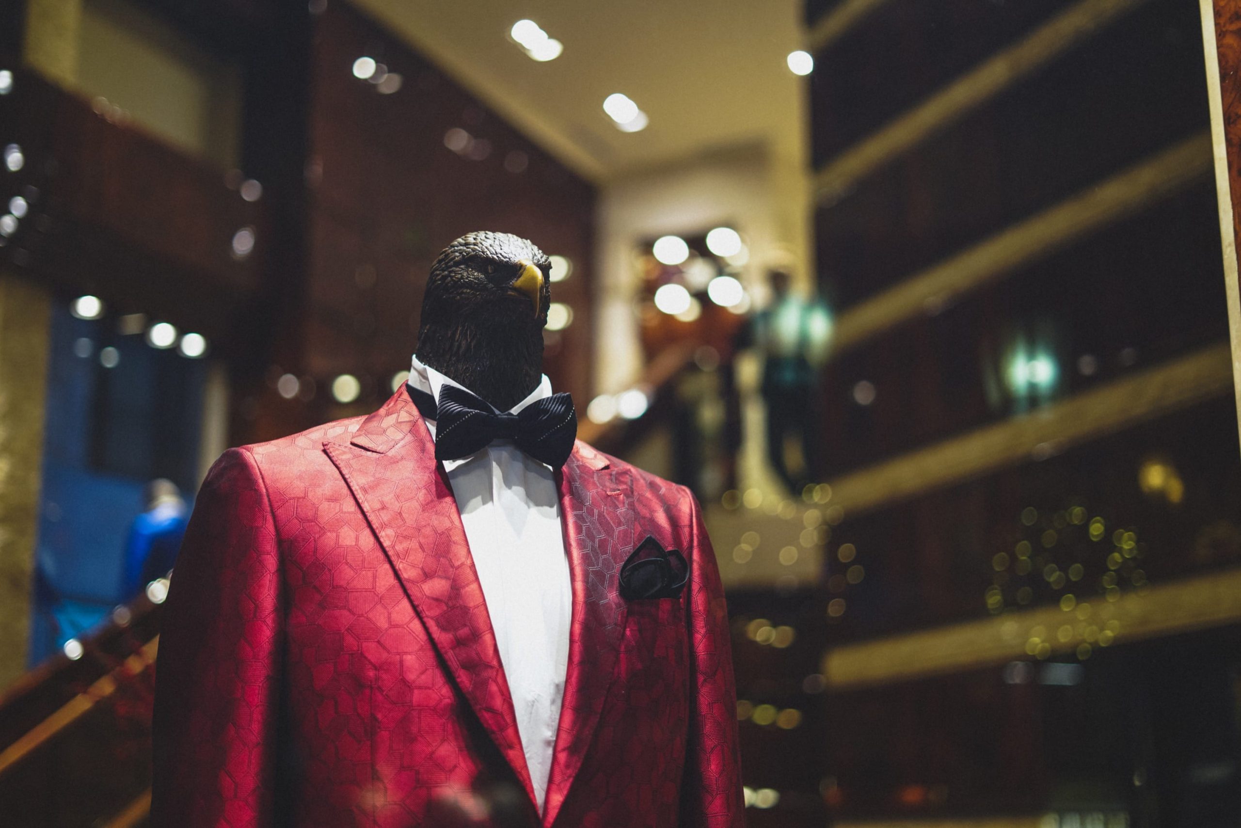
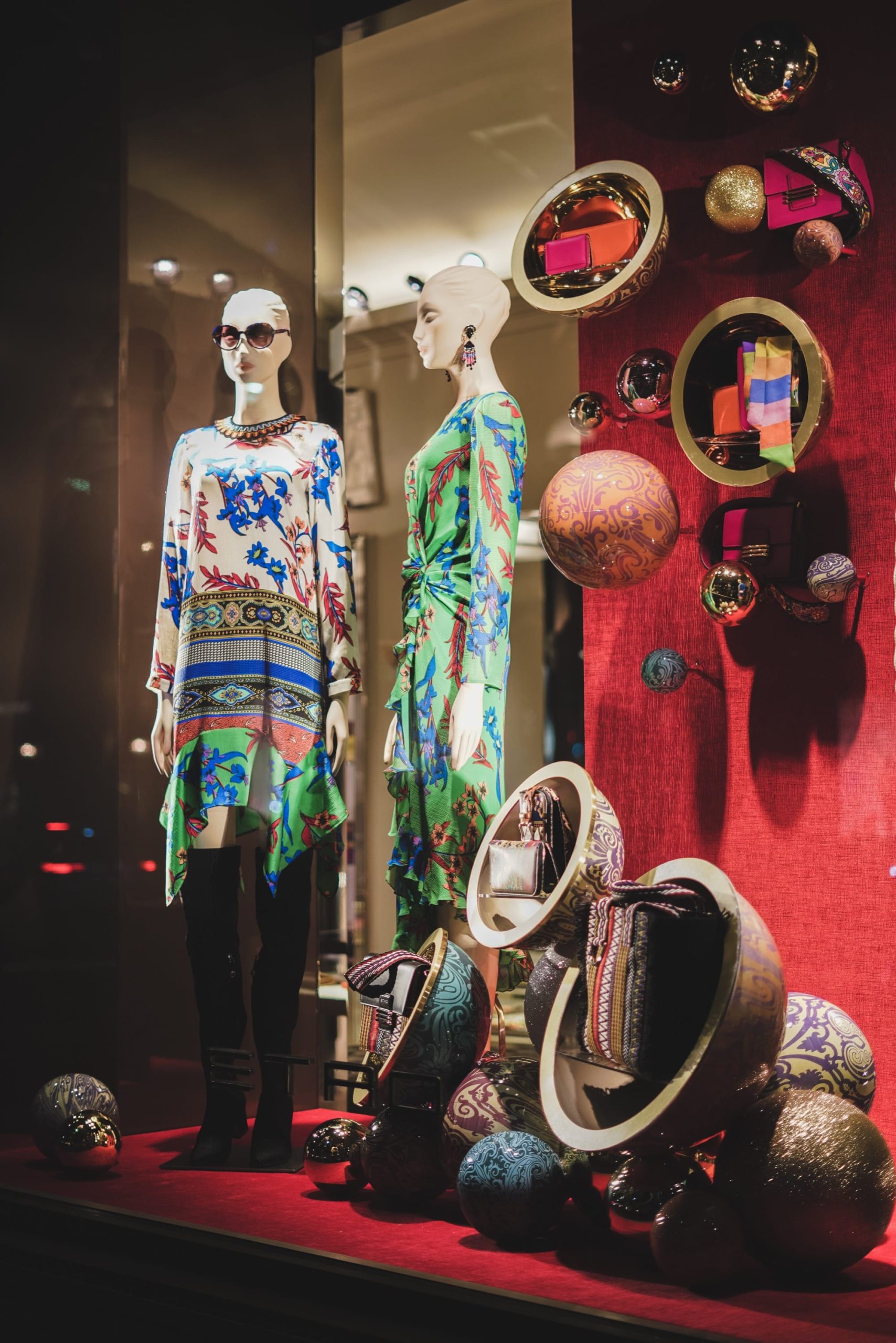
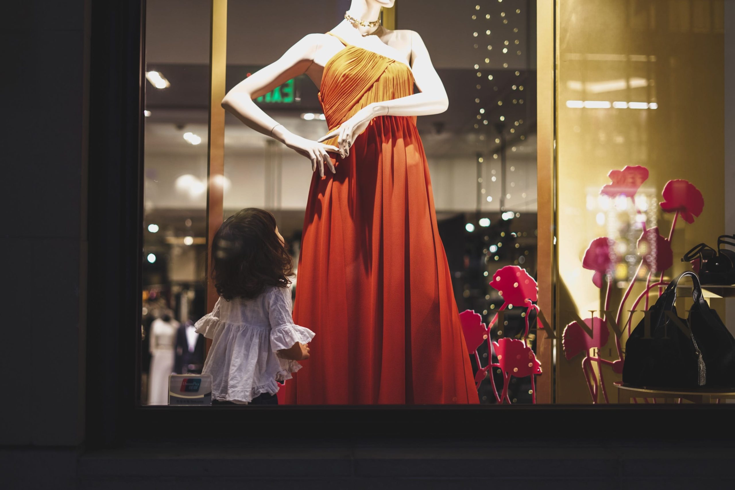
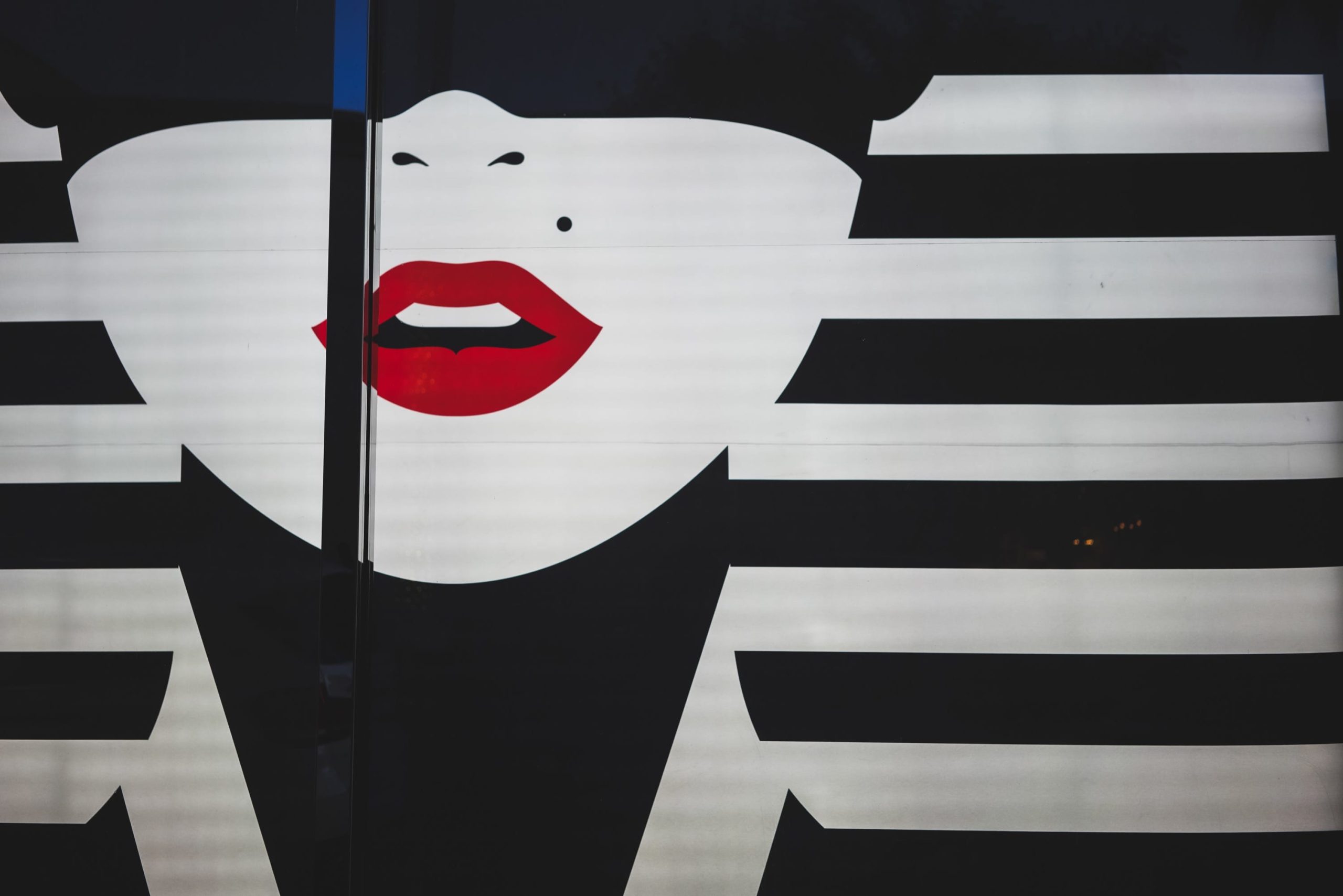
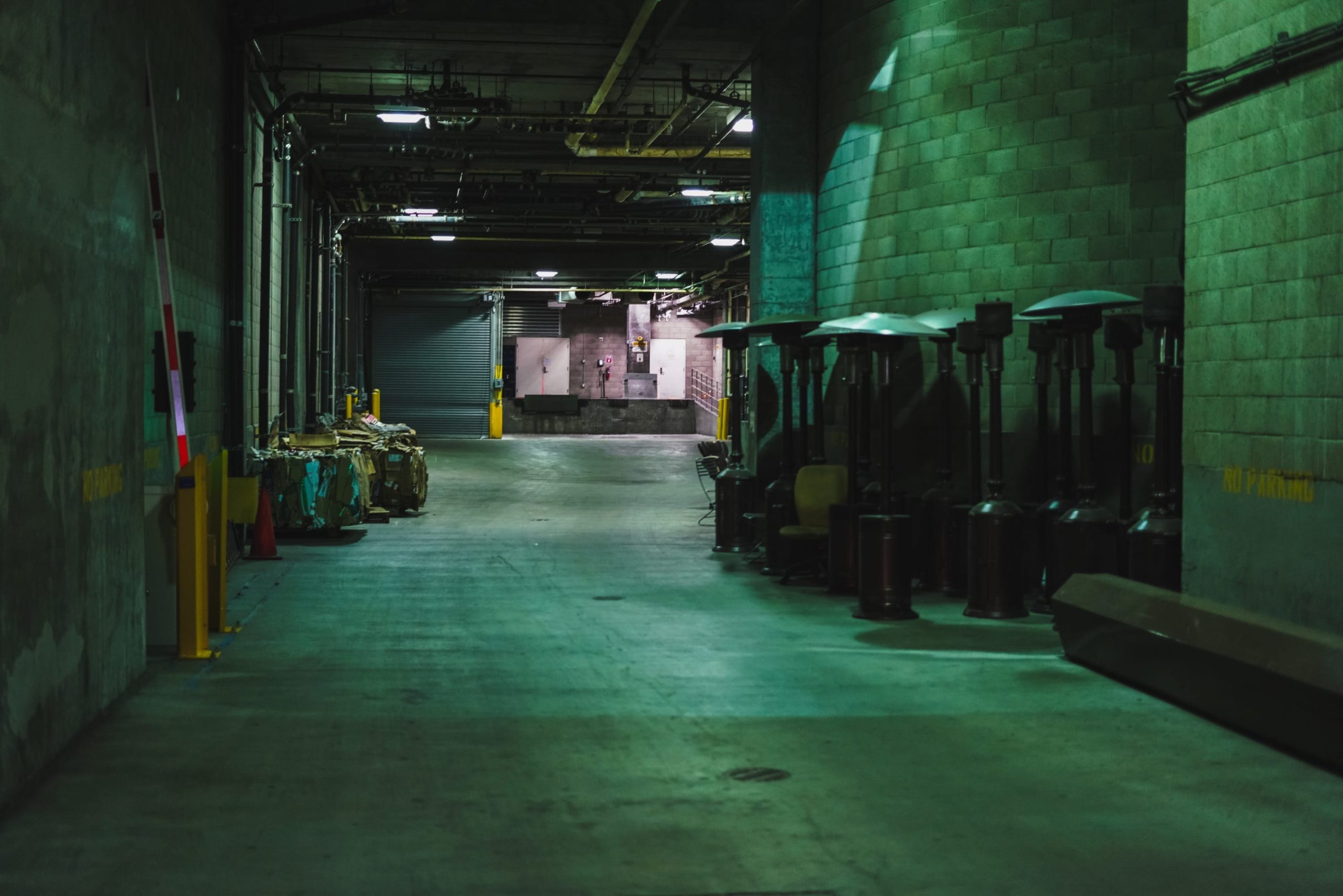
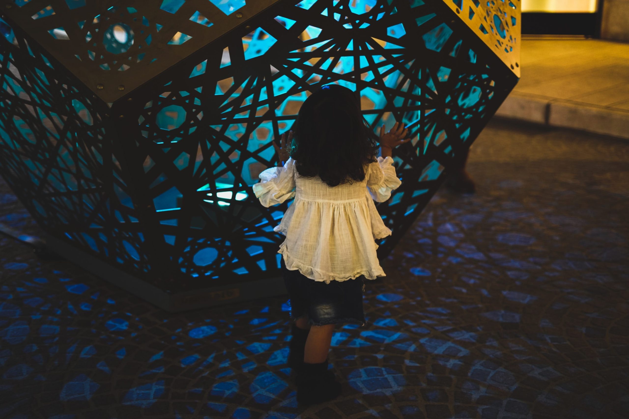
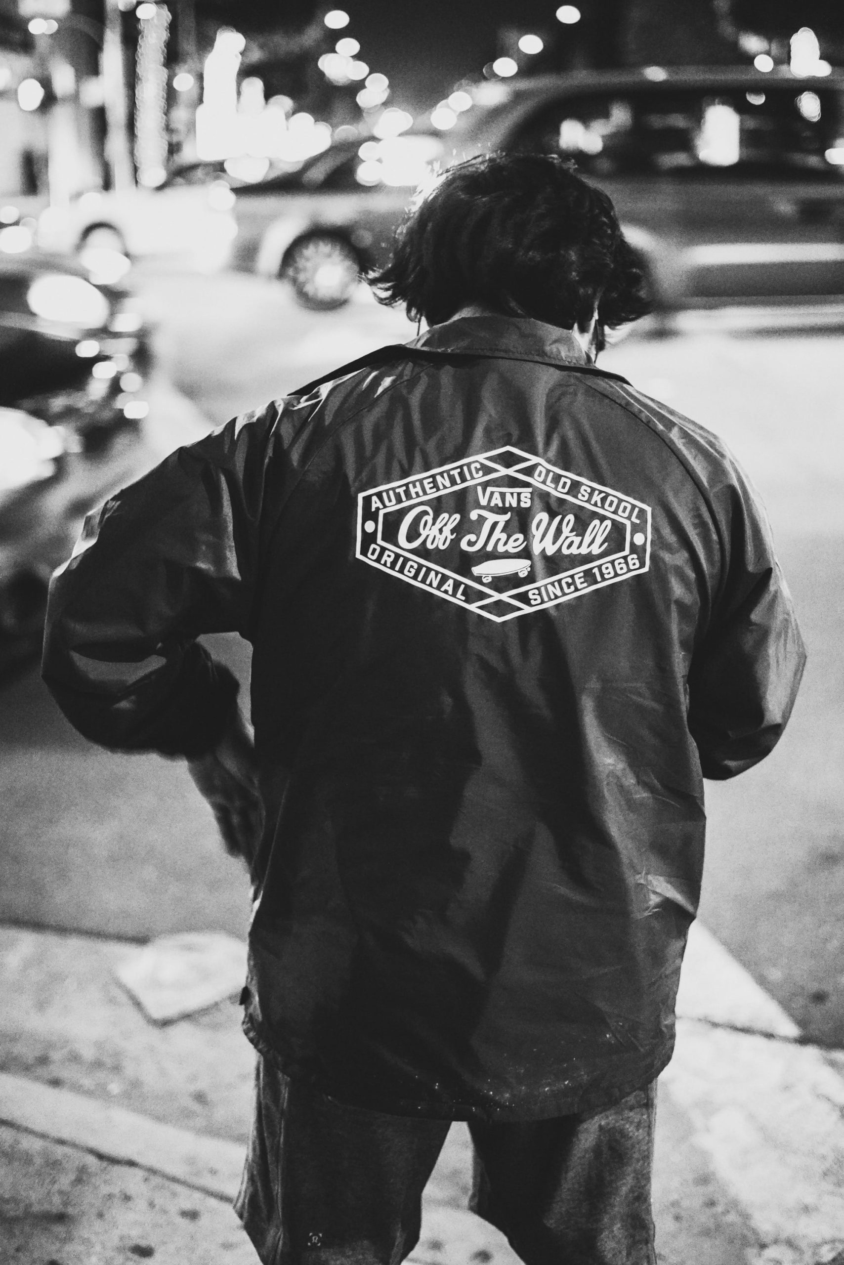
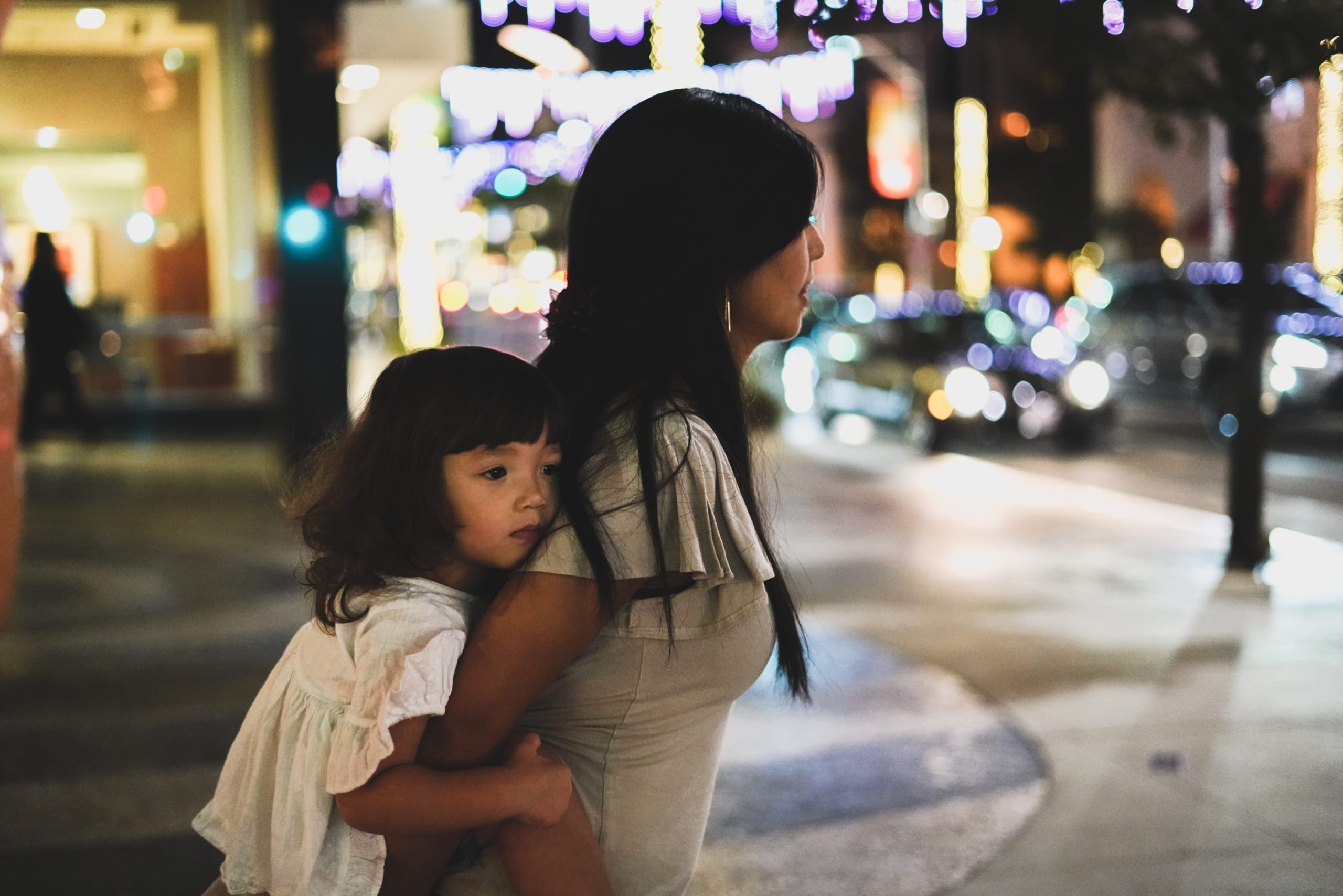
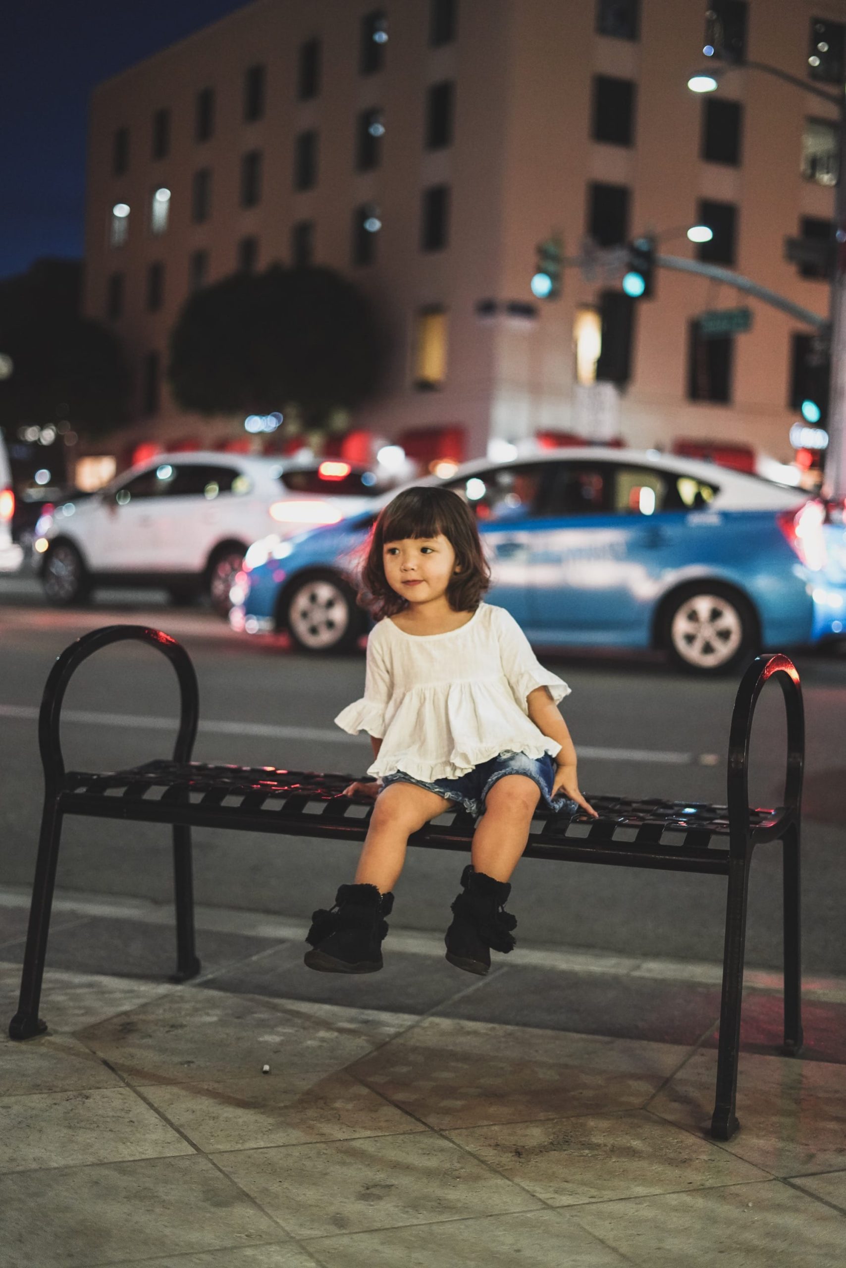
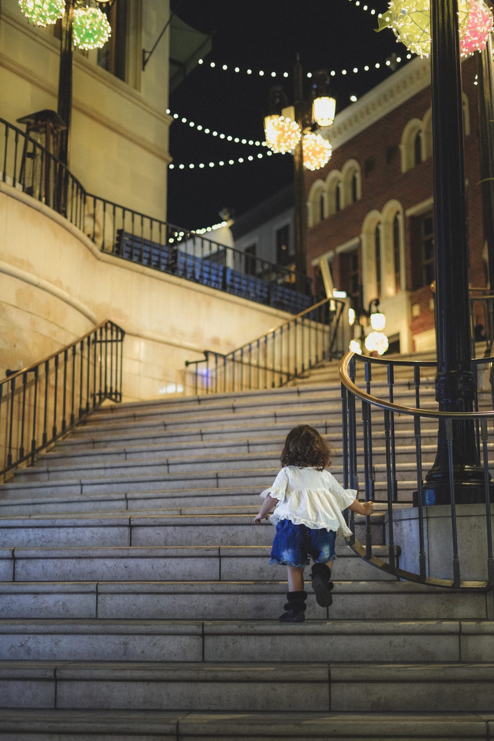
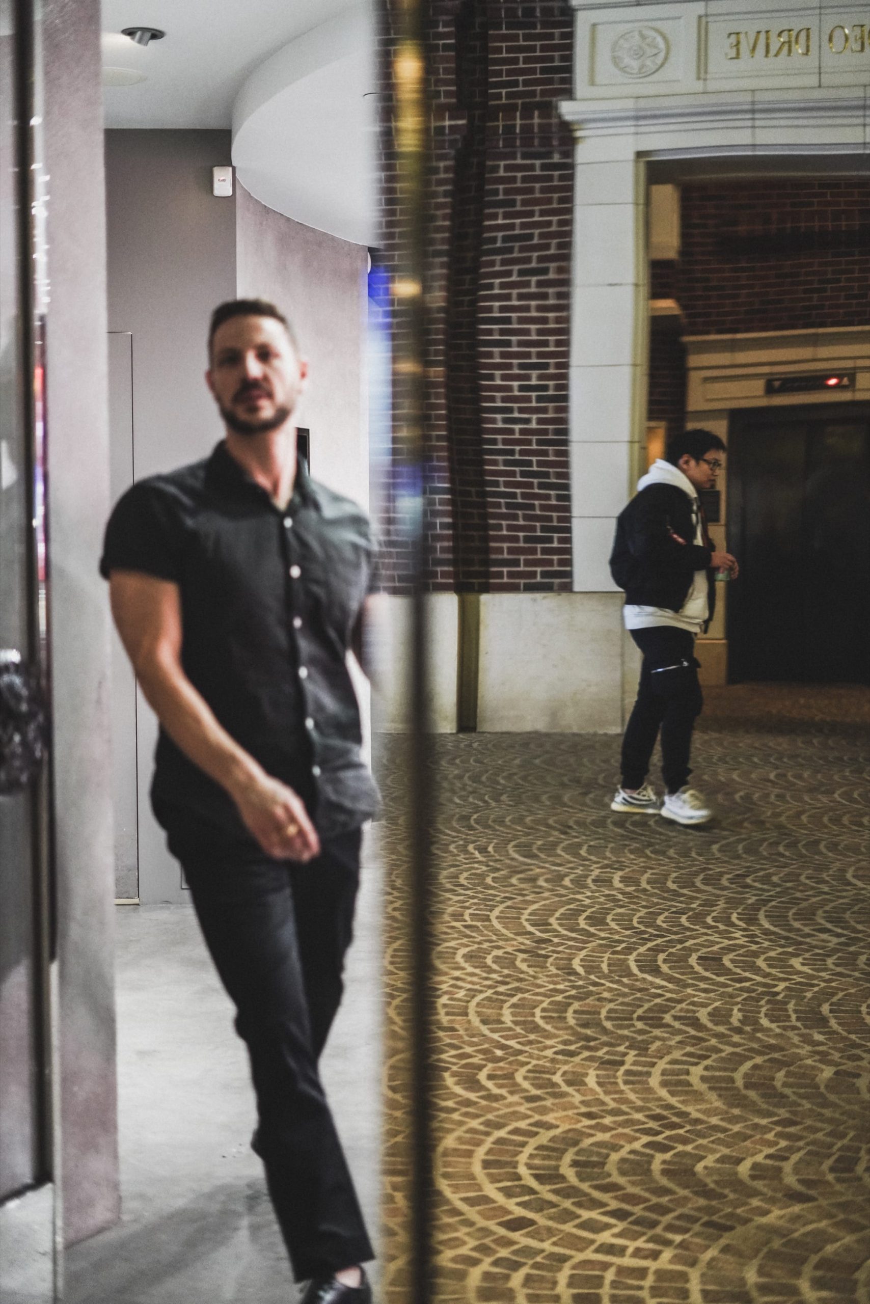
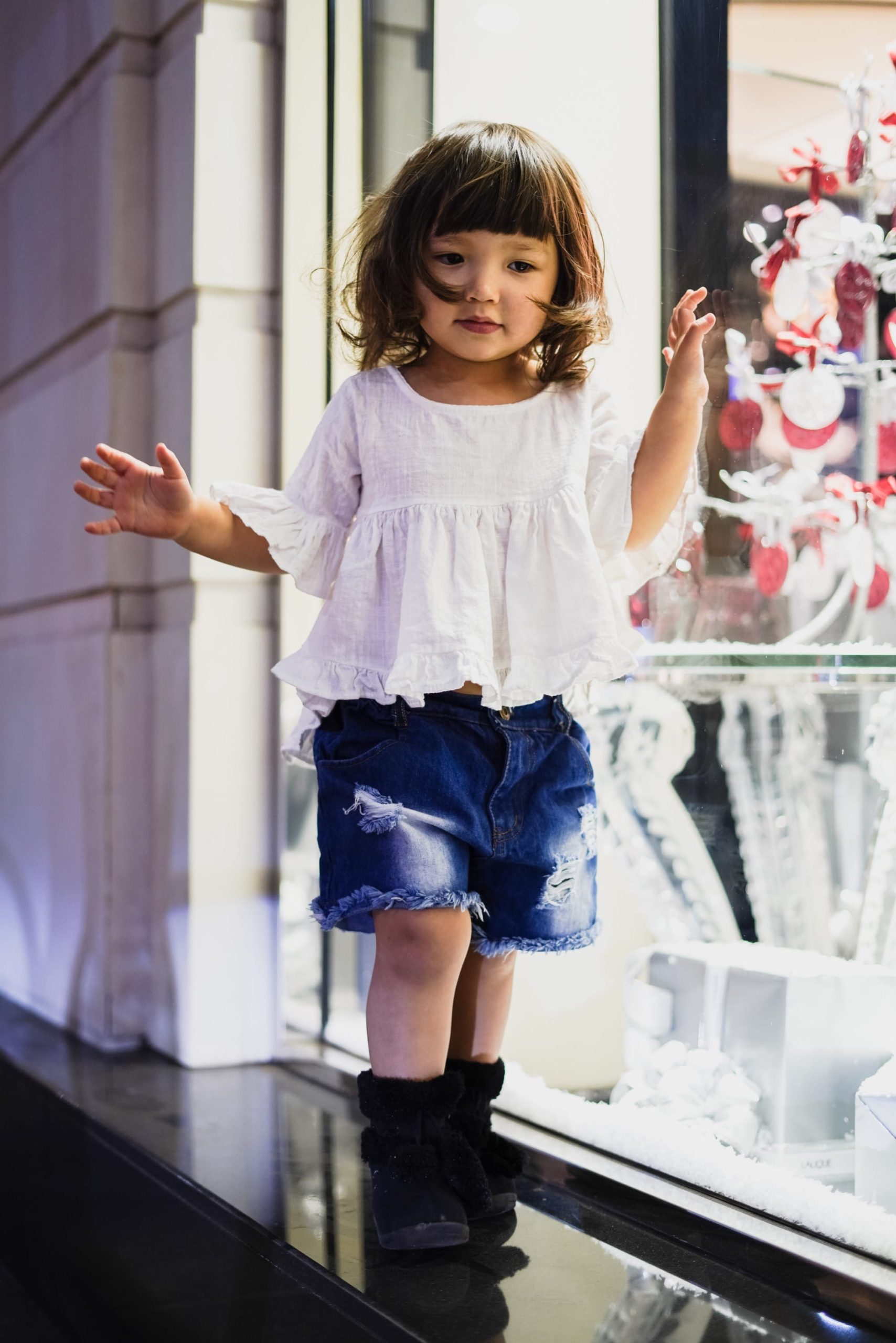
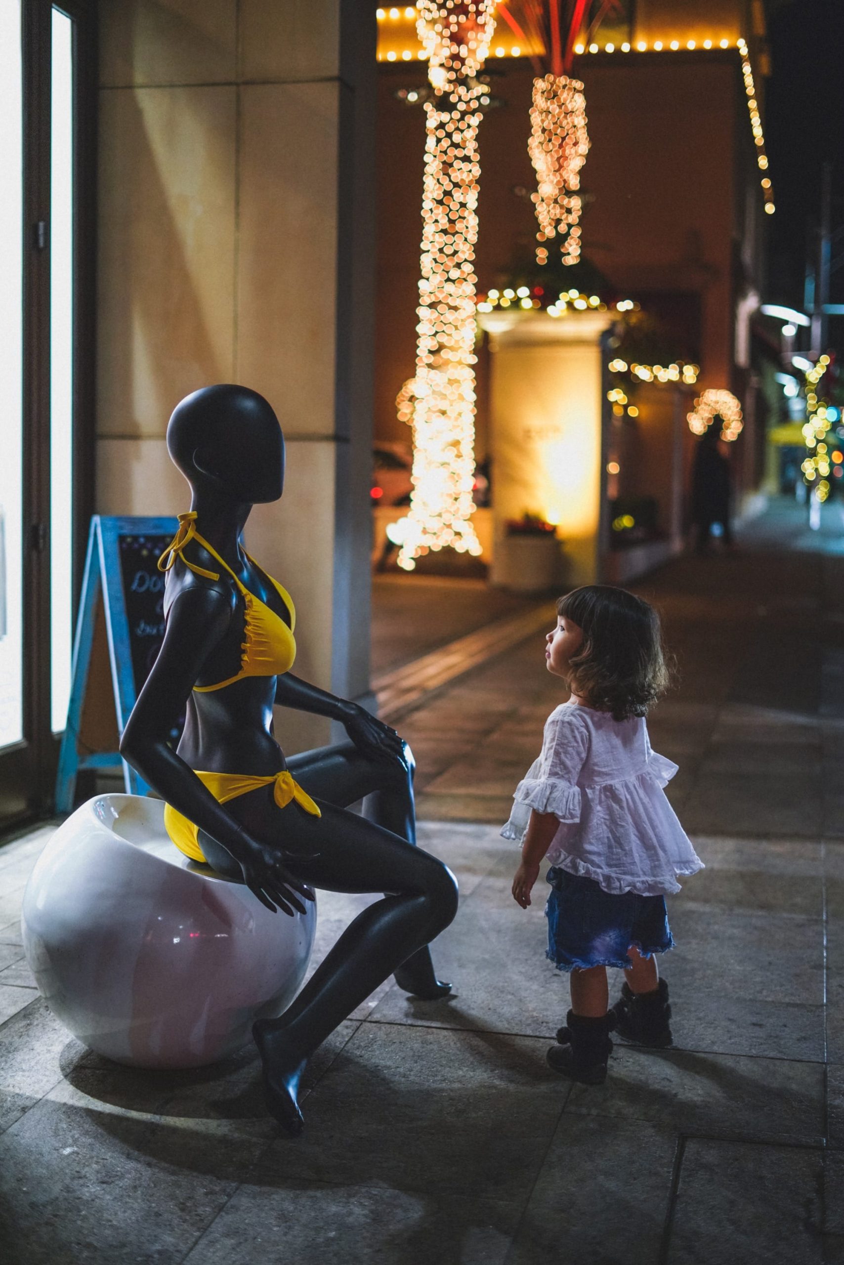
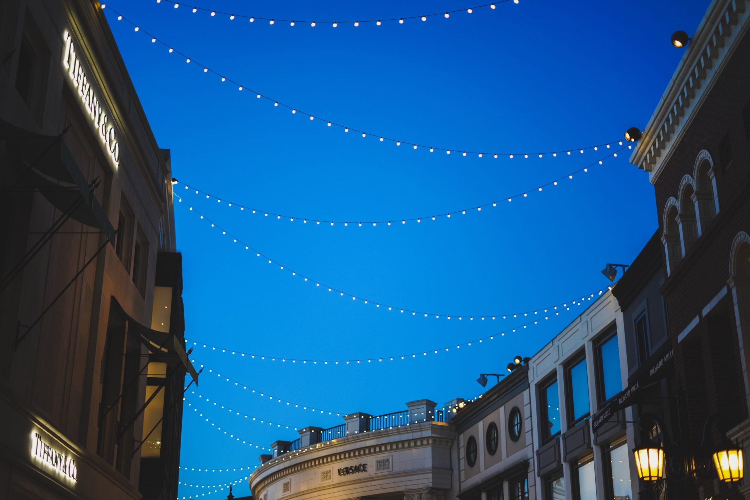
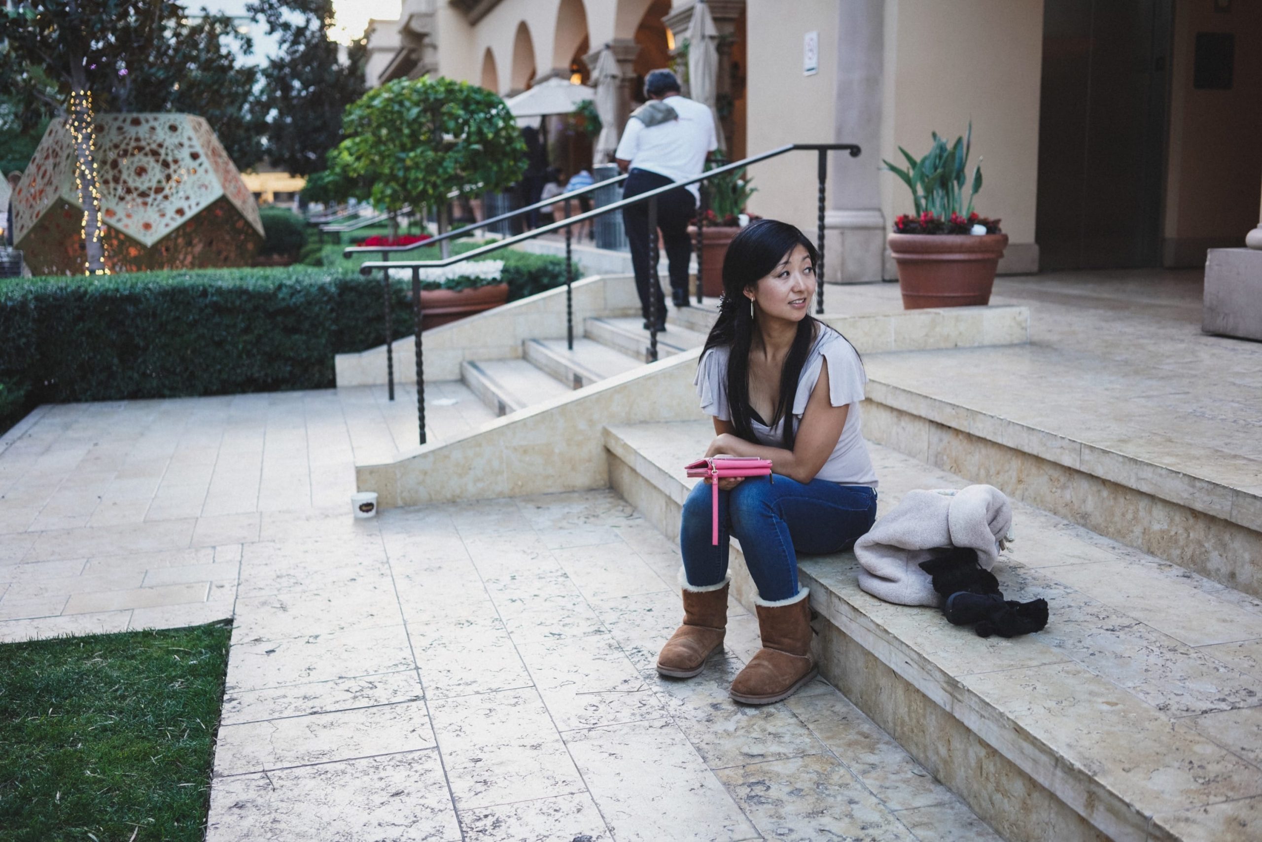
These were all shot in Beverly Hills using the Sony Neutral and Standard color profiles. I did not adjust any white balance, colors, or vibrance on any shot, just saturation.
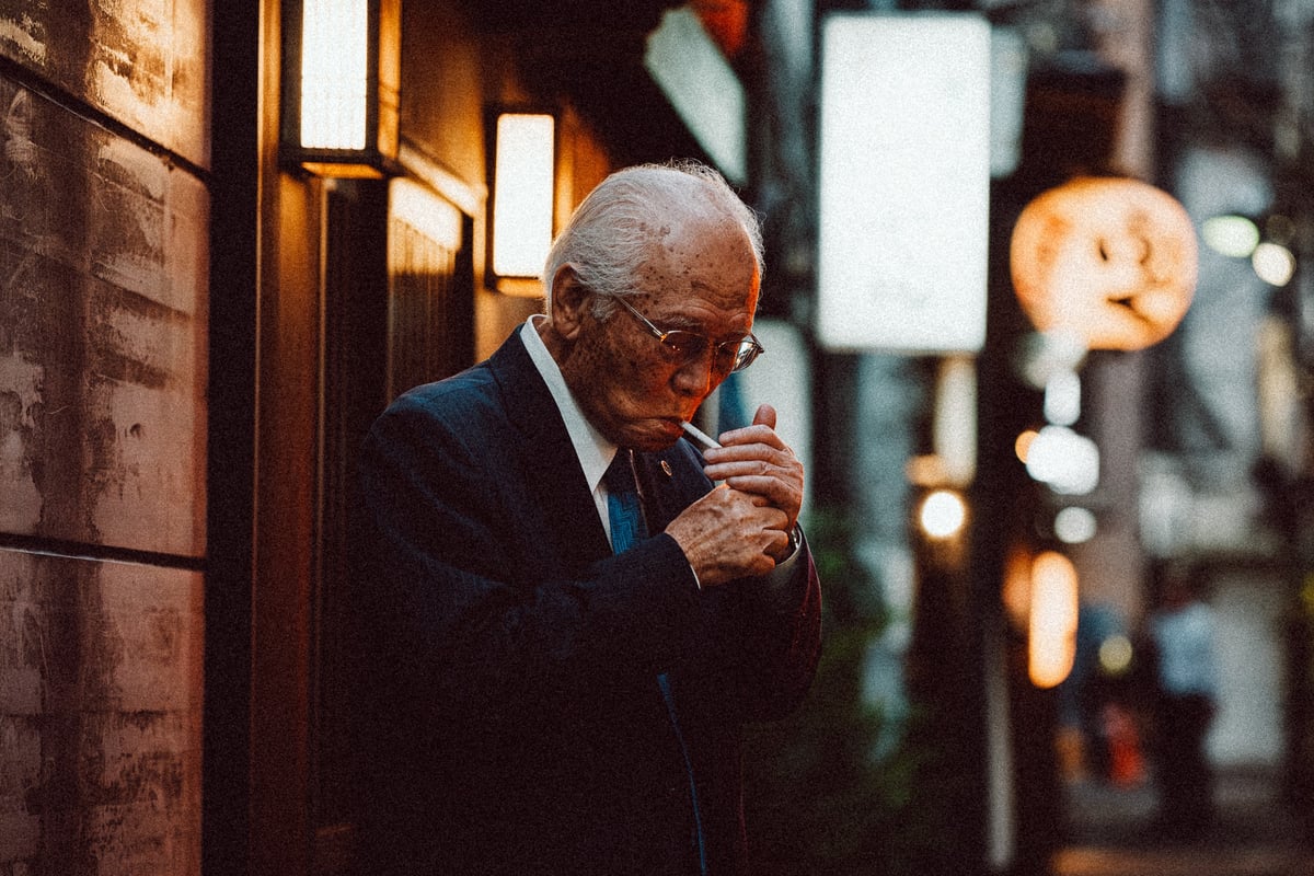
Sony A7r III Sample Photos


**This website contains affiliate links. We will earn a small commission on purchases made through these links. Some of the links used in these articles will direct you to Amazon. As an Amazon Associate, I earn from qualifying purchases. |
good read right here. in terms of color, fuji xt2 or sony a7riii? which would you prefer? thanks!
Fujifilm X-T2 hands down.
Good to know! Thanks! Happy Holidays!
You too!
Great post! I am shooting a7r3, but miss the tonalities i’d get from my xt2. i’m going to try the color edits you listed.
Thanks for the comment Alejandro.
This is an interesting article, thanks. Not enough people talk about colour and almost no reviewers. But it’s a deal-breaker for me. My X-Pro 2 gives beautiful APS-C colour science, but I sold my A7rii a while back partly because of this. I can’t really tell from these low-light mixed light samples whether it’s really improved. Any chance of a side-by-side raw and camera profiles comparison between the A7riii and X-T2, specifically with skintones?
I was doing some more tests with color on the A7r III today. I would say the color profiles still feel very Sony, it’s just the new color engine seems to help make it feel more natures and balances everything out better. Kind of like how Velvia was updated with the X-Pro2 / X-T2, but maybe a little better. The core colors, in my opinion are still off. Not even close to one to one with reality nor does it have a cool harmony like you get with Provia or Classic Chrome.
I was playing with it some today and could see the colors are just not accurate when looking at violets and purples to pinks. They light violet is too purple and pink is too red. I would still say it’s a deal breaker if color if your concern. It’s still has that Sony look.
I mostly use my Sony for Landscapes so I almost always use HSL to mix my colors up. But for casual daily photography I still prefer my X-Pro 2 and X-T2 simply because I don’t have to do as much work to get the colors looking good and balancing colors and creating harmony with them is always a challenge for me.
I’ll do some side by sides and update with the X-T2.
Thanks man, that’s 100% helpful reply, really appreciate the time you took to go into detail. Yeah, I think that is a deal-breaker for me, but I’ll hold off if you’re going to run a few side by side tests. Realistically, for the outlay of an A7riii, I would have to use the camera for portraits, travel and video as well as landscapes (for which I also play with HSL!). Like you, for non-human subjects I can live with and tweak Sony colour, but I couldn’t tweak or profile out their skin tones to my satisfaction even in raw when I had the Rii. This is especially a problem in video with relatively weak codecs you can’t grade too far.
Ok, Check this out. A quick and dirty color comparison between the two camera systems. Except I used the X-Pro 2 since it was sitting right next to me. https://alikgriffin.com/sony-a7r-iii-vs-fujifilm-x-pro-2-quick-color-comparison/
Thank you! I already left a comment on the other page.
Hey question. I read ur other blogs and saw you use VSCO. Im trying to upgrade to 7r3 but i noticed VSCO doesnt have the 7r3 as supported camera profile yet. Do you shoot raw and use the “standard” vsco presets to edit them? Thats about the only thing stopping me. I love VSCO and always start off with porta160/400 and fuji400h amd tweak from there. The custom camera profile works well with the non standard presets.
I still use the Sony profiles. Sometimes I’m lazy and just keep the Fujifilm profiles open as well because now I have my own custom personal presets built off of the VSCO presets based on Fujifilm VSCO settings.
The difference isn’t huge between camera and I usually do a little more tweaking after that since it’s almost never a one click solution to great looking photos. Sometimes I’ll have to tweak the blues a bit more and often times with Sony the yellows and oranges come off as looking strange so I tweak those slightly as well.
But also, I use the actual presets in Lightroom, not their profiles for the camera raw. I believe they still give you both when you buy the packs but it’s been years since I’ve installed them so I can’t remember exactly.
I also use RNI Films presets for their Kodachrome.
With VSCO Portra is where I start 95% of the time as well. I’ll have to try Fuji400. I’m always doing Portra and if I don’t like the look, I usually end up on Kodak Gold or an Ektar or Fortia.
If I’m editing mobile for on the road Instagram shots I use Darkroom App and almost always end up using A210 at about half power. That seems to work really well with Sony.